
7 Spring Color Palettes That Instantly Refresh Your Home
April 28, 2026

Introduction
Trending Finds Readers Are Loving
Explore affordable luxe discoveries people are clicking on right now.
See What's TrendingSpring is not just a season—it is a visual and emotional reset. After months of heavier colors, darker light, and layered textures, our homes often start to feel like they are holding onto winter. That’s usually when the urge to open windows, clear surfaces, and change colors shows up.
But refreshing your home for spring does not mean repainting everything or following short‑lived trends. The most effective seasonal updates come from changing the color story—the way your walls, textiles, furniture, and accents speak to each other.
The right spring color palette can make a space feel lighter, calmer, cleaner, and more alive without changing the bones of your home. In this guide, you’ll find 7 spring color palettes that work across many styles, rooms, and budgets—each designed to feel fresh now and still good months from now.
1) Sage Green + Warm White + Light Wood

This is one of the most reliable spring refresh palettes because it works with almost any interior style—from modern to cottage to traditional. Sage green brings in nature without being loud or trendy. Warm white keeps the space bright but not cold or clinical. Light wood adds softness and warmth so the room still feels grounded rather than washed out.
Psychologically, this palette works because it balances freshness with stability. Green is restorative to the eyes, warm white keeps the space open, and wood tones prevent the room from feeling sterile. Together, they create a space that feels calm, breathable, and quietly optimistic—exactly what most people want in spring.
This palette is perfect if:
- Your home already has a lot of neutral furniture
- You want something calm and timeless rather than seasonal-looking
- You want spring freshness without floral overload
How to use it in practice:
- Use sage in pillows, throws, planters, or curtains rather than large furniture
- Keep walls and large surfaces in warm white or soft ivory
- Bring in light wood through trays, stools, picture frames, or small tables
This palette works beautifully in living rooms, bedrooms, kitchens, and entryways—and transitions well into summer without needing to be changed again.
2) Butter Yellow + Soft Gray + Linen
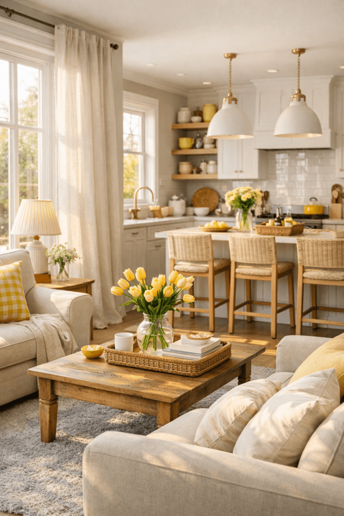
Butter yellow is a sunlight color. It instantly makes rooms feel happier and brighter, but unlike bold yellow, it doesn’t feel sharp or childish. When paired with soft gray and linen tones, it becomes elegant, warm, and very livable.
This palette is ideal for homes that feel a little flat or dull after winter. The yellow brings energy, the gray keeps it grounded, and the linen tones soften everything so the room still feels calm rather than busy.
This palette is perfect if:
- Your home feels a little heavy or muted
- You want a cheerful spring mood without strong color statements
- You love light, airy rooms that still feel sophisticated
How to use it in practice:
- Keep butter yellow in small doses: pillows, art, ceramics, or a single accent chair
- Use soft gray in rugs, upholstery, or as a wall color
- Layer in linen tones through curtains, bedding, or lampshades
This palette shines in kitchens, breakfast nooks, living rooms, and anywhere you want a gentle lift in mood.
3) Blush + Mushroom + Warm White
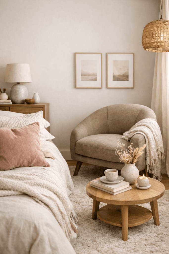
This is a soft, romantic, grown‑up palette that feels calming rather than decorative. Blush adds warmth and life. Mushroom (a warm taupe or greige) keeps the palette grounded and mature. Warm white keeps everything clean and bright.
This combination works especially well for people who want color but don’t like anything that feels bold or obvious. It creates a space that feels gentle, welcoming, and quietly elevated.
This palette is perfect if:
- You want warmth without strong or trendy colors
- You love soft, calming interiors
- You want something that feels elegant and timeless
How to use it in practice:
- Use blush in throws, pillows, or artwork
- Use mushroom in larger pieces like rugs, curtains, or an accent chair
- Keep walls and large surfaces in warm white
This palette is especially beautiful in bedrooms, dressing rooms, and calm sitting areas.
4) Sky Blue + Oatmeal + Driftwood

This palette feels like open windows and fresh air. Sky blue brings in the feeling of clear spring skies. Oatmeal keeps the room warm and soft. Driftwood tones add subtle texture and depth.
It is ideal for homes that feel stuffy, dark, or visually heavy after winter. This combination instantly makes spaces feel more open and breathable.
This palette is perfect if:
- Your home feels dark or closed-in
- You want a coastal or airy feeling without beach themes
- You love light-filled, relaxed spaces
How to use it in practice:
- Use sky blue in pillows, vases, or artwork
- Use oatmeal in rugs, sofas, or curtains
- Bring in driftwood tones through frames, trays, or furniture
This palette works wonderfully in living rooms, bedrooms, and sunrooms.
5) Terracotta + Olive + Warm Sand
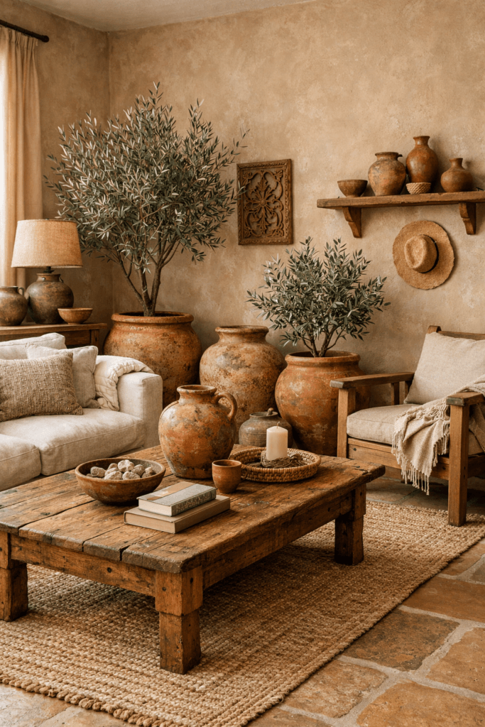
This is a grounded spring palette for people who don’t love pastels. Terracotta brings warmth and earthiness. Olive brings nature and depth. Warm sand keeps everything light enough for the season.
This palette feels organic, stable, and timeless rather than sweet or decorative. It is perfect for homes that already lean warm, rustic, or natural.
This palette is perfect if:
- You prefer earthy tones over soft florals
- Your home uses a lot of wood, stone, or warm neutrals
- You want spring to feel natural rather than pretty
How to use it in practice:
- Use terracotta in pots, pillows, or art
- Use olive in plants, textiles, or small furniture
- Use warm sand in walls, rugs, or large surfaces
This palette is beautiful in living rooms, dining rooms, and kitchens.
6) Lavender + Soft Charcoal + Ivory
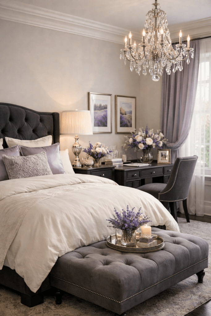
Lavender doesn’t have to feel childish or overly floral. When paired with soft charcoal and ivory, it becomes elegant, calm, and modern.
This palette is ideal if you like cooler tones but still want your space to feel warm and inviting. The charcoal grounds the lavender, and the ivory keeps everything light and clean.
This palette is perfect if:
- You want a hint of color without losing sophistication
- You like cooler palettes but still want warmth
- You want something a little different from typical spring colors
How to use it in practice:
- Use lavender in small accents like pillows or art
- Use soft charcoal in frames, lamps, or a side table
- Use ivory in walls, bedding, or rugs
This palette works beautifully in bedrooms, offices, and reading corners.
7) Dusty Peach + Stone + Antique Gold

This is a warm, flattering, light‑reflecting palette that feels both fresh and cozy. Dusty peach brings life and warmth. Stone keeps the palette neutral and calm. Antique gold adds quiet elegance and a little glow.
This combination is especially good for rooms that feel cold or flat and need a touch of warmth without becoming heavy.
This palette is perfect if:
- Your home feels cool or a bit lifeless
- You want warmth without going dark or heavy
- You love subtle, elegant color stories
How to use it in practice:
- Use dusty peach in pillows or artwork
- Use stone in walls or rugs
n- Use antique gold in frames, trays, or lighting
This palette is beautiful in living rooms, bedrooms, and entryways.
How to Use Spring Color Palettes Without Replacing Everything
You do not need new furniture to refresh your home for spring. The easiest seasonal refresh points are:
- Pillow covers
- Throws
- Curtains
- Rugs
- Art
- Decorative objects
Changing 10–20% of the visible color in a room is often enough to make it feel completely new.
Final Thoughts
Spring color palettes are not about trends. They’re about how you want your home to feel. The right palette can make your space feel lighter, cleaner, calmer, and more alive—without changing anything structural. Choose one direction, apply it consistently, and let the season do the rest.