
Things that quietly make a home look cheap
July 16, 2026
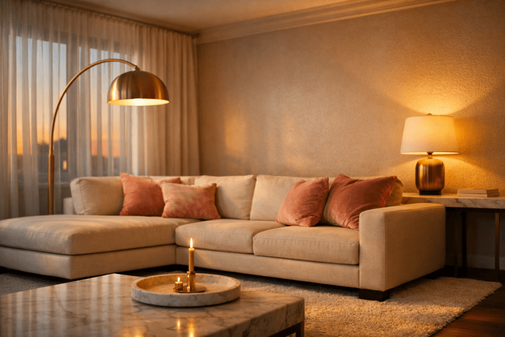
The Details That Lower the Look — Without You Realizing
Trending Finds Readers Are Loving
Explore affordable luxe discoveries people are clicking on right now.
See What's TrendingA home rarely looks inexpensive because of the sofa.
More often, it’s the small, overlooked details that quietly reduce the overall impression.
Luxury is not built through excess. It is created through proportion, lighting, cohesion, and restraint. When even one of those elements is slightly off, the entire room can feel less refined — even if the furniture itself is beautiful.
The good news? These are subtle shifts. Once corrected, the transformation feels immediate.
Below are the first two details that most often lower the look of a space — and how to elevate them without overspending.
1. Harsh or Flat Lighting
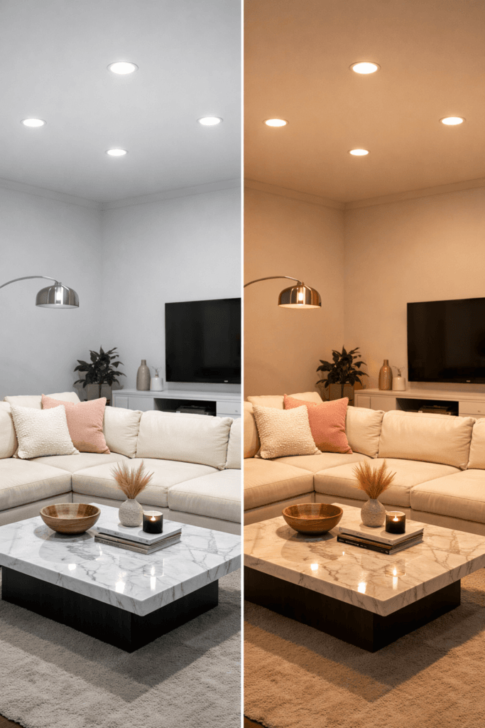
Lighting quietly determines whether a room feels warm and dimensional or flat and sterile.
Overhead lighting alone tends to wash out texture. It casts downward shadows, removes depth from walls, and highlights imperfections rather than enhancing design elements. Under cool-toned bulbs, blush tones lose richness, gold accents appear brassy, and neutral upholstery can take on a gray cast.
The shift is subtle but powerful.
Rooms that feel slightly cold at night or oddly unfinished often suffer from this single issue.
Layered lighting changes everything.
Instead of relying on one ceiling fixture, introduce light at three different heights: floor, table, and low accent. A tall arc floor lamp placed beside a seating area creates eye-level warmth. A mid-height table lamp adds balance. A small candle or subtle accent glow introduces depth.
Warm bulbs in the 2700K–3000K range enhance undertones and create softness that feels intentional.
If you want a full breakdown of how to layer light properly, revisit our guide on the Designer Lighting Rule That Makes Any Home Look Expensive. Lighting is never decoration — it is structure.
Once layered correctly, even simple furnishings begin to feel elevated.
2. Rugs That Are Too Small
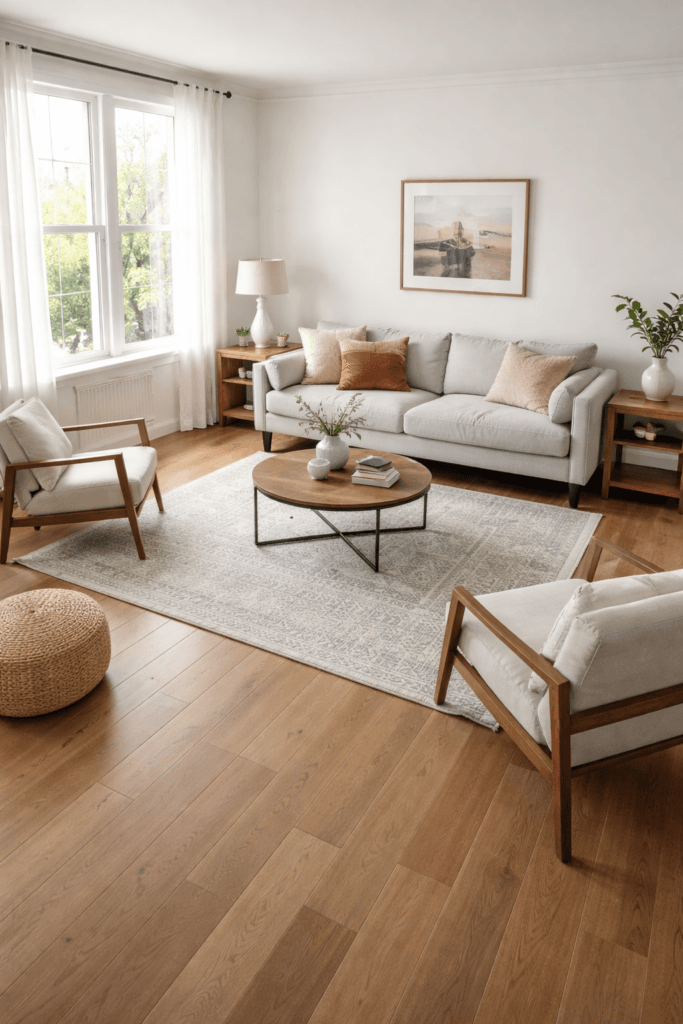
An undersized rug is one of the most common elements that quietly makes a home look inexpensive.
When a rug only touches the coffee table or sits awkwardly in the center of the room, the furniture appears disconnected. Visual balance disappears. The space feels slightly off, even if you cannot immediately explain why.
Luxury interiors ground their furniture.
In a living room, at least the front legs of your sofa and chairs should sit on the rug. Ideally, the rug extends generously beyond the seating area to anchor the layout.
Scale communicates value.
A larger rug creates cohesion and softness. It allows the eye to move across the space without interruption. It makes the room feel designed rather than assembled.
The difference is not dramatic — but it is noticeable.
If you are refining your layout overall, our full guide on how to make a home look expensive on a budget explains how proportion and balance work together.
The rug does not need to be extravagant. It simply needs to be correctly scaled.
Subtle Clutter on Surfaces
Luxury spaces feel calm because surfaces are edited.
Coffee tables layered with multiple small decor pieces. Consoles crowded with uneven-height accessories. Shelves filled edge-to-edge with objects. These details may not seem problematic individually, yet together they create visual noise.
Editing does not mean removing personality. It means creating breathing room.
Instead of five small accessories, choose one larger statement piece. Rather than stacking multiple picture frames at different angles, select a single intentional focal point.
Texture creates more impact than quantity.
A marble tray with one candle and one sculptural object feels elevated. An uncluttered console with a balanced lamp and a mirror feels considered. When negative space is present, the room feels curated.
If your surfaces still feel slightly busy, lighting may be amplifying the issue. Harsh brightness highlights clutter, while layered lighting softens edges and enhances depth.
Refinement often begins with subtraction.
When Small Details Add Up
None of these elements alone define the entire room.
However, when harsh lighting, an undersized rug, and cluttered surfaces exist together, the overall impression becomes diluted.
Luxury is rarely about what you add. It is about what you refine.
Soft glam interiors thrive on warmth, proportion, and controlled repetition. Once lighting is layered, scale is corrected, and surfaces are edited, the foundation of the room shifts.
And that shift feels expensive.
The Subtle Details That Quietly Disrupt Luxury

Once lighting and scale are corrected, the room already feels more refined. Yet a few additional details can still quietly lower the overall impression.
Luxury is cohesive. When elements compete instead of complement, the space feels slightly unsettled. The shift may be subtle, but the eye notices.
3. Mismatched Finishes
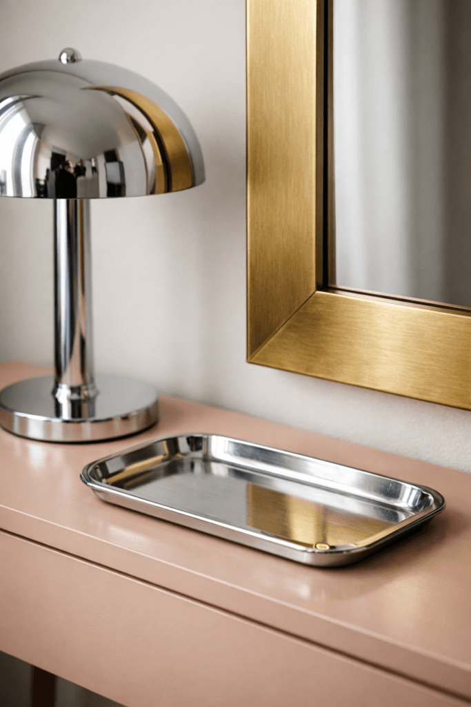
Mixing finishes is not inherently wrong. In fact, layered metals can feel sophisticated when done intentionally. The issue arises when finishes appear random rather than curated.
Chrome hardware beside brushed gold lamps. Matte black fixtures paired with warm brass accents. Cool silver tones layered over blush and ivory textiles. These combinations create visual tension that disrupts cohesion.
High-end interiors repeat finishes with restraint.
If brushed gold appears in your lighting, allow that same tone to echo in cabinet hardware, mirror frames, or decorative accents. Repetition builds rhythm. Rhythm builds refinement.
This does not mean every metal must match perfectly. Instead, choose one dominant finish and allow it to lead. Secondary finishes should support rather than compete.
Consistency communicates intention.
If your space still feels slightly disconnected, revisit our guide on the Designer Lighting Rule. Cohesive finishes paired with layered lighting instantly elevate the look.
4. Wall Art That Is Too Small
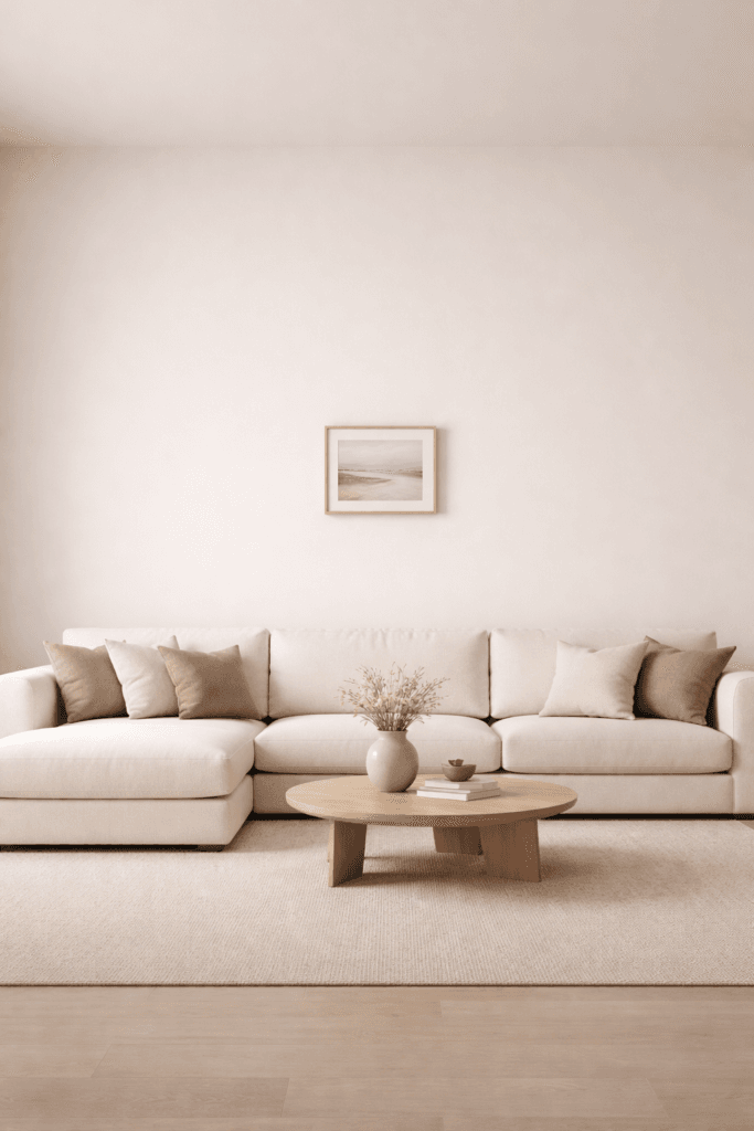
Undersized artwork is one of the most common design missteps — and one of the easiest to correct.
A small frame floating above a wide sofa creates imbalance. The wall appears empty, while the art looks isolated. Even beautiful pieces lose impact when scale is off.
Luxury interiors embrace proportion.
Artwork should occupy approximately two-thirds to three-quarters of the width of the furniture beneath it. Larger pieces anchor the wall and create presence.
When multiple smaller frames are used, they should be grouped tightly to read as one unified composition rather than scattered individually.
Scale creates confidence.
If your layout still feels incomplete, you may find additional guidance in our full breakdown of how to make a home look expensive on a budget, where proportion plays a central role.
5. Curtains Hung Too Low
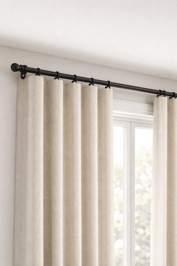
Window treatments influence perceived ceiling height more than most people realize.
When curtain rods are installed directly above the window frame, the ceiling appears lower. The room feels slightly compressed, even if the furniture is beautiful.
Designers often mount curtain rods several inches below the ceiling line to elongate the wall visually.
Full-length panels that gently graze the floor create softness and vertical movement. The eye travels upward, and the room immediately feels taller.
Vertical emphasis enhances elegance.
Fabric choice matters as well. Light-filtering linen or soft textured panels feel elevated compared to stiff, overly shiny materials. Subtle texture adds depth without overwhelming the space.
Balanced Placement Matters
Even well-chosen decor can feel inexpensive if placement lacks intention.
A console pushed awkwardly into one corner. Lamps positioned too far apart. Decorative objects clustered unevenly on one side of a surface. These arrangements disrupt visual balance.
Symmetry is not required in every room, yet balance always is.
Placing matching lamps on either side of a sofa instantly introduces harmony. Centering artwork properly above furniture creates alignment. Allowing negative space on both sides of a console adds breathing room.
Refinement often lies in adjustment rather than replacement.
When Refinement Feels Effortless
None of these changes require a full redesign.
Correcting finishes. Adjusting art scale. Raising curtain rods. Editing placement. These are small shifts with significant visual impact.
Luxury is rarely loud. It feels composed.
When lighting is layered, rugs are properly scaled, finishes are cohesive, art is proportioned, and curtains elongate the wall, the space begins to feel curated.
Quiet refinement transforms the entire atmosphere.
The Final Layer of Refinement
Once lighting, scale, finishes, and placement are corrected, a room begins to feel noticeably elevated. Yet true luxury is often revealed in the quietest details.
Refinement is not dramatic. It is intentional.
Unbalanced Color Distribution
A space can feel slightly inexpensive when color is not evenly distributed.
For example, blush pillows on one side of the room without any coordinating tone elsewhere may feel accidental. Gold accents clustered in one corner can create imbalance. When color appears isolated rather than echoed, cohesion weakens.
Luxury interiors repeat tones softly throughout the space.
If blush appears in throw pillows, allow a subtle version of that hue to appear in artwork, florals, or a small decorative object across the room. If brushed gold is introduced through lighting, repeat it in mirror frames or hardware.
Repetition builds rhythm. Rhythm builds harmony.
Visible Cords and Cluttered Edges
Small visual distractions can quietly lower the overall impression.
Visible lamp cords trailing across walls. Chargers resting on consoles. Extension cords exposed near baseboards. These details may seem minor, yet they interrupt the visual calm that luxury spaces embody.
Editing is not limited to decor — it extends to functionality.
Concealing cords, using cord covers that match wall color, and keeping edges clear restores polish. Clean lines allow lighting and proportion to stand out instead of distractions.
Too Many Small Decor Pieces
Quantity can dilute impact.
Multiple tiny objects scattered across shelves often feel busy rather than curated. Even beautiful accessories lose presence when competing for attention.
Luxury favors scale and breathing room.
Replace several small items with one larger statement piece. A single sculptural vase commands more attention than five miniature accents. An oversized art piece creates stronger presence than multiple small frames spaced too far apart.
Subtraction strengthens sophistication.
The Soft Glam Luxury Checklist
If you want to assess your space quickly, walk through this refinement checklist:
- Are there at least three layers of warm lighting?
- Does the rug anchor the furniture properly?
- Are finishes cohesive rather than random?
- Is artwork scaled appropriately to furniture?
- Are curtain rods mounted high enough to elongate walls?
- Is color repeated subtly throughout the room?
- Are surfaces edited with breathing room?
If even one of these elements is slightly off, the room may feel less elevated than it could.
Revisit our full breakdown of the Designer Lighting Rule if lighting remains inconsistent, and explore how to make a home look expensive on a budget for a complete foundation review.
The Evening Refinement Test
Luxury is most noticeable after sunset.
Turn off overhead lighting. Allow only layered lamps and accent lighting to glow. Observe how shadows move across walls and how textures appear under warm illumination.
Notice whether the space feels calm. Pay attention to focal points. Look for depth in textiles and surfaces.
If the room feels balanced and intentional, refinement is working.
If something feels slightly unsettled, it is usually a matter of scale, lighting height, or clutter density.
Why Quiet Changes Create the Biggest Impact
Expensive-looking interiors rarely rely on extravagant pieces.
Instead, they rely on discipline.
Discipline in lighting height. Discipline in finish repetition. Discipline in editing surfaces. Discipline in proportion.
When these principles align, even affordable furnishings feel elevated.
Luxury is not excess.
Luxury is intention.
Luxury is editing.
Luxury is proportion.
Luxury is cohesive lighting and controlled repetition.
Small details quietly shape perception. Once refined, the difference is unmistakable.
Bellencinista Notes
Upgrade lighting to warm 2700K bulbs, scale rugs properly, repeat finishes intentionally, hang curtains higher, and edit surfaces with restraint. Small refinements create cohesion, and cohesion is what makes a home feel expensive.