Spring Color Palettes by Room: The Best Colors for Every Space in Your Home
April 30, 2026

Spring color palettes by room are one of the fastest ways to make your home feel new again—without repainting every wall or replacing furniture. The secret is simple: each room has a different job. Your bedroom should calm you, your kitchen should energize you, your entryway should welcome you, and your living room should feel balanced enough for real life. When you pick spring colors that match the purpose of the space, your home feels refreshed in a way that’s both visible and emotional.
This guide breaks down the best spring color palettes room by room—mixing airy neutrals with soft color, plus a few brighter options where they make sense. You’ll also get practical ways to apply each palette using the easiest “swap points” (pillows, throws, art, rugs, towels, tabletop decor) so you can refresh your look without starting from scratch.
If you want a broader palette overview first, pair this with your foundational guide: “7 Spring Color Palettes That Instantly Refresh Your Home.” (Internal link recommended.)
Price: 13.99
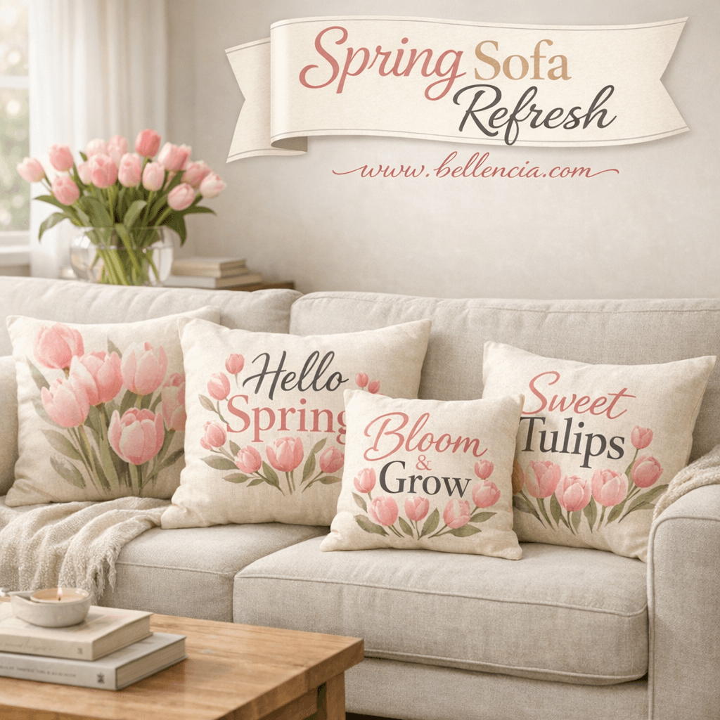
Shop Similar:Pink Tulips Bicycle Throw Pillow Covers, 18 x 18 Inch – a must-have featured in this post.
1) Spring Color Palettes for the Living Room
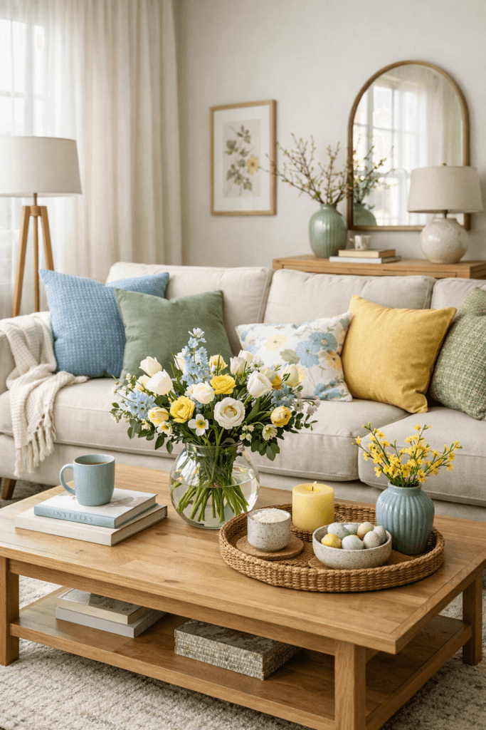
The living room is your home’s main “public” space, which means it needs the most balance. In spring, your goal isn’t to make the room look themed—it’s to make it feel lighter, cleaner, and more breathable while still staying grounded. The easiest way to do that is to keep your large surfaces neutral (sofa, rug, curtains) and let spring color live in smaller layers.
Palette A (Calm + Fresh): Sage Green + Warm White + Light Wood
This palette is a spring classic because it reads as “fresh” without ever feeling trendy. Sage is restorative and soft, warm white keeps your room bright, and light wood adds natural warmth so the space doesn’t feel cold. Use sage in 2–4 touchpoints: pillow covers, a throw, a ceramic vase, and a bit of greenery. Keep warm white dominant in the room (curtains, walls, or slipcovers), then reinforce light wood with trays, frames, or a small side table.
Palette B (Airy + Bright): Sky Blue + Oatmeal + Driftwood
If your living room feels heavy after winter, sky blue is like opening a window. The key is to pair it with oatmeal (warm neutral) so it doesn’t go icy. Driftwood tones—weathered wood, wicker, or neutral oak—pull everything together. Add sky blue through art, a patterned pillow, or glass decor, then repeat the tone once more so it feels intentional.
Palette C (Warm + Modern): Dusty Peach + Stone + Antique Gold
This palette gives spring warmth without shouting. Dusty peach flatters rooms with low light, stone keeps the palette mature, and antique gold adds a soft glow. Try peach in pillows or a throw, stone in a rug or wall decor, and gold in frames, candlesticks, or a lamp base.
Quick living room rule: If your sofa is neutral, your spring refresh can be as simple as changing 10–20% of what you see. Start with pillows + throw + one new art print, then add one anchor object (tray, vase, lamp).
2) Spring Color Palettes for the Bedroom
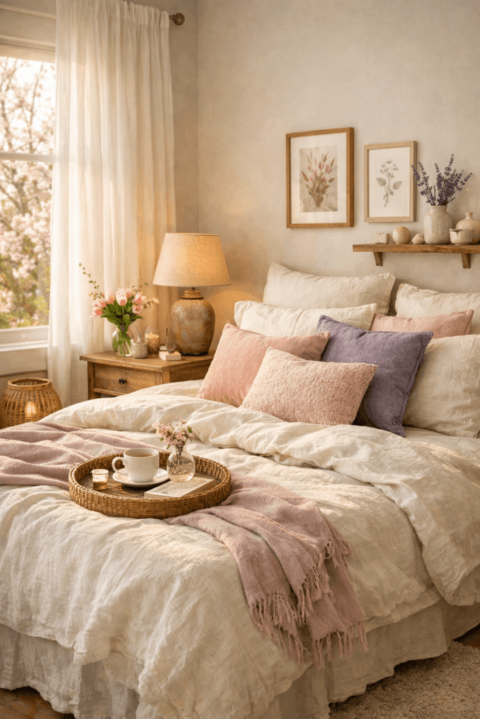
Your bedroom is where spring should feel the most calming. This is not the room for chaotic color experiments—unless your personality thrives on boldness. Most people sleep better and feel more restored when the bedroom palette is soft, warm, and consistent. In spring, the bedroom refresh is mostly about textiles: bedding, curtains, and light layering.
Palette A (Soft + Romantic): Blush + Mushroom + Warm White
This palette is gentle, grown-up, and incredibly easy to style. Warm white keeps your room clean and bright. Mushroom (warm greige/taupe) adds depth without darkness. Blush brings life without feeling “pink.” Use warm white for bedding base, mushroom for a throw blanket or rug, and blush in one or two accents—like a pillow cover and a framed print. This palette also looks beautiful with subtle brass or antique gold hardware.
Palette B (Calm + Elevated): Lavender + Soft Charcoal + Ivory
Lavender can look sophisticated when it’s muted and supported by darker neutrals. Ivory keeps the room light, charcoal grounds it, lavender adds spring softness. Try ivory bedding, charcoal nightstands or frames, and lavender in a pillow or curtain tie. This works especially well if you want something different from the typical spring greens and blues.
Palette C (Minimal + Fresh): Warm White + Light Wood + Pale Sage
If you want your bedroom to feel like a reset, keep the palette quiet. Warm white dominates, light wood adds warmth, and pale sage is the whisper of color. Add one botanical print or a ceramic vase with greenery and stop there. Spring doesn’t need to be busy to be beautiful.
Bedroom refresh tip: Swap pillowcases and duvet cover first. If you change nothing else, those two items can shift the entire mood of the room instantly.
3) Spring Color Palettes for the Kitchen
The kitchen is where spring can handle brighter color because it’s an energy space. People naturally associate kitchens with freshness, light, and “clean starts,” so spring color palettes work especially well here—even if the rest of your home stays neutral. The goal is to keep color functional: think textiles, containers, and countertop styling, not clutter.
Palette A (Cheerful + Clean): Butter Yellow + Soft Gray + Linen
Butter yellow feels like sunlight. It’s happy without being loud, especially when paired with soft gray and linen tones. Use butter yellow in dish towels, a small vase, a fruit bowl, or a single piece of wall art. Let soft gray show up in a runner rug or countertop accessories. Linen tones keep everything soft and natural so your kitchen doesn’t feel “theme-y.”
Palette B (Fresh + Botanical): Sage Green + Warm White + Brass
This palette is perfect if you love the look of herbs, greenery, and natural materials. Warm white keeps the kitchen bright and open, sage adds life, and brass (or warm metal) gives a polished finish. Try sage planters, a cutting board display, warm white ceramics, and one brass accent like a utensil holder or candle stick.
Palette C (Earthy Spring): Terracotta + Cream + Olive
If you don’t like pastels, this is your spring palette. Terracotta adds warmth, olive brings nature, cream keeps it light. This palette looks incredible with wood shelves, ceramic bowls, and natural fiber baskets. Keep the counters edited—let one terracotta bowl and one olive plant be the statement instead of a dozen small items.
Kitchen refresh rule: Choose one “countertop vignette” area and style it intentionally (tray + candle + vase + functional item). Remove everything else that doesn’t serve daily use.
4) Spring Color Palettes for the Bathroom
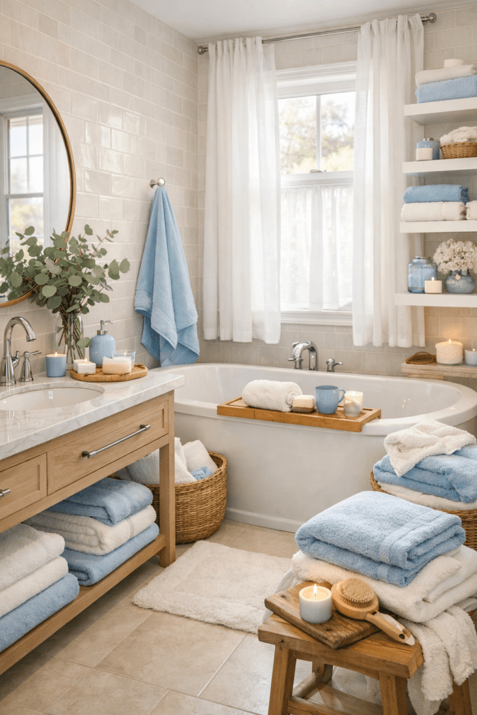
Bathrooms should feel clean and spa-like in spring. This is where color works best in small doses—towels, a bath mat, a soap dispenser, a candle, and one plant. The trick is to keep the palette cohesive so it feels intentional rather than random.
Palette A (Spa Fresh): Sky Blue + Warm White + Light Sand
Sky blue reads as water and air—perfect for spring. Warm white prevents it from feeling icy. Light sand adds warmth and keeps the bathroom from looking stark. Use sky blue in a towel set or bath mat, warm white in shower curtain or tile, and sand tones in baskets or accessories.
Palette B (Botanical Calm): Sage + Cream + Soft Charcoal
This palette looks expensive because it’s restrained. Sage in eucalyptus stems or a towel accent, cream in textiles, soft charcoal in frames or containers. The charcoal creates contrast without going “dark.”
Palette C (Warm + Elevated): Stone + Warm White + Antique Gold
If your bathroom already leans neutral, add antique gold through a mirror frame, a tray, or small hardware accents. Pair with stone-toned textiles and warm white as your base for a clean spring look.
Bathroom refresh tip: Replace towels first. Fresh towels (and a matching mat) make the bathroom feel instantly “new,” even if nothing else changes.
5) Spring Color Palettes for the Entryway
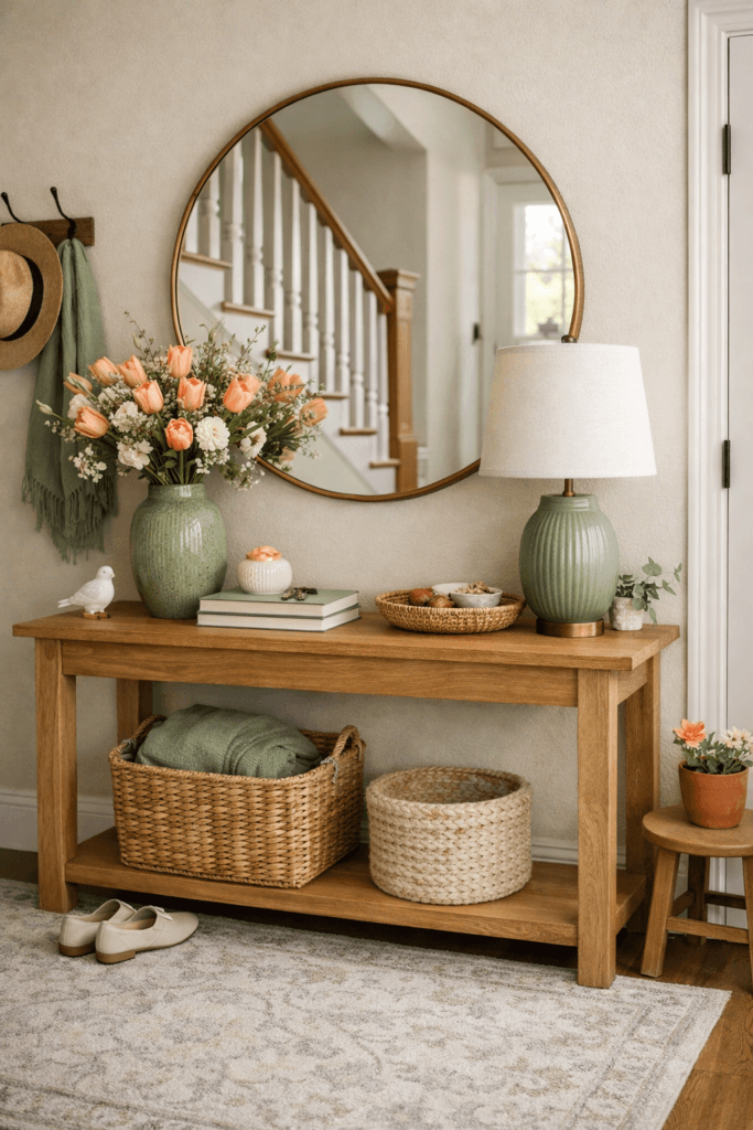
Your entryway sets the tone for your entire home. In spring, it should feel welcoming, light, and edited—not crowded. Color palettes work best here when they’re paired with function: a tray for keys, a basket for shoes, a mirror for light, and one seasonal accent.
Palette A (Fresh Welcome): Sage + Warm White + Light Wood
This palette makes an entryway feel instantly calmer. Warm white keeps it bright, sage adds life, and light wood brings warmth. Use a sage vase or small art print, warm white runner rug, and wood tray or stool.
Palette B (Warm + Sunny): Butter Yellow + Linen + Soft Gray
Butter yellow is especially effective in entryways because it reads as cheerful and welcoming. Keep it minimal: one piece of art or one small object. Linen and gray keep it grounded so it doesn’t feel loud.
Palette C (Soft Glam Spring): Dusty Peach + Stone + Antique Gold
Dusty peach adds warmth and softness. Stone keeps it modern. Antique gold adds that “polished” look. Try a stone-toned runner, peach florals, and a gold-framed mirror.
Entryway refresh rule: Reduce visual noise. A clean entryway with one beautiful color moment feels more “spring” than an entryway full of decor.
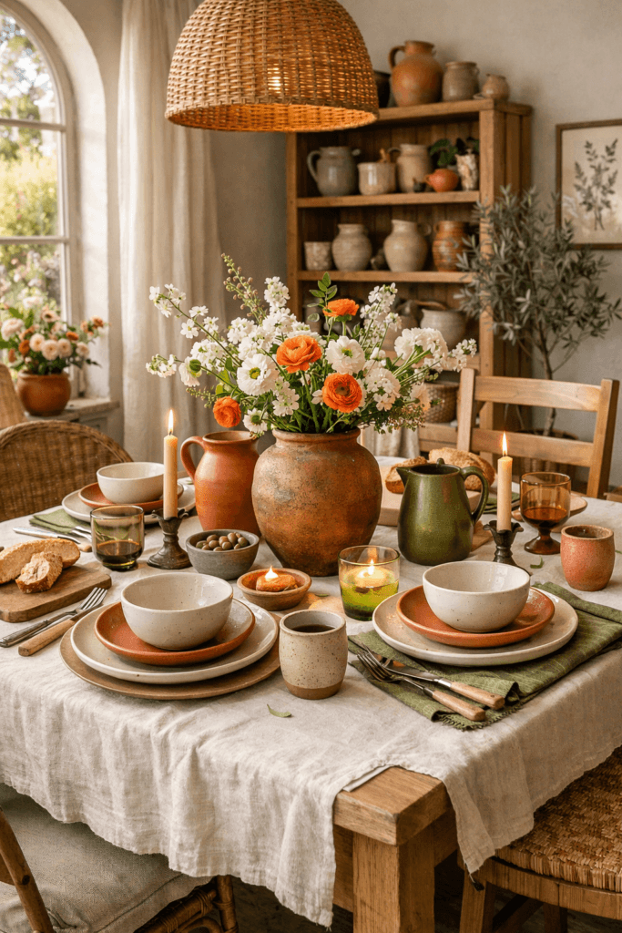
6) Spring Color Palettes for the Dining Room
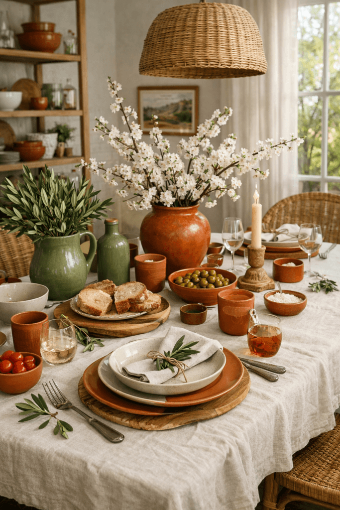
Dining rooms are perfect for spring palettes because you can refresh them with tabletop styling rather than big changes. Think table linens, centerpiece, candles, and chair cushions. Spring dining palettes should feel inviting and a little brighter than winter—without looking like seasonal decor you’ll want to remove in a month.
Palette A (Earthy + Elegant): Terracotta + Olive + Warm Sand
This palette is stunning for spring dinners because it’s grounded but lively. Terracotta adds warmth, olive adds freshness, warm sand keeps it light. Use a linen table runner in sand, olive greenery (real or faux), and terracotta ceramic pieces.
Palette B (Airy + Soft): Sky Blue + Oatmeal + White
If you want the dining room to feel open and calm, this is it. Use oatmeal linens, white dishes, and one sky-blue accent (glassware, napkins, or a vase). This palette photographs beautifully for Pinterest.
Palette C (Romantic Spring): Blush + Warm White + Brass
Keep blush subtle: napkins, florals, or a candle. Warm white as base, brass for candle holders or flatware accents. The result is soft, elevated, and not overly sweet.
Dining refresh tip: Start with a new table runner + a simple centerpiece. That alone can change the entire vibe without buying anything large.
7) Spring Color Palettes for the Home Office
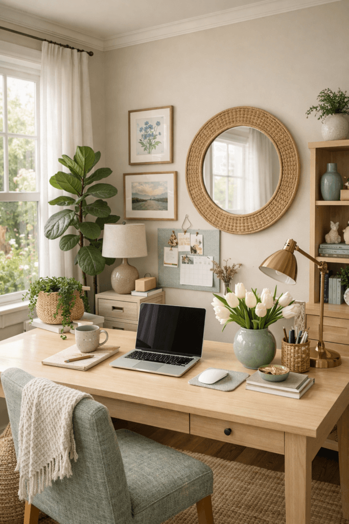
A spring home office palette should do two things: reduce stress and support focus. Overly bright colors can feel stimulating, while overly neutral spaces can feel dull. The sweet spot is “soft energy”—a calm base with a few uplifting touches.
Palette A (Focus + Fresh): Soft Blue + Warm White + Light Wood
Soft blue encourages a calm, clear feeling. Warm white keeps the space bright. Light wood adds warmth. Use blue in art or desk accessories, warm white for walls or shelving, and wood in your desk or storage.
Palette B (Quiet + Modern): Sage + Oatmeal + Soft Charcoal
Sage keeps the room feeling alive without being distracting. Oatmeal softens the space. Charcoal adds contrast so the room doesn’t feel washed out. This palette works beautifully with minimal styling and one strong lamp.
Palette C (Creative Spring): Lavender + Ivory + Warm Gray
Lavender can be a creativity cue when it’s muted. Keep the base ivory, use warm gray in rugs or storage, and lavender in one or two accents. It’s unique and still professional-looking.
Office refresh rule: Keep your desk surface clean. Let your palette show up in the background (art, lamp, shelf styling). Visual calm supports mental clarity.
How to Apply Spring Color Palettes Without Replacing Everything
You don’t need new furniture to refresh your home. In most rooms, changing 10–20% of what you see is enough to shift the entire mood. Focus on the easiest “swap points”:
- Pillow covers and throws
- Table linens and napkins
- Towels and bath mats
- Artwork (even one new print)
- Rugs (or smaller layered rugs)
- Decor objects (vases, trays, candles)
If you want a color system that stays timeless, it helps to follow classic color principles like harmony, contrast, and repetition. For deeper reading, you can explore color guidance from high-authority sources like the Pantone color resource and foundational color theory concepts from the Encyclopaedia Britannica.
Final Thoughts
Spring color palettes by room work best when you treat color as a strategy, not an impulse. Keep your base neutral, choose a palette that matches the function of the room, and repeat your accent colors just enough to feel intentional. Whether you go calm and airy or bright and cheerful, your home will feel refreshed when every space looks like it belongs to the same season—without looking like you redecorated your whole life.