Trending Finds Readers Are Loving
Explore affordable luxe discoveries people are clicking on right now.
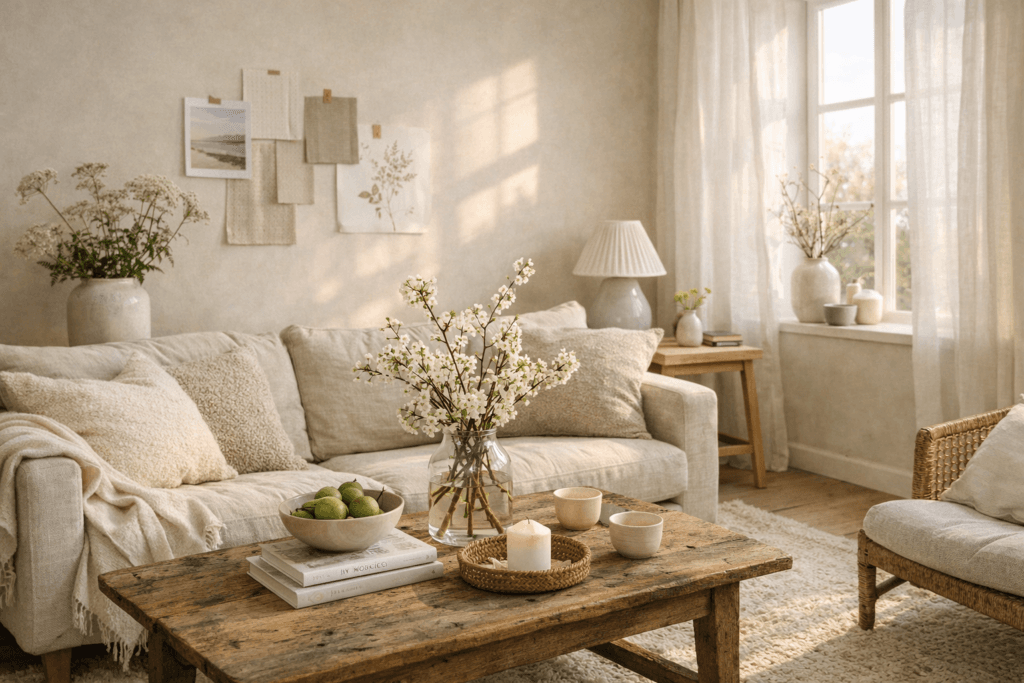
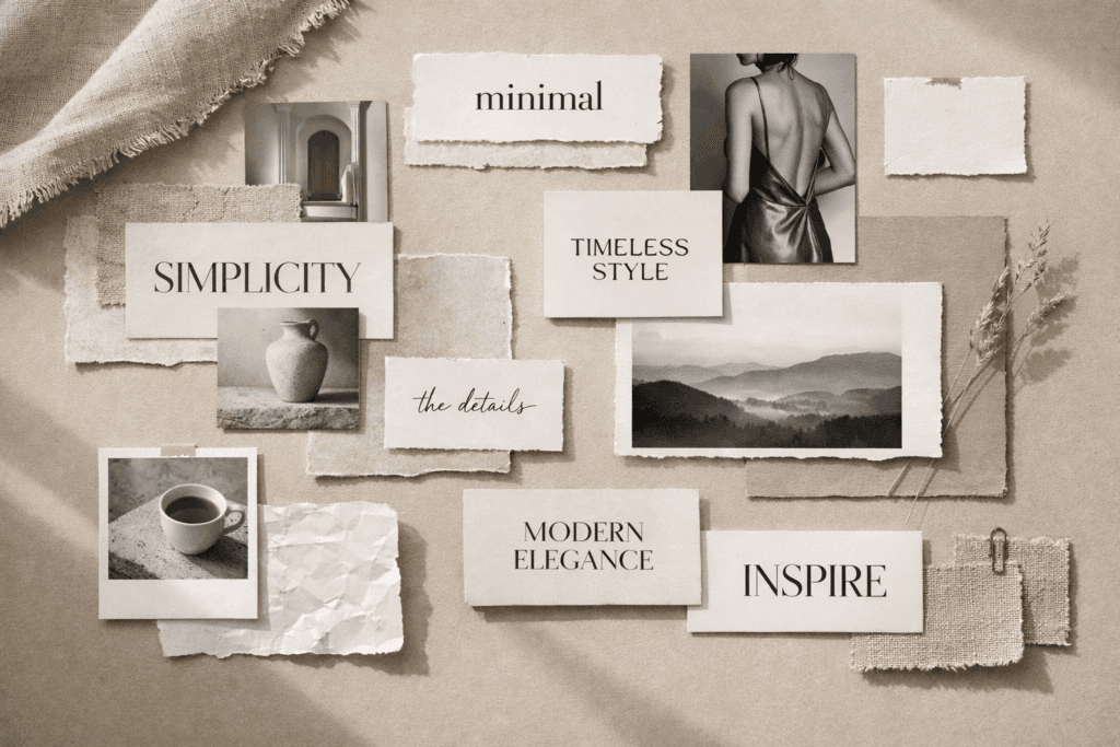
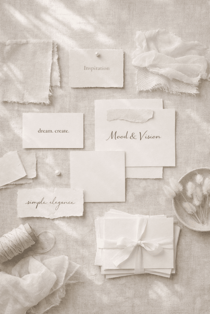
See What's TrendingThere is something unforgettable about a monochrome aesthetic. When everything aligns under one cohesive color story, even the simplest visuals become magnetic. A monochrome moodboard doesn’t just look elevated—it communicates intention, clarity, and quiet luxury in a way that chaotic visuals can’t compete with. In today’s hyper-visual digital world, audiences want inspiration that feels organized, branded, and emotionally grounded. Monochrome imagery achieves all of that effortlessly.
This post explores how monochrome moodboards have evolved into a sophisticated design asset used by brands, Pinterest creators, fashion labels, interior designers, and marketing teams to build stronger visual presence online. We’ll break down why they work, how to build them, which colors to experiment with, and how moodboards help your brand stand out on platforms like Pinterest, Instagram, and Tumblr. If you’ve been searching for a simple but powerful creative framework, this is it.
Pinterest currently favors cohesive, niche storytelling over random imagery. Users want content that feels curated, not cluttered. That’s exactly why monochrome moodboards perform so well—they remove distraction, deepen emotional resonance, and carry a “premier brand identity” energy. If one image can tell a story, imagine what fifteen aligned visuals can do.
Why Monochrome Moodboards Feel So Luxurious
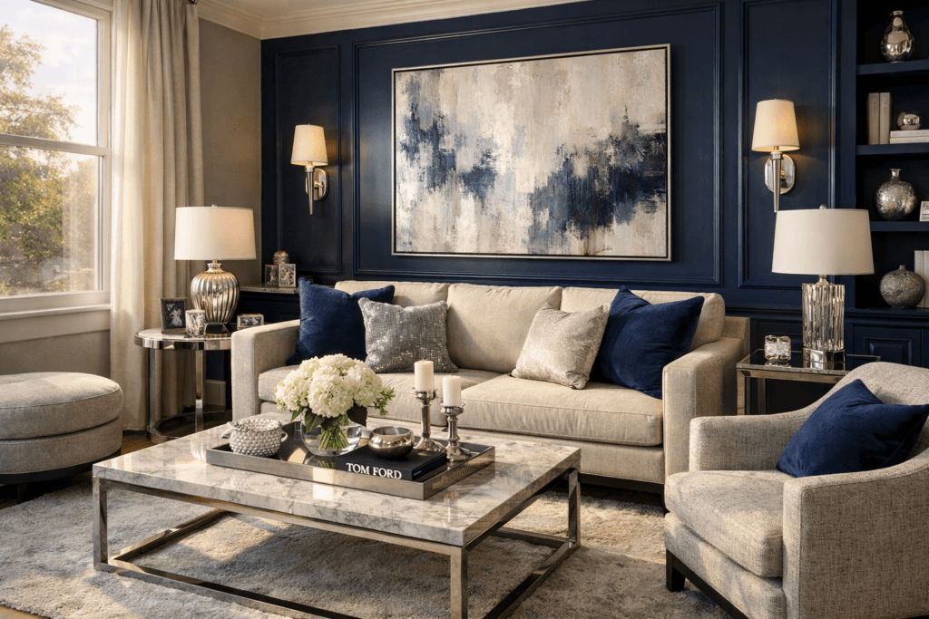
The reason monochrome moodboards translate as luxurious is because they embody discipline. Think about high-end fashion houses, minimalist architecture, modern brand identity work—they rely heavily on tone-on-tone imagery because it conveys purpose and excellence. When you commit to a single hue, the message becomes stronger and the experience more immersive.
Color variety can be beautiful, but color chaos is rarely chic. Monochrome visuals, on the other hand, create a beautifully restful pause in the visual noise. They are clean, organized, and direct. Your viewers know instantly what to feel, what to look at, and why the mood matters.
It also taps into psychology. Color controls emotion. When you guide every visual element under one shared tone, you’re guiding how the viewer experiences your brand story.
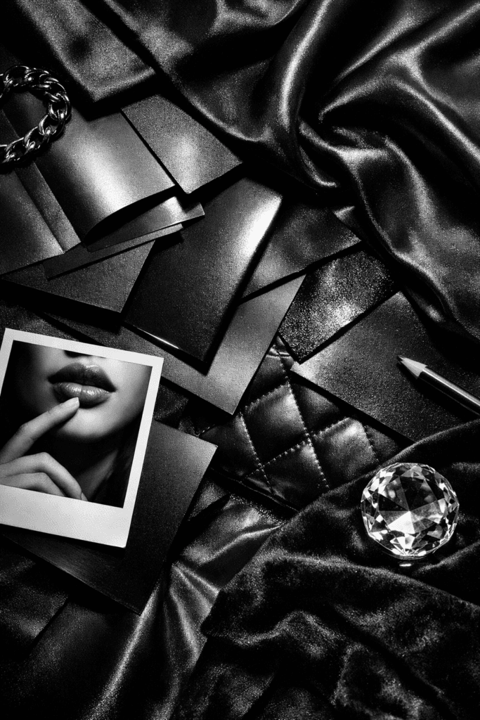
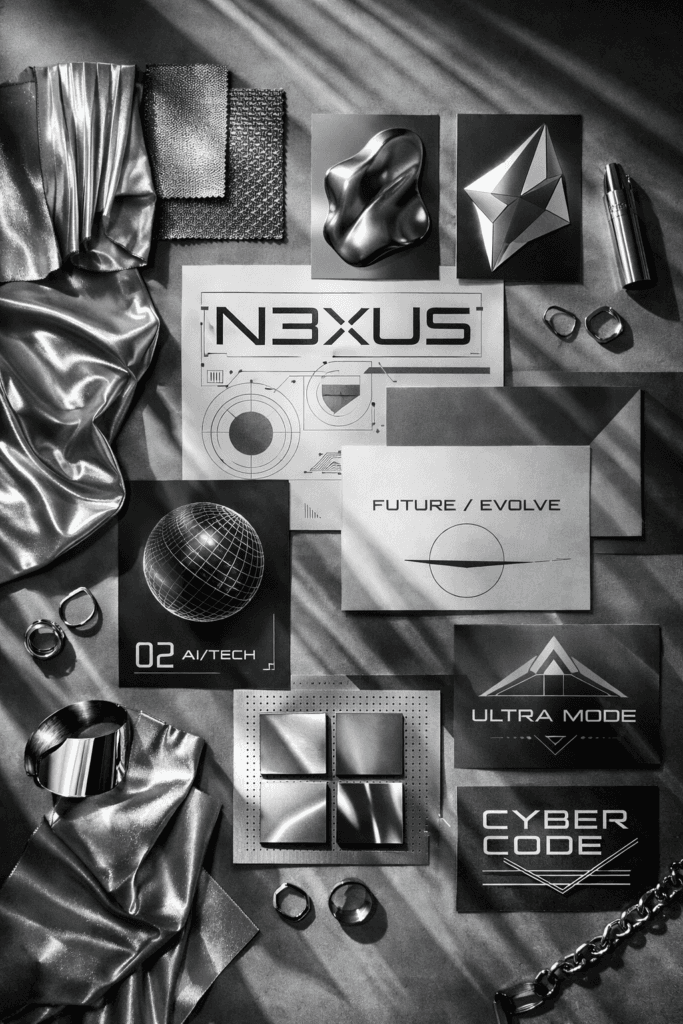
- Black-based monochrome implies confidence, influence, and editorial power.
- White monochrome communicates precision, clarity, and fresh minimalism.
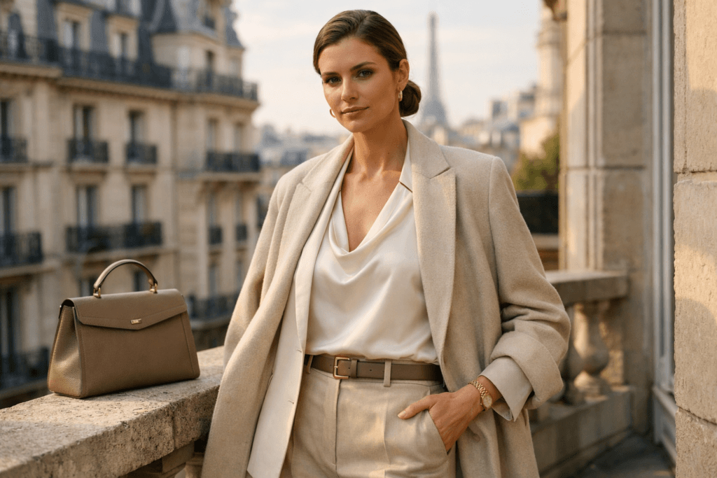
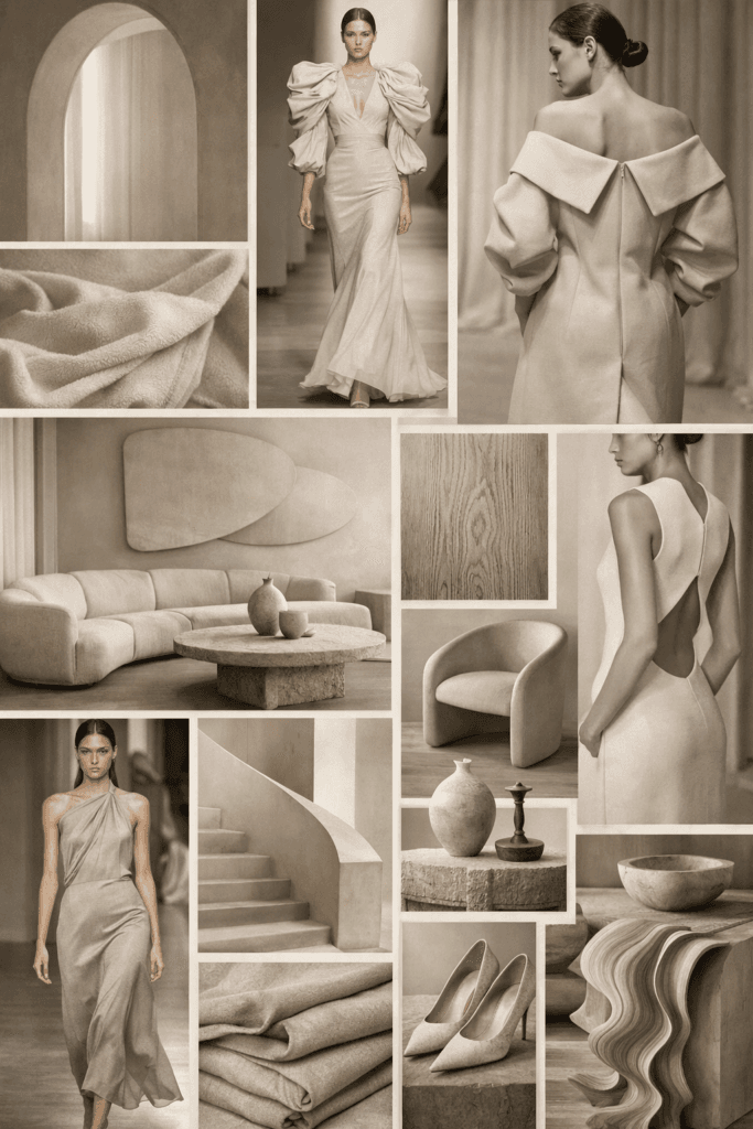
- Beige and cream evoke safety, elegance, femininity, and lifestyle softness.
- Grey tones suggest modern thinking, innovation, and cutting-edge strategy.
- Red monochrome shows boldness, romance, and immediate attention.
- Pink shades express creativity, warmth, softness, and visual romance.
The visual intention becomes irresistible to audiences craving aesthetic identity—especially on Pinterest, where users save boards based on color femininity, capsule wardrobe planning, digital branding, wedding palettes, home design, and mood-focused vision boards.
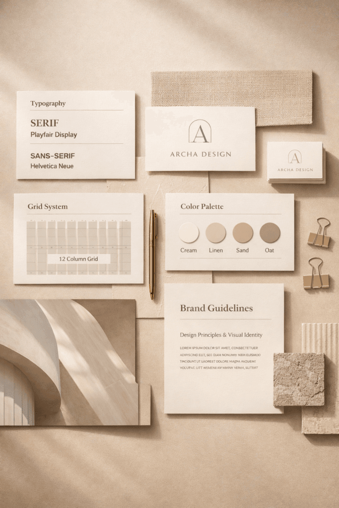
The Strategic Branding Advantage

Brands today are being built visually first, verbally second. People see your identity before they hear your voice. The monochrome approach strengthens your position because it creates signature consistency. Think of the world’s strongest brands: they’re recognizable in seconds. That’s not accidental—it’s intentional color strategy.
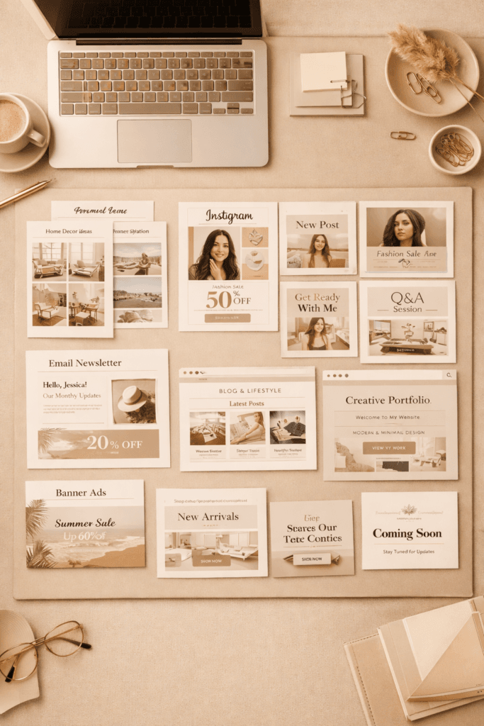
If you’re creating content online, this style can rapidly increase aesthetic value across:
- Blog branding
- Pinterest boards and pins
- Instagram highlight covers
- Marketing decks
- Product flat-lay planning
- Lifestyle editorials
- Interior design previews
- Brand collaborations
One board, one color, full visual alignment—it becomes a portfolio tool without the complexity.
Why Monochrome Moodboards Perform So Well on Pinterest
Pinterest’s algorithm is rooted in search, keyword relevance, psychological aesthetics, and shareability. Monochrome visuals feed all four factors at once. They stop the scroll and display creative direction. They help people plan identities: outfits, weddings, vision boards, capsule closets, paint palettes, makeup aesthetics, and branding concepts.
Because monochrome boards feel calm and editorial, they pull stronger saves. They also signal high-value creativity—which drives click-through to blogs, products, and services. Users love saving boards like:
- Black and white fashion moodboards
- All-beige wardrobe inspiration
- White interior design inspiration
- Pink branding moodboards
- Brown-toned autumn aesthetics
- Monochrome capsule closet planning
If your content speaks to lifestyle, fashion, interior design, photography, branding, or editorial storytelling, monochrome is a category you can dominate quickly.
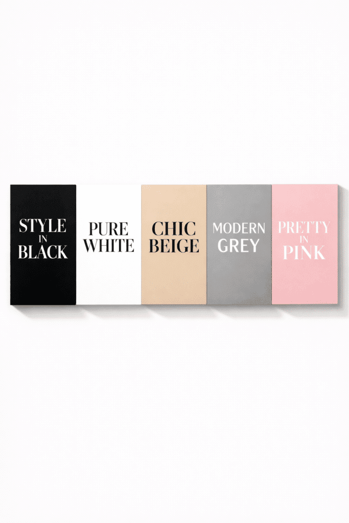
Choosing Your Color Direction
Before you build a monochrome moodboard, decide what emotional message you want people to experience. Color carries narrative weight.
Black monochrome works beautifully for:
- streetwear outfit planning
- luxury interior design
- sleek branding identities
- masculine minimalism
White monochrome is perfect for:
- lifestyle blogs
- beauty flatlays
- clean corporate design
- wedding content
- skincare marketing
Grey and silver monochrome speaks to:
- tech companies
- digital entrepreneurs
- modern architecture moodboards
Pink monochrome shines for:
- feminine branding
- fashion aesthetics
- romantic moodboard storytelling
- Pinterest lifestyle pins
Every color tone becomes its own universe—a space where creativity looks polished, premium, and highly influential.
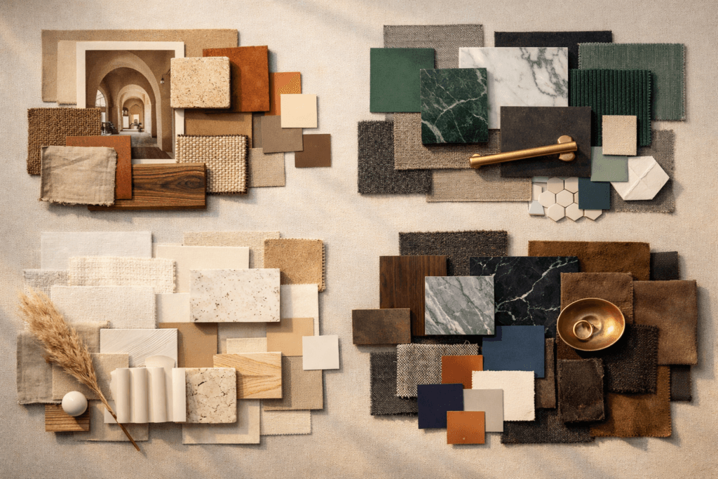
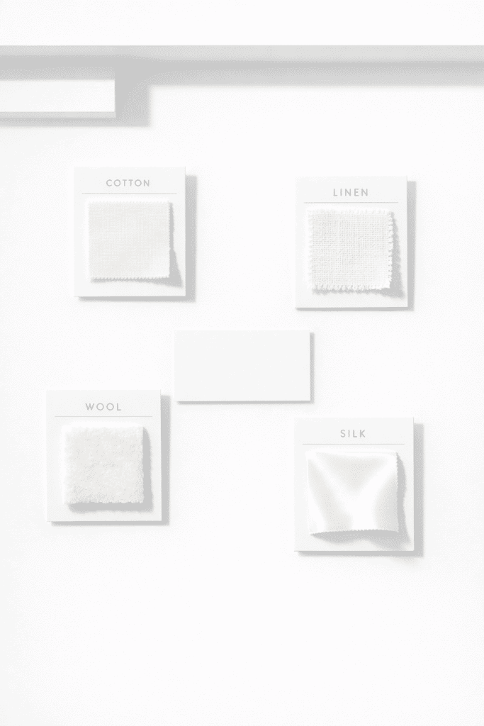
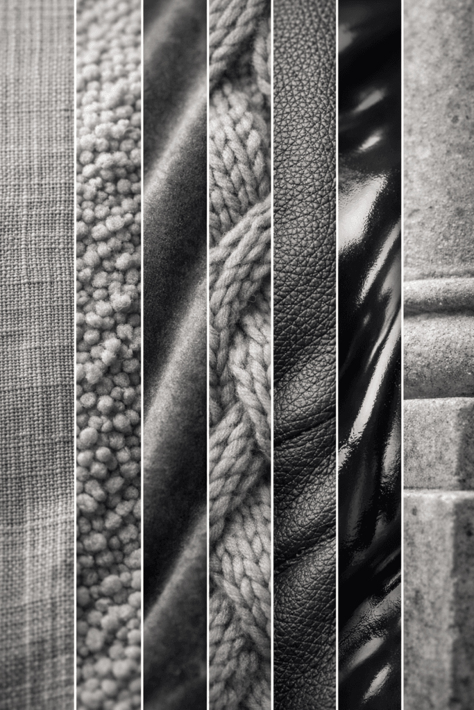
Texture Is Your Secret Weapon
Monochrome does not mean flat. The richest boards include texture contrast. Think velvet beside denim. Satin next to wool. Leather layered with metal. Transparency layered with matte. This adds movement, dimension, and visual story depth.
When viewers pause to explore texture, they emotionally invest in your content. That’s priceless.
Minimalism Makes It Look Expensive
A visually expensive moodboard isn’t created by adding more—it’s created by subtracting excess. Minimal layouts prevent distraction. Your viewers see negative space as sophistication. That’s why upscale editorial fashion houses use empty borders, clean spacing, and simple framing around their campaigns.
Less color creates more power.
How to Build a Monochrome Moodboard
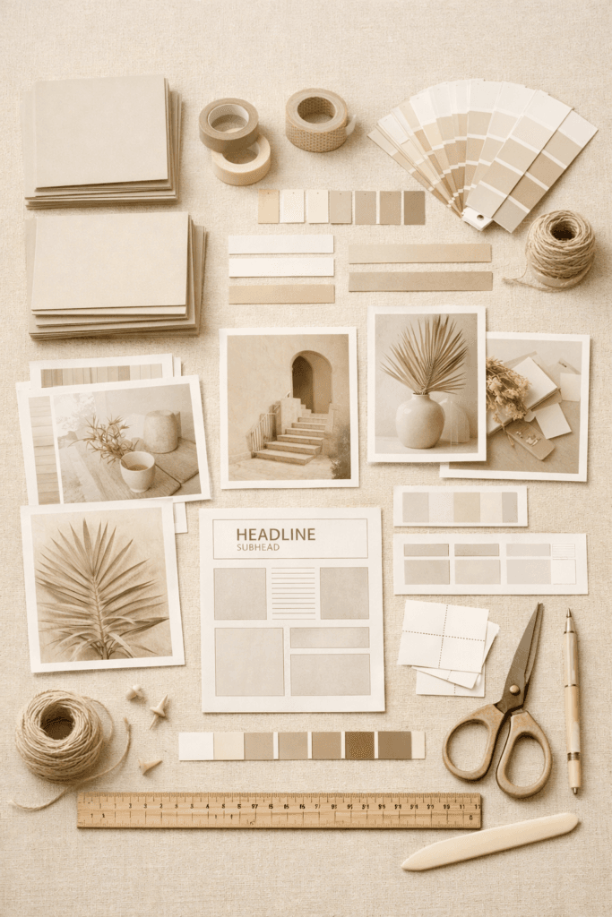
The process is simple, but success requires discipline:
- Choose your single core color.
- Collect 20–50 images with cohesive tone.
- Focus on balance—mix lifestyle, product, texture, and typography.
- Build strong spacing structures.
- Create vertical and horizontal layouts for Pinterest.
- Add brand fonts when relevant.
- Save in HD resolution.
When executed properly, these boards look like luxury branding packages that could cost thousands.
Why They Are Going Viral in Fashion & Interior Spaces
Monochrome boards give audiences mental organization. They also make planning easier:
- Wardrobes become more wearable.
- Interiors become more intentional.
- Brand guidelines become clearer.
- Photography direction becomes stronger.
Pinterest, Tumblr, and Instagram users save monochrome because it gives them identity direction.
Imagine a woman planning a capsule wardrobe—she wants visual simplicity and elegance. Monochrome feeds that need. Or a bride planning a blush-pink wedding vision—she can save an entire color category from a single moodboard set.
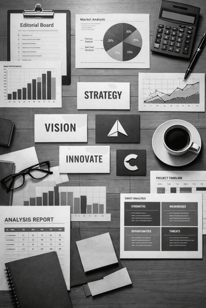
The Corporate Edge: Business Benefits
Professionally, monochrome moodboards improve:
- team alignment
- brand storytelling
- marketing deck clarity
- creative control
- internal presentation quality
Leaders love clean visual documentation. It drives faster decision-making and reduces creative disputes.
Where to Use Monochrome Moodboards Online
You can convert these boards into:
- Pinterest pins
- Instagram carousels
- header graphics
- lifestyle blog visuals
- Tumblr reposts
- brand pitches
- mood study collections
On Pinterest especially, boards like this can accumulate thousands of impressions per day because they satisfy both search intent and aesthetic craving.
Future Trend Outlook
Monochrome visuals are not a trend that will fade. They are aligning with deeper lifestyle movements:
- quiet luxury fashion
- minimalist design
- warm neutral interiors
- structured brand identities
- sustainability-driven color focus
- curated capsule lifestyles
Consumers crave identity structure. Monochrome gives them a sense of control and creative relief—something the chaotic digital world desperately lacks.
Final Thoughts
If you’re building a digital brand, monochrome moodboards can become the visual gateway that elevates your content from average to editorial. They are memorable, versatile, emotionally rich, and algorithm-friendly—especially on platforms like Pinterest where visual quality determines ranking power.
Lean into color consistency. Let simplicity become your luxury language. Build boards that feel like magazine stories—quietly powerful, deeply intentional, and effortlessly chic.