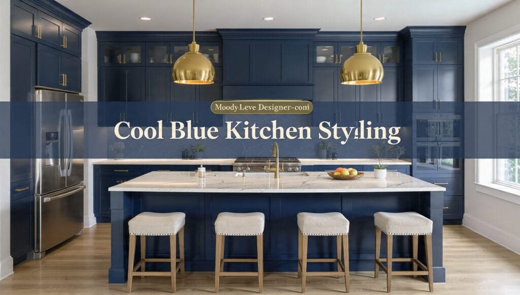
Cool Blue Kitchen Styling is powerful when done correctly.
But when done wrong?
It feels heavy.
Cold.
Overly dramatic.
Or worse — trendy in a way that dates quickly.

Price: 28.99
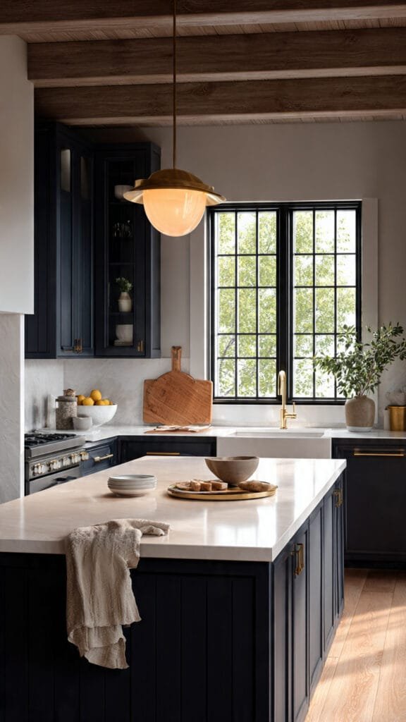
Shop Similar: Brushed Brass Kitchen Hardware – a must-have featured in this post.
The difference between a moody navy kitchen that feels designer-level and one that feels overwhelming comes down to proportion, undertone balance, and lighting control.
Deep blue cabinetry is not the problem.
Unbalanced blue is.
A Cool Blue Kitchen Styling approach should feel grounded, warm, and intentional — not like a dark paint experiment.
Let’s build this properly.
1. Choose the Right Navy (Not Just “Blue”)
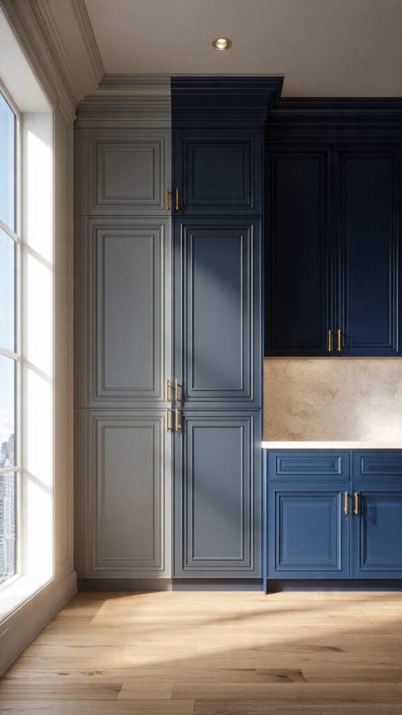
Not all navy is created equal.
A true luxury navy kitchen leans:
• Slightly warm (with subtle charcoal undertones)
• Not overly saturated
• Not bright cobalt
• Not green-toned
If the navy reads electric or overly cool in daylight, it will feel cold at night.
Test cabinet samples vertically against:
• Your countertop slab
• Flooring
• Hardware finish
Industry design publications like Architectural Digest consistently highlight undertone alignment as the defining difference in luxury kitchens (https://www.architecturaldigest.com).
Navy should feel rich — not sharp.
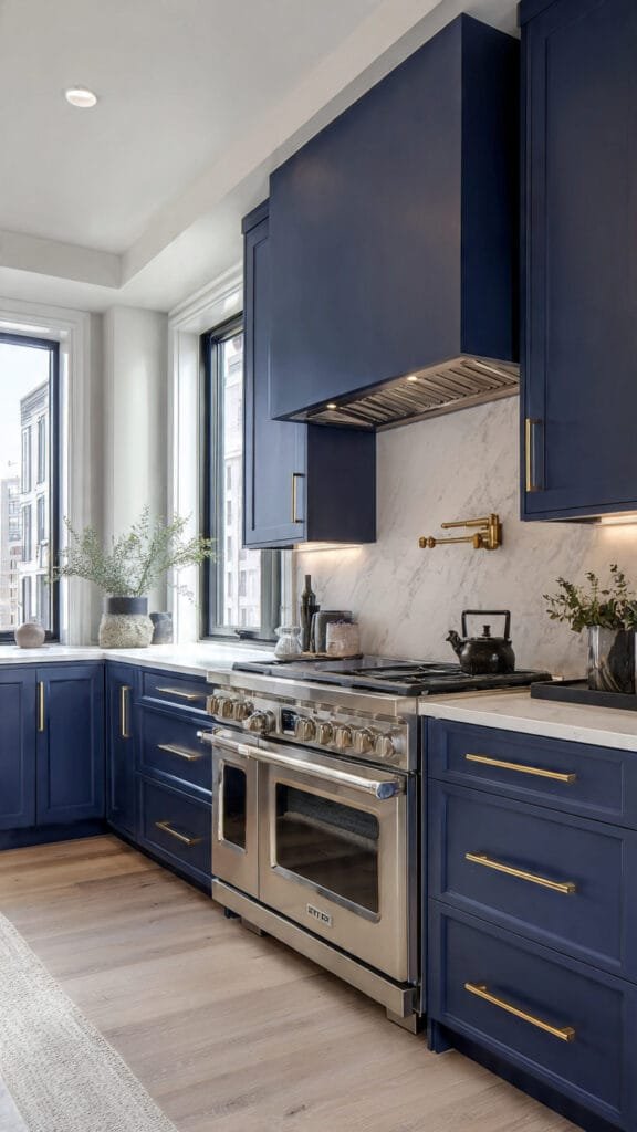
2. Balance Navy With Warm Materials
A moody blue kitchen without warmth becomes visually dense.
You need contrast that softens the drama.
Best pairings:
• Brushed brass hardware
• Warm oak flooring
• Cream marble or quartz with soft veining
• Off-white backsplash (not stark white)
• Linen or woven bar stools
Avoid pairing navy with:
• Cool gray floors
• Blue-white LED lighting
• Chrome-heavy fixtures
• High-gloss black surfaces
The goal is depth, not darkness.
Warm materials create glow.
Glow creates luxury perception.
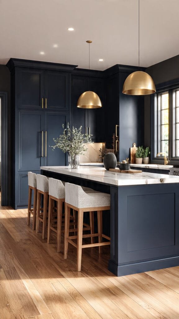
3. Proportion Is Everything in Dark Kitchens
Dark cabinetry visually advances.
It pulls forward in a space.
Which means scale matters more than ever.
Rules to follow:
• Use navy on lower cabinets if ceiling height is under 9 feet
• If full-height navy, incorporate open shelving or lighter uppers
• Balance island color with perimeter cabinetry
• Use larger-format tiles to prevent visual busyness
A Cool Blue Kitchen Styling strategy should never feel compressed.
Breathing room is critical.
If your home includes a warm neutral living space, balance the drama by keeping adjacent rooms lighter. Our warm palette breakdown here explains how to create tonal flow across rooms: www.bellencia.com/warm-modern-beige-living-room-ideas
Contrast between rooms should feel intentional — not accidental.
4. Lighting Makes or Breaks Navy
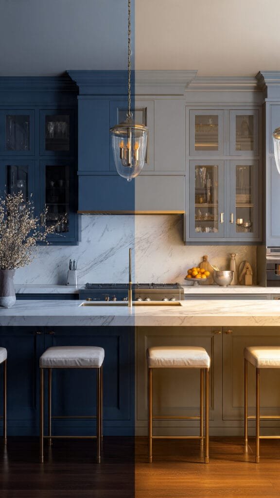
This is where most dark kitchens fail.
Under cool lighting, navy reads flat and cold.
Under warm lighting, it reads rich and tailored.
Stay within:
• 2700K for evening warmth
• 3000K max for task lighting
Layer lighting intentionally:
• Under-cabinet glow
• Pendant lighting above island
• Soft recessed ceiling lighting
Avoid:
• Harsh spotlighting
• Blue-toned LEDs
• Single overhead fixtures
Designers frequently emphasize layered lighting in moody kitchens because it prevents shadow pooling and heaviness — something highlighted in high-end kitchen features on HGTV (https://www.hgtv.com).
Navy needs dimension.
Dimension comes from glow.
Why Moody Navy Works
A Cool Blue Kitchen Styling approach in deep navy works because:
• It feels confident
• It feels expensive
• It feels tailored
• It photographs beautifully
But only when warmth and proportion are handled with discipline.
A moody navy kitchen only looks designer-level when the surrounding materials elevate it.
Deep cabinetry on its own is dramatic.
But drama without refinement feels heavy.
In this section, we’re refining.
5. Countertop Pairings That Instantly Elevate Navy
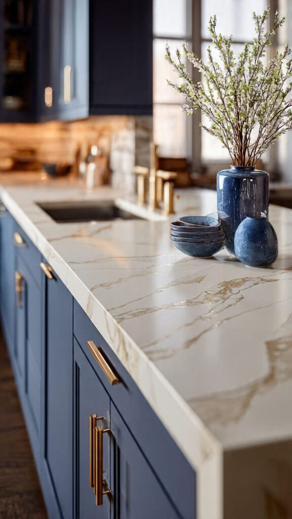
The countertop choice determines whether your Cool Blue Kitchen Styling feels modern luxury — or overly dark.
The safest elevated options:
• Cream marble with soft gray veining
• Warm white quartz with subtle movement
• Light travertine-inspired slabs
• Honed finishes instead of high-gloss
Avoid overly busy veining.
Dark cabinetry already carries visual weight. If your slab competes for attention, the kitchen feels chaotic.
Luxury kitchens use restraint.
For inspiration, high-end kitchen features in Architectural Digest often showcase navy cabinetry paired with warm-veined stone rather than stark white quartz (https://www.architecturaldigest.com).
Subtle movement in stone softens navy without overpowering it.
Proportion rule:
If using a waterfall island, ensure the slab veining flows vertically and horizontally correctly. Misaligned veining immediately reads DIY.
6. The Island as an Architectural Anchor
In a moody navy space, the island should feel grounded — not floating.
Island proportions matter:
• Length should be at least 60–84 inches depending on room width
• Overhang depth should be 10–12 inches for bar seating
• Stool height must align with counter height (24 inches for 36-inch counters)
Bar stools should introduce warmth.
Best finishes:
• Linen upholstery
• Woven seats
• Light wood legs
• Aged brass accents
Avoid heavy black stools against navy cabinetry. It compounds darkness.
Instead, lighten visually at seating level.
This is especially important if your adjacent living space leans lighter. If your home includes warm neutral spaces, maintaining tonal balance across rooms strengthens cohesion. For flow strategies, reference www.bellencia.com/warm-modern-beige-living-room-ideas.
Contrast across rooms should feel intentional, not disconnected.
7. Hardware That Signals Luxury
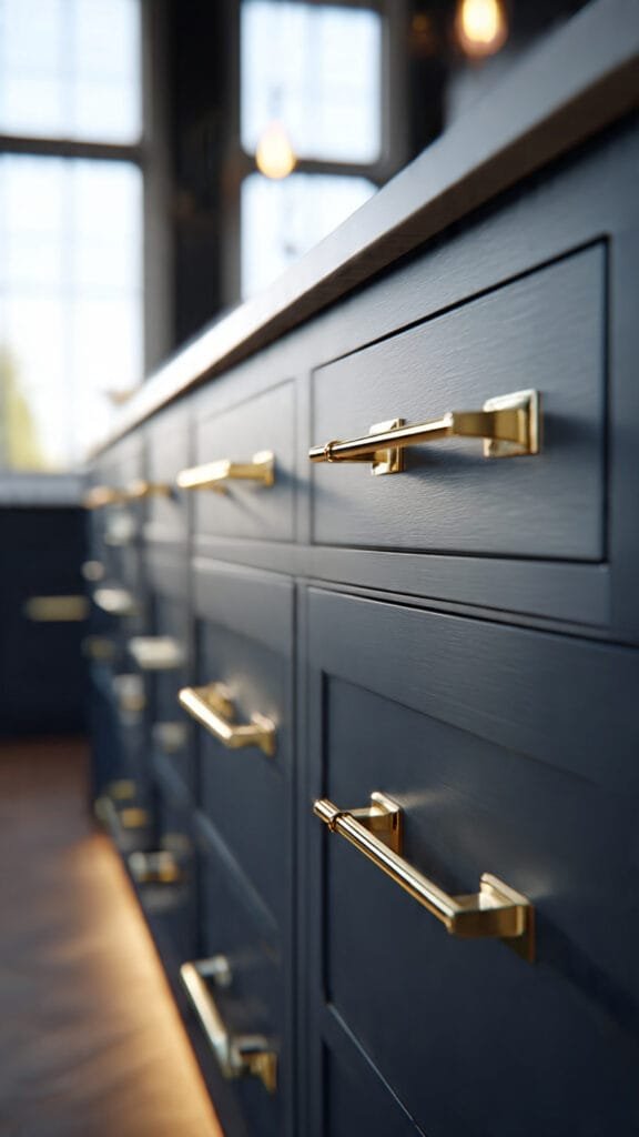
Hardware is where budget kitchens either elevate — or fail.
Best finishes for navy:
• Brushed brass
• Aged bronze
• Satin nickel (only if flooring leans cooler)
Avoid shiny chrome in moody kitchens. It feels stark and modern in a way that fights navy’s richness.
Handle scale also matters.
Longer pulls (6–8 inches) feel custom.
Tiny knobs feel standard.
For drawers wider than 30 inches, use double pulls to maintain proportion.
Luxury kitchens often repeat hardware finish in:
• Faucet
• Pendant lighting
• Pot filler
• Cabinet pulls
Repetition builds visual consistency.
Consistency builds perceived value.
8. Backsplash Strategy (Don’t Overcomplicate It)
The backsplash should calm the navy — not compete with it.
Strong options:
• Warm white zellige tile (subtle texture, not high-gloss glare)
• Large-format matte subway tile
• Slab backsplash continuation from countertop
• Soft cream plaster finish
Avoid:
• Busy mosaic patterns
• High-contrast black grout
• Stark cool white tiles
The goal is to let navy remain the statement.
Everything else supports it.
9. Budget Swaps That Still Look Custom
You don’t need a full renovation to achieve Cool Blue Kitchen Styling.
Strategic upgrades can dramatically shift the perception of the space.
High-impact swaps:
• Replace builder-grade pendants with oversized linen or brass fixtures
• Upgrade faucet to brushed brass or matte black
• Swap bar stools for woven or upholstered options
• Install under-cabinet lighting
• Add oversized cutting boards for warm wood contrast
Large decor pieces elevate faster than small clutter.
Avoid over-accessorizing counters.
Negative space in kitchens reads expensive.
Clutter reads chaotic.
10. The Psychology of Moody Navy
Deep blue kitchens feel:
• Intentional
• Confident
• High-end
• Slightly dramatic
But they must be softened strategically.
When balanced properly, a navy kitchen becomes the anchor of the home.
It pairs beautifully with:
• Warm beige living rooms
• Light oak floors
• Soft neutral dining spaces
This tonal interplay across rooms increases the feeling of thoughtful design.
Pinterest content featuring navy kitchens performs well because contrast is visually striking — but saves increase when warmth is layered in.
In Part 3, we’ll break down:
• Styling open shelving in navy kitchens
• The biggest mistakes that cheapen dark cabinetry
• Appliance finishes that work (and those that don’t)
• How to keep navy from feeling dated
We’re not chasing trend.
We’re building depth with discipline.
A moody navy kitchen only feels luxurious when restraint is applied.
Dark cabinetry is bold.
Bold requires discipline.
By now you’ve chosen the right undertone, balanced warmth, selected refined countertops, and layered lighting correctly.
Now we refine the final details — the ones that separate a Pinterest-pretty kitchen from a truly designer-level space.
11. Styling Open Shelving in a Navy Kitchen
If your Cool Blue Kitchen Styling includes open shelving, styling must be intentional.
Navy is visually heavy. Overloading shelves compounds that weight.
Follow this structure:
• 60% negative space
• 30% tonal decor
• 10% subtle contrast
Best shelf styling elements:
• Cream ceramic bowls
• Light oak cutting boards (leaned vertically)
• Neutral cookbooks with linen covers
• Small brass accents
• Clear glass jars
Avoid:
• Bright white dishes
• Colorful decor
• Cluttered stacked items
• Plastic containers
Shelves should feel curated, not storage-heavy.
Material repetition matters. If you use brushed brass hardware, introduce a subtle brass object on shelving to create cohesion.
Luxury kitchens repeat finishes with intention.
12. Appliance Finishes That Work (and Those That Don’t)
Appliances can quietly elevate — or cheapen — a navy kitchen.
Best pairings:
• Panel-ready integrated appliances
• Stainless steel with brushed finish
• Matte black accents (used sparingly)
Avoid:
• Glossy black appliances (too reflective)
• High-shine chrome finishes
• Mismatched metal tones
If your refrigerator dominates visually, consider paneling it to match cabinetry.
Integrated appliances instantly increase perceived value.
Publications like HGTV frequently highlight appliance integration as a defining trait of custom kitchens (https://www.hgtv.com).
Continuity is luxury.
Visible interruption is budget-coded.
13. The Biggest Mistakes That Cheapen Navy
Even the perfect shade of blue can fall flat if these mistakes happen:
• Using cool-toned white walls against warm navy
• Installing cool 4000K lighting
• Choosing undersized pendants
• Overusing black accents
• Skipping under-cabinet lighting
Lighting shadows are more visible in dark kitchens.
Without layered lighting, navy appears flat.
With glow, navy appears tailored.
The difference is subtle — but noticeable.
14. Preventing the “Dated Navy” Look
Navy is timeless when paired correctly.
It becomes dated when styled in overly coastal or theme-heavy ways.
Avoid:
• Rope decor
• Anchor motifs
• Nautical accessories
• Stark white + navy contrast everywhere
Modern navy feels:
• Architectural
• Warm
• Minimal
• Textural
If your home transitions into lighter neutral spaces, allow navy to anchor rather than dominate.
For example:
A navy kitchen flows beautifully into a warm beige living space when wood tones repeat between rooms. For tonal continuity strategies, revisit www.bellencia.com/warm-modern-beige-living-room-ideas.
Design flow increases perceived home value.
Disconnected rooms decrease it.
15. The Moody Navy Formula That Always Works
If you want a clean, repeatable formula for Cool Blue Kitchen Styling, use this:
• Warm navy cabinetry
• Cream or lightly veined quartz countertops
• Brushed brass hardware
• Light oak flooring
• Linen or woven seating
• 2700K layered lighting
• Minimal, tonal decor
That’s it.
No extra color needed or heavy accessorizing.
No overcomplication.
When navy is treated as the statement, everything else supports it quietly.
And quiet support is what makes a kitchen feel expensive.
Why Moody Navy Performs So Well
Deep blue kitchens photograph beautifully.
They create contrast.
Create mood.
They create drama.
But they must be warmed intentionally.
Pinterest favors contrast.
Resale markets favor balance.
Moody navy — when softened with brass, oak, and warm lighting — achieves both.
This isn’t about painting cabinets dark.
It’s about creating depth without heaviness.
And when done correctly, a Cool Blue Kitchen Styling approach feels tailored, elevated, and timeless.
Bellencinista Notes
Always test navy cabinet samples vertically under both daytime and nighttime lighting. If the blue shifts noticeably toward green under warm bulbs, it will feel dated within two years.