Introduction: Why a Color Reset Changes Everything
Trending Finds Readers Are Loving
Explore affordable luxe discoveries people are clicking on right now.
See What's TrendingA living room reset doesn’t always require new furniture, expensive renovations, or dramatic design overhauls. Often, what feels “off” in a space comes down to color—or more specifically, the lack of a clear color direction. When colors feel mismatched, overly busy, or emotionally disconnected, the room stops feeling restful and starts feeling cluttered, even if it’s tidy.
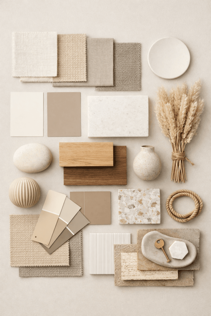
This is where color palette moodboards become powerful. A moodboard isn’t just a collection of colors—it’s a visual strategy. It helps you see how tones interact, how warmth or coolness affects the room’s energy, and how subtle shifts can completely change how a space feels.
A living room reset rooted in a thoughtful color palette creates clarity. It brings cohesion. And most importantly, it allows the room to support your lifestyle rather than distract from it.
What a Living Room Reset Really Means
A reset isn’t about starting over. It’s about realignment.
Most living rooms accumulate layers over time—throw pillows added impulsively, artwork chosen in isolation, rugs that once worked but no longer connect to the rest of the space. Individually, these pieces may still be beautiful. Together, they often lose harmony.
A color palette moodboard helps you step back and look at the room as a whole. Instead of asking, What should I buy next?, you start asking, What feeling do I want this room to give me?
That shift changes everything.
Why Color Palette Moodboards Work Better Than Guesswork
Without a moodboard, most color decisions happen in isolation. A paint sample looks good in the store. A pillow feels right online. A rug works in another room. But once everything is together, the room lacks flow.
Moodboards solve this by:
- Showing relationships between colors
- Revealing undertones you might otherwise miss
- Preventing over-buying
- Helping you reuse what you already own more intentionally
They also remove emotional fatigue. Decision-making becomes easier when you can visually confirm that something belongs.
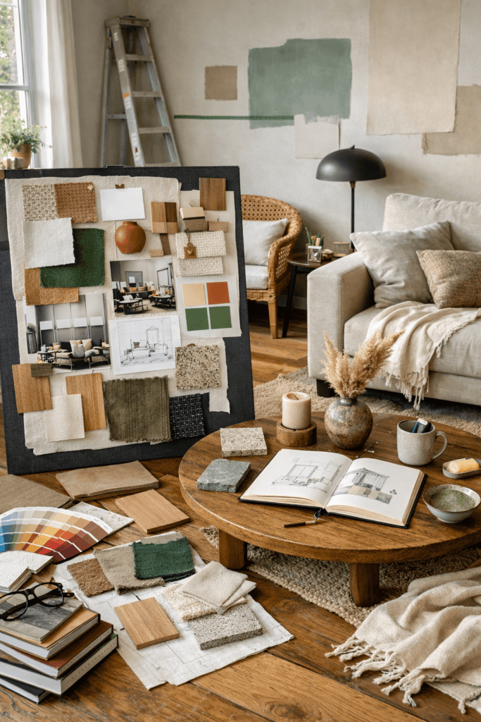
How to Start a Color Palette Moodboard for Your Living Room
Before choosing colors, start with observation, not inspiration.
Look at:
- Natural light direction
- Existing furniture finishes
- Architectural details
- Flooring tone
- Permanent elements you won’t change
Your moodboard should respond to these realities—not fight them.
Once you’ve taken stock, begin collecting:
- 1–2 dominant base colors
- 1–2 supporting tones
- 1 accent color used sparingly
A reset doesn’t need five bold hues. It needs intention.
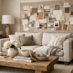
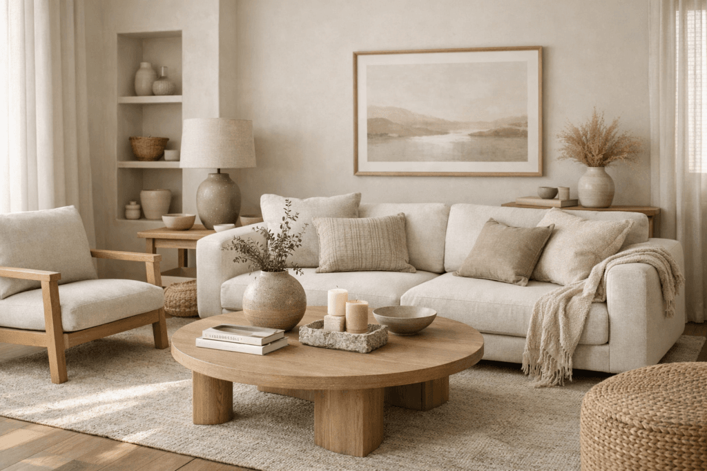
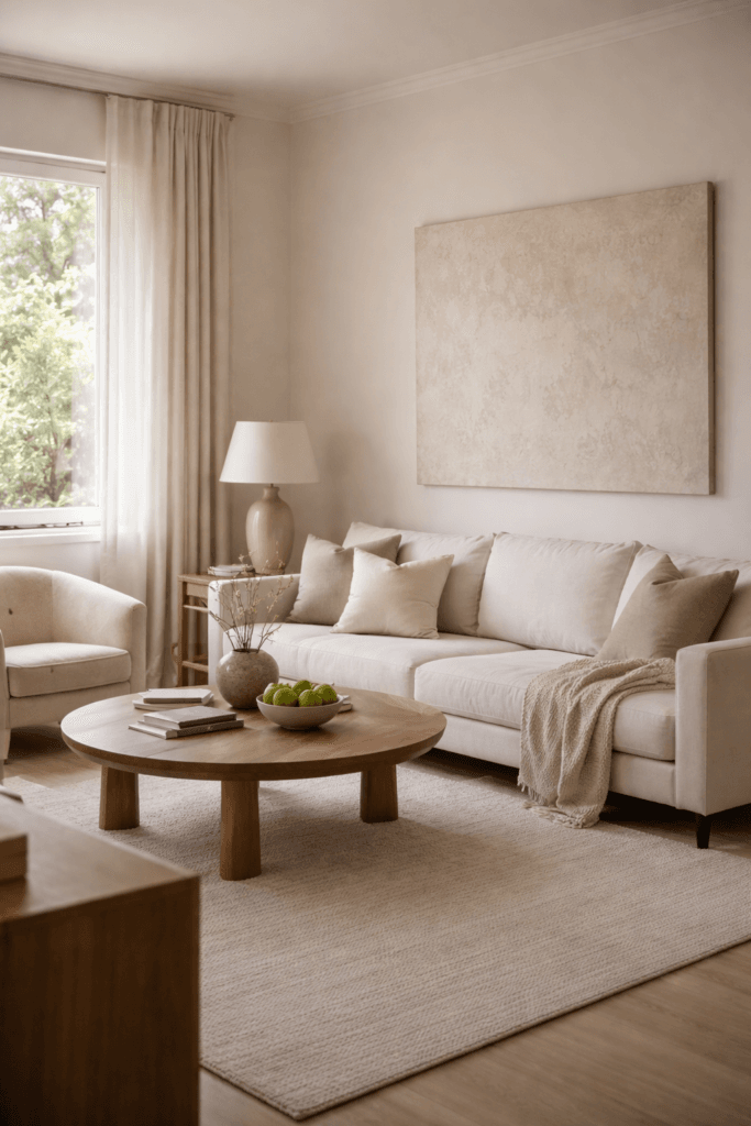
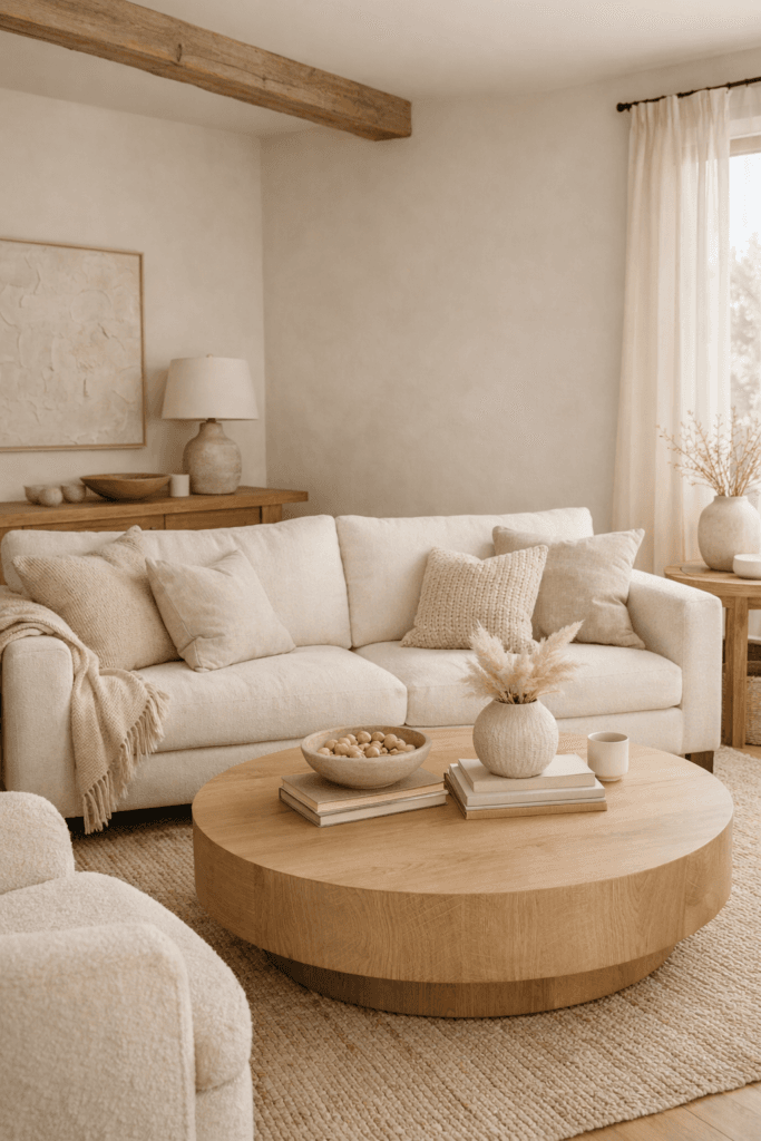
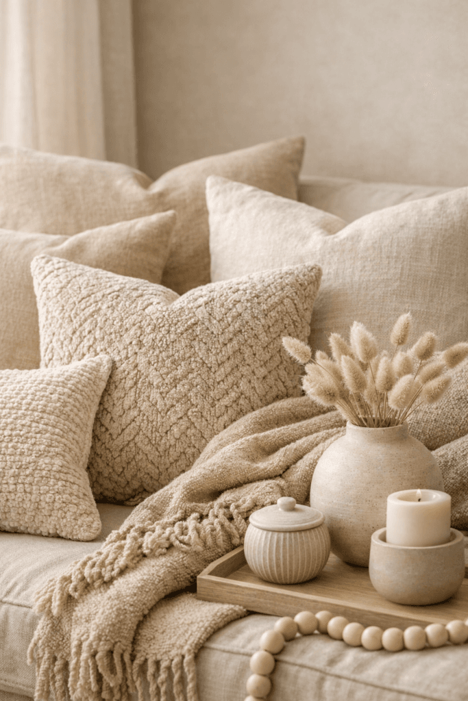
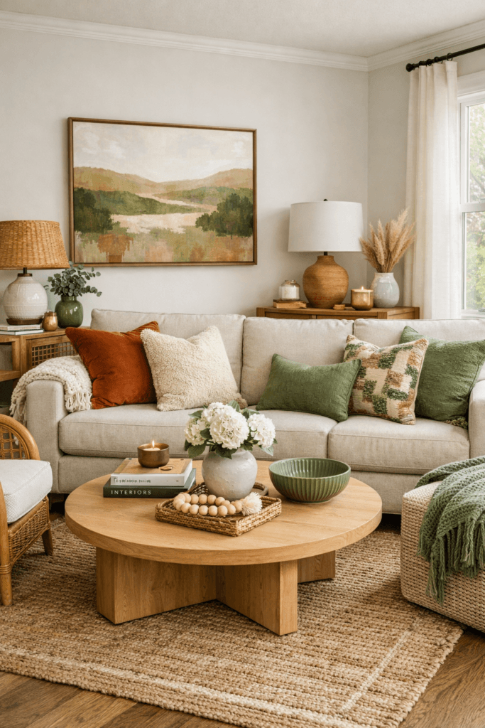
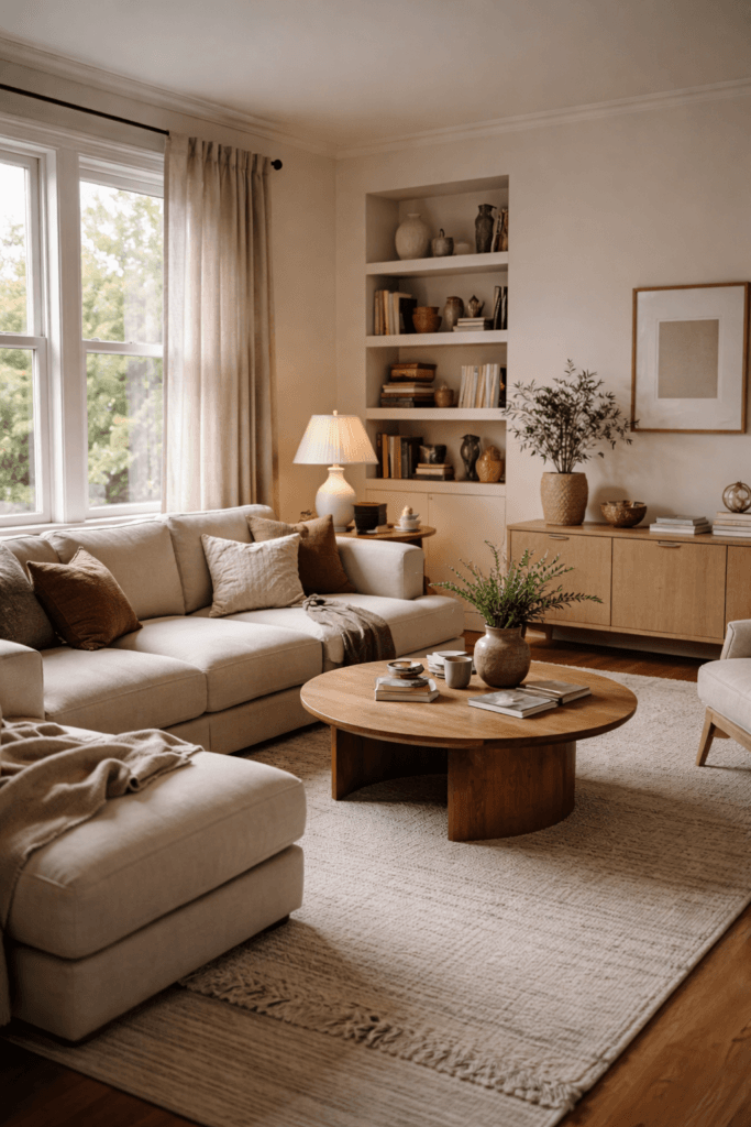
Neutral-Based Color Palette Moodboards (Calm & Elevated)
Neutral palettes are often misunderstood as boring. In reality, they’re some of the most complex and expressive when done well.
Neutral living room moodboards might include:
- Warm creams and soft beiges
- Taupe, greige, or mushroom tones
- Natural wood hues
- Soft stone and clay influences
The key is variation in texture and undertone, not contrast.
A neutral palette reset works beautifully if your goal is calm, longevity, and adaptability. These palettes allow art, lighting, and texture to shine without visual noise.
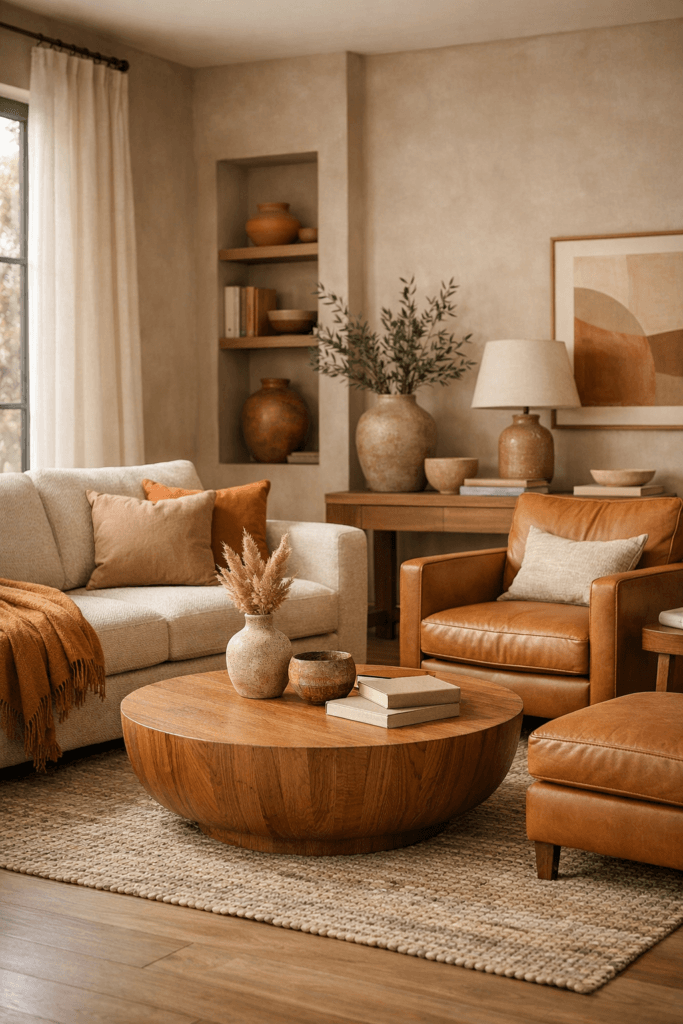
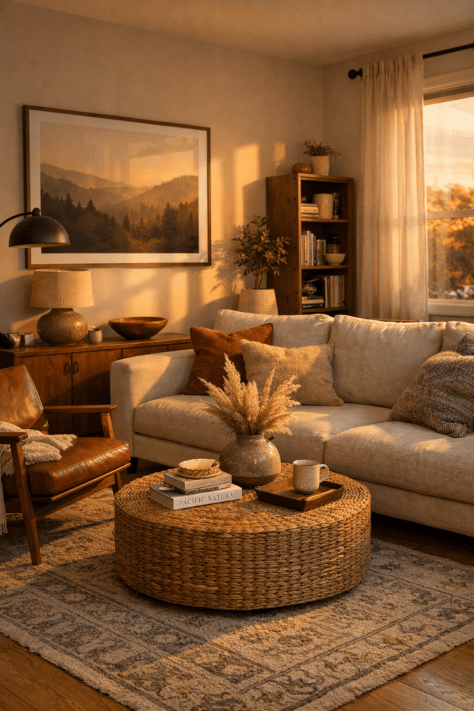
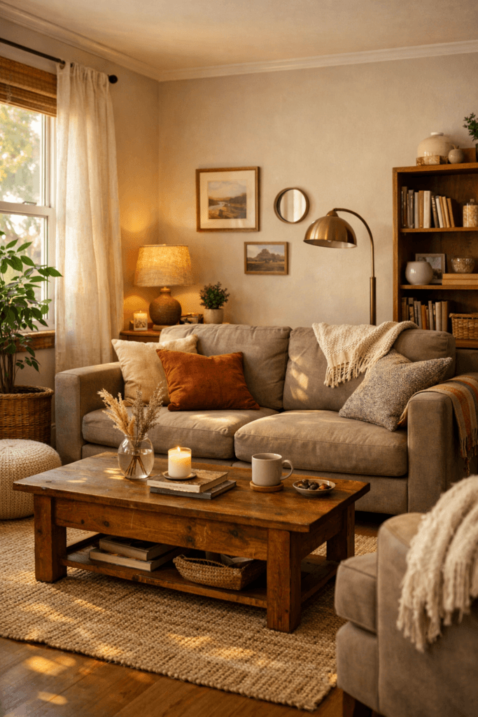
Warm Color Palette Moodboards (Comfort Without Heaviness)
Warm palettes bring emotional ease to a living room—but they must be handled carefully to avoid feeling dated or heavy.
A warm living room moodboard might include:
- Soft terracotta
- Muted caramel
- Warm sand
- Subtle rust or clay accents
The trick is restraint. Warm tones should feel sun-touched, not saturated. Balance them with light neutrals or natural textures to keep the space breathable.
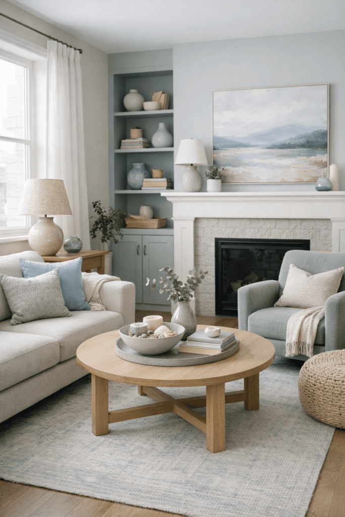
Cool Color Palette Moodboards (Soft, Not Stark)
Cool palettes often get a bad reputation for feeling cold. In reality, they can feel incredibly calming when softened properly.
Effective cool living room moodboards include:
- Blue-gray rather than true gray
- Muted sage instead of emerald
- Soft charcoal rather than black
- Pale stone or cloud tones
The goal is softness. Avoid sharp contrasts and overly crisp whites. Let the palette feel layered rather than linear.
Color Palette Moodboards That Add Depth Without Overwhelm
Depth doesn’t come from more color—it comes from repetition and restraint.
To add depth:
- Repeat tones at different intensities
- Layer matte and soft finishes
- Use accents sparingly but consistently
Your moodboard should look calm even when layered. If it feels busy on the board, it will feel overwhelming in the room.
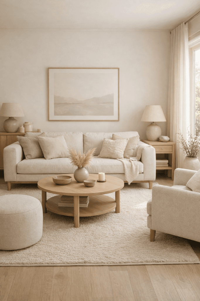
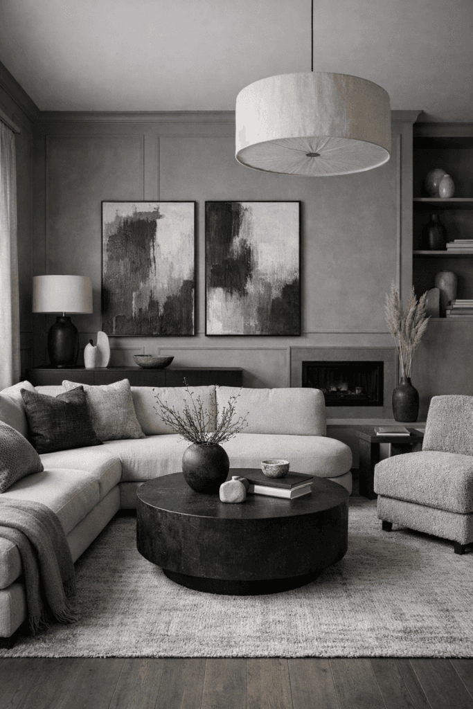
Monochrome Color Palette Moodboards (Done the Right Way)
Monochrome palettes are often misunderstood. Many people assume monochrome means using one flat color everywhere, which can quickly lead to a dull or lifeless space. In reality, a monochrome color palette moodboard is about working within one color family while exploring variation, depth, and nuance.
For a living room reset, monochrome palettes work best when you layer:
- Multiple shades of the same color
- Different materials and textures
- A mix of matte and soft finishes
For example, a beige-based monochrome palette might include warm linen, soft camel, light stone, and deeper mushroom tones. The room feels cohesive without feeling repetitive because the eye experiences subtle shifts rather than stark contrast.
Monochrome moodboards are especially effective if your living room feels visually scattered. By narrowing the color story, you allow the space to settle and feel intentional again.
How to Reset Your Living Room Without Repainting
One of the biggest misconceptions about a living room reset is that it requires new paint. While paint can be transformative, it isn’t always necessary. A color palette moodboard helps you see how much impact you can create using what you already have.
Start by identifying your existing dominant color—walls, large furniture, or flooring. Build your moodboard around that anchor rather than fighting it. Then look at:
- Textiles such as pillows, throws, and curtains
- Artwork and frames
- Decorative objects
- Lighting tones and lamp shades
Replacing or editing these elements can dramatically shift the room’s palette without touching the walls. This approach is not only budget-friendly but also more sustainable.
A reset doesn’t require erasing the room’s history. It requires refining it.
Using Moodboards to Identify What No Longer Belongs
One of the most underrated benefits of a color palette moodboard is clarity. When all your intended colors live in one visual place, it becomes immediately obvious what feels out of sync.
That accent pillow you once loved may suddenly feel too cool. A piece of art may clash in undertone rather than color. A rug may feel heavier than you realized.
Moodboards give you permission to let go—not because something is “bad,” but because it no longer supports the direction you’re moving in.
This is where real resets happen: not by adding more, but by editing.
Common Color Palette Mistakes That Sabotage a Living Room Reset
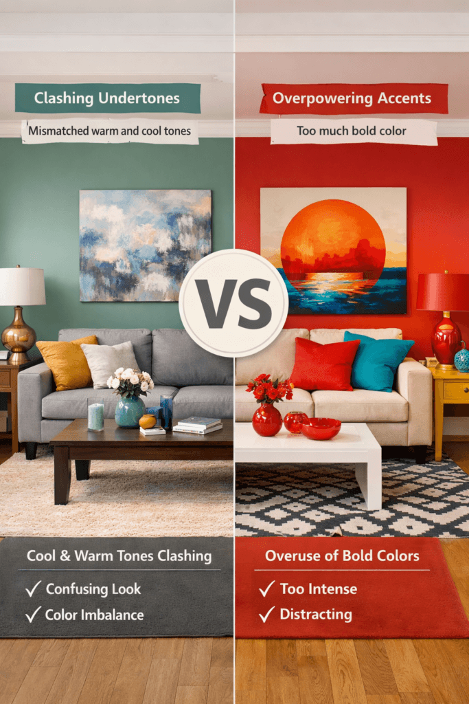
Even with good intentions, certain mistakes can keep a reset from fully working.
One common issue is relying too heavily on trend colors. Trends can inspire, but when they dominate a palette, the room quickly feels dated. A moodboard helps you use trends as accents rather than foundations.
Another mistake is mixing undertones without realizing it. Warm beige and cool gray may look similar individually, but together they often create tension. Moodboards reveal these clashes before they happen in the room.
Finally, too many accent colors dilute impact. A reset works best when accents are repeated intentionally rather than scattered randomly.
How Lighting Affects Your Color Palette Moodboard
Lighting changes everything. A color that feels warm and inviting in daylight may feel flat or dull in the evening if lighting isn’t considered.
When building your moodboard, think beyond color swatches. Consider:
- Warm versus cool light bulbs
- The direction and strength of natural light
- How shadows fall in the room
A well-planned palette accounts for how the room looks at different times of day. This ensures the reset feels consistent rather than unpredictable.
Seasonally Evolving Your Living Room Color Palette
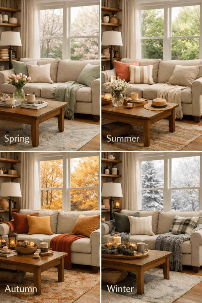
A successful color palette moodboard doesn’t lock you into one look forever. Instead, it provides a foundation that can evolve with the seasons.
For example:
- A neutral base palette can support warmer accents in fall
- Lighter textiles can refresh the space in spring
- Deeper tones can add coziness in winter
Because the core palette remains consistent, these shifts feel intentional rather than disruptive. The living room feels refreshed without ever feeling redecorated from scratch.
Why Moodboards Create Emotional Balance, Not Just Visual Balance
Color affects how we feel in a space. A living room reset isn’t only about aesthetics—it’s about emotional comfort.
Moodboards help you choose colors that support:
- Relaxation
- Focus
- Connection
- Calm
When colors are intentional, the room becomes a place you want to spend time in rather than a space you’re constantly adjusting.
Final Thoughts: A Living Room Reset That Lasts
A true living room reset doesn’t chase trends or perfection. It creates alignment. Color palette moodboards allow you to step back, see the bigger picture, and make decisions with clarity rather than impulse.
When your colors work together, everything else feels easier. Furniture placement improves. Styling feels natural. The room finally supports the way you live.
A reset isn’t about changing everything. It’s about choosing what stays—and making sure it all belongs.