The Foundation of Spatial Strategy
Trending Finds Readers Are Loving
Explore affordable luxe discoveries people are clicking on right now.
See What's TrendingSmall space layout rules determine whether a room feels elevated and intentional—or cramped and unresolved. The difference between “tight” and “tailored” rarely comes down to square footage. It comes down to layout strategy.
Before color, decor and styling.
Layout is the architecture of experience.
Whether you are designing a compact living room, a narrow bedroom, a studio apartment, a home office, or even a small commercial suite, the same foundational principles apply. When the layout is correct, everything else becomes easier—furniture selection, lighting placement, visual balance, and even emotional comfort.
Let’s begin with the structural layer of design: spatial hierarchy.
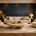
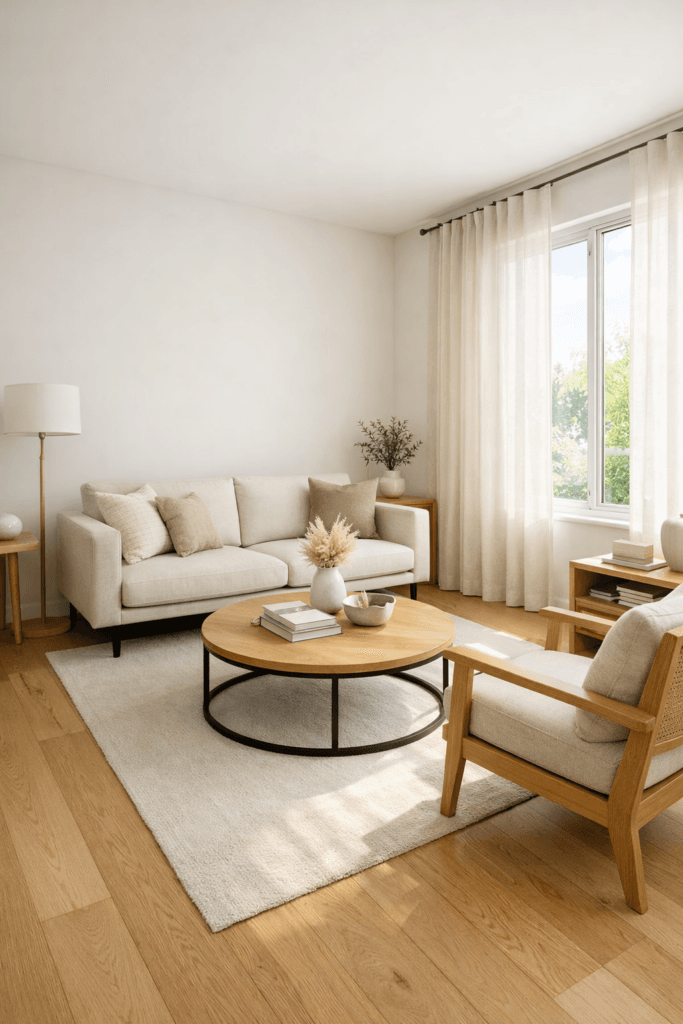
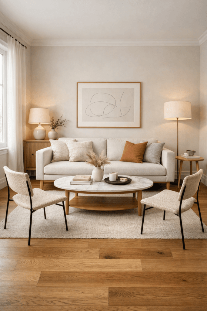
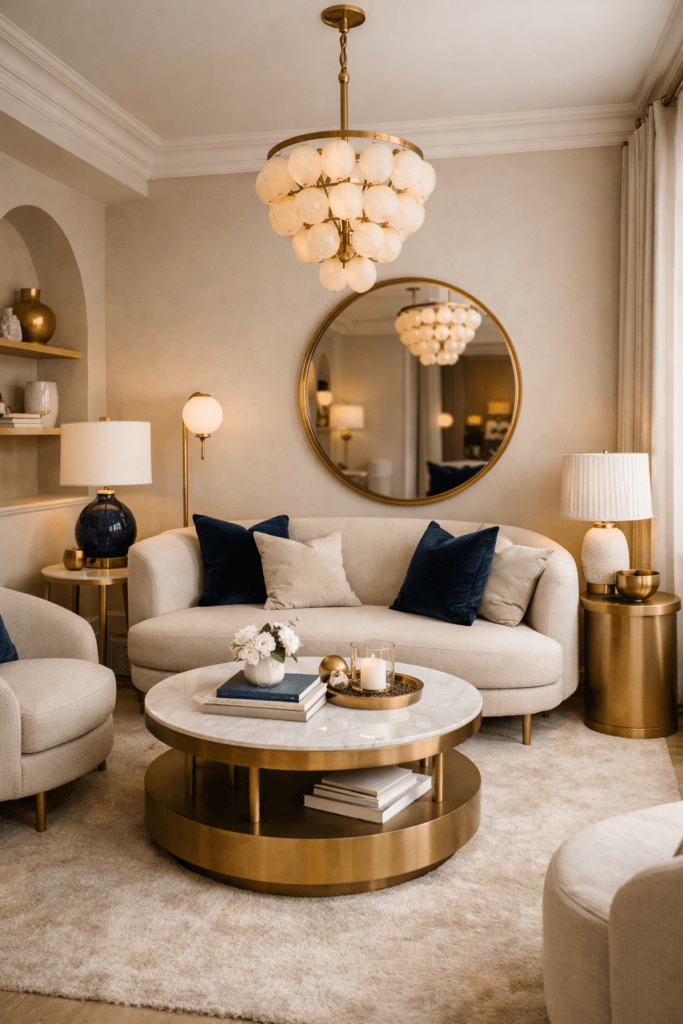
Rule 1: Establish a Dominant Focal Point
Every well-designed space has a visual anchor. Without one, the eye wanders, and the room feels disorganized—even if it is tidy.
In residential settings, a focal point may be:
- A fireplace
- A television wall
- A statement art installation
- A large window
- Architectural molding
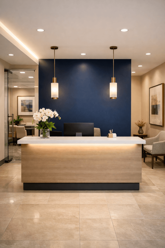
In office or commercial interiors, the focal point shifts:
- A reception desk
- A feature branding wall
- A conference table
- A central lighting installation
The mistake most people make in small spaces is creating multiple competing focal points. When two walls compete for dominance, the room feels split. When seating does not align with the anchor, the space feels misaligned.
The solution is decisive placement.
Align primary furniture toward one dominant feature. Secondary elements should support—not compete with—that anchor.
Clarity creates expansion.
Rule 2: Prioritize Circulation Before Furniture Placement
One of the most underestimated small space layout rules is this: circulation determines perceived size.
A room may measure 12×12 feet, but if pathways are blocked, it will feel closer to 8×8.
Start every layout by mapping traffic flow:
- Where do people enter?
- Where do they naturally walk?
- What path do they take between zones?
Primary walkways should maintain 24–30 inches of clearance whenever possible. In tighter spaces, even 20 inches can work if it remains uninterrupted.
When furniture intrudes into these invisible pathways, the subconscious registers tension. Tension makes rooms feel smaller.
In offices, this principle is magnified. Smooth movement equals psychological ease. When employees or clients must navigate obstacles, the space immediately feels constrained.
Protect the walkways first. Then build around them.
Rule 3: Avoid the “Wall-Hugging” Instinct
When designing small spaces, many people push all furniture against the walls in an attempt to “create space.”
Ironically, this often makes the room feel flatter and less dynamic.
Floating furniture—strategically and subtly—creates depth.
Instead of pressing a sofa flush against the wall, pull it forward three to six inches. Add a slim console behind it. This introduces layering.
Instead of centering everything around the perimeter, create a defined conversation zone in the center of the room.
Depth adds perceived square footage.
In commercial spaces, floating seating arrangements can define zones without adding physical partitions. That preserves openness while maintaining structure.
Rule 4: Scale Intelligently, Not Minimally
Small space design does not mean tiny furniture.
The key is proportional refinement.
Bulky furniture compresses vertical and horizontal perception. Oversized arms, deep cushions, and heavy silhouettes visually crowd the room.
Instead, choose:
- Sofas with slim arms
- Raised legs that allow light beneath
- Narrow console tables
- Rounded coffee tables in tight areas
- Armless accent chairs
Furniture that allows visual breathing room expands the environment.
In office settings, this means choosing streamlined desks rather than oversized executive models in compact rooms.
Refinement increases elegance. Elegance increases perceived space.
Rule 5: Define Zones Clearly
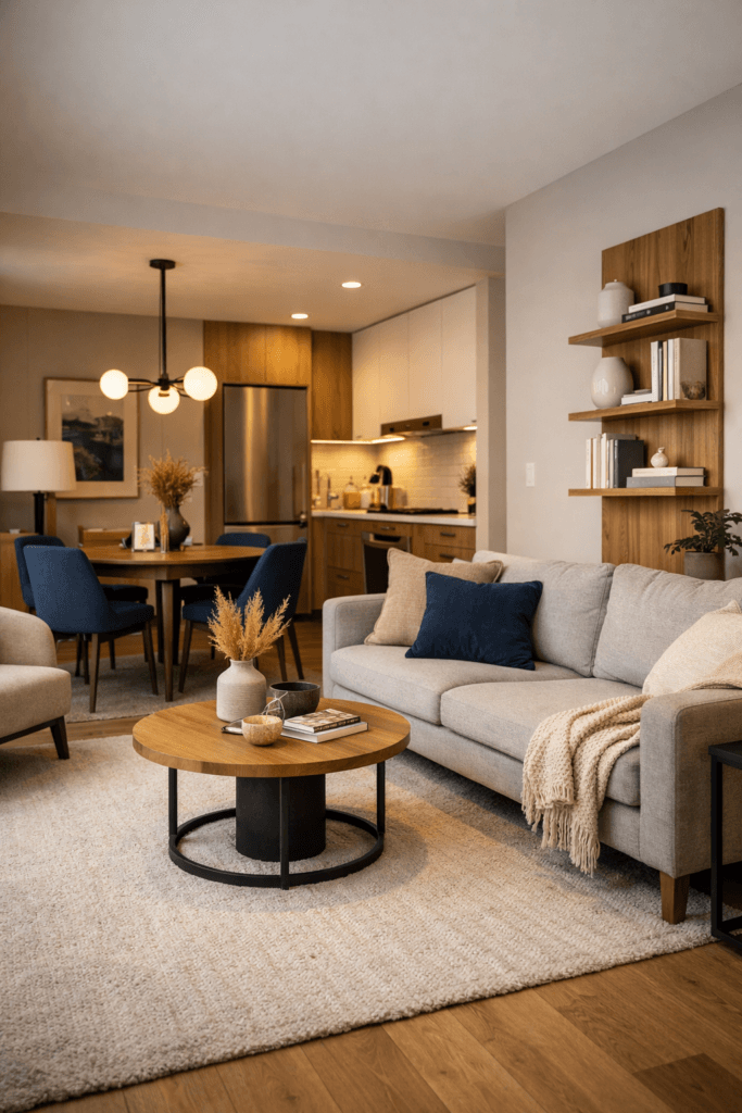
Small rooms feel chaotic when multiple functions overlap without boundaries.
Even in compact interiors, zoning is essential.
For example:
- A living room may include lounging, reading, and media viewing.
- A studio apartment may combine sleeping, dining, and working.
- A small office may include collaboration, storage, and individual work.
Define each zone through alignment, rug placement, lighting variation, or subtle furniture orientation.
You do not need walls to create structure.
You need intention.
Rule 6: Let Negative Space Work for You
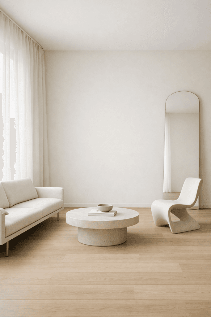
One of the most advanced small space layout rules is restraint.
Negative space—the empty areas between objects—is not wasted square footage. It is visual oxygen.
When every inch is filled, the room feels compressed. When breathing room exists around focal pieces, the eye relaxes.
Edit aggressively.
Remove one unnecessary side table.
Eliminate the extra chair that serves no daily function.
Reduce layered decor that clutters horizontal surfaces.
Less density equals more expansion.
Rule 7: Think Vertically
Horizontal crowding is common in small spaces. Vertical opportunity is often ignored.
Shift attention upward:
- Floor-to-ceiling curtains
- Tall mirrors
- Vertical shelving
- Slim vertical art groupings
- Elongated light fixtures
When the eye travels upward, ceilings appear higher. Height increases perceived volume.
In offices, vertical storage keeps floors clear and pathways uninterrupted.
The result is spatial efficiency without visual heaviness.
Strategic Summary: The Layout Hierarchy
When designing any small space, follow this sequence:
- Identify the dominant focal point
- Protect circulation pathways
- Float and layer furniture intentionally
- Scale proportionally
- Define zones clearly
- Embrace negative space
- Expand vertically
This order matters.
When executed correctly, square footage becomes secondary. The room begins to feel deliberate, breathable, and elevated.
Furniture Placement Systems & Room-by-Room Strategy
If Part 1 established the structural foundation of small space layout rules, Part 2 moves into applied execution.
Because knowing the rules is one thing.
Placing furniture correctly is another.
Small spaces do not tolerate guesswork. Every inch must perform visually and functionally. The key is using placement systems instead of random arrangement.
Let’s break down how to apply layout intelligence across different room types.
The Core Furniture Placement Systems
Before diving into specific rooms, understand these three layout systems. Nearly every successful small-space design falls into one of them.
1. The Anchor + Orbit System
This is the most common layout system.
- One clear focal point (the anchor)
- Primary furniture arranged around it (the orbit)
- Secondary pieces supporting the perimeter
Example:
In a living room, the TV wall is the anchor. The sofa faces it. Accent chairs flank. A coffee table centers the grouping. A console sits behind.
In an office, the main desk becomes the anchor. Guest seating or storage orbits around it.
This system creates visual hierarchy and prevents scattered placement.
2. The Floating Island System
This system works beautifully in open-concept layouts and small commercial suites.
Instead of pushing everything against walls, you create a central “island” of function.
Example:
- A sofa floats in the center of the room.
- A rug defines the zone.
- Walkways wrap around the grouping.
In offices:
- A collaborative table floats centrally.
- Circulation flows around it.
The floating island system increases depth perception and makes rooms feel intentionally designed rather than squeezed.
3. The Linear Efficiency System
For narrow rooms, hall-like spaces, or tight offices, linear placement works best.
Furniture aligns along one dominant wall. Secondary pieces follow the same directional flow.
Key rules:
- Keep silhouettes slim.
- Avoid zigzag placement.
- Maintain one consistent visual line.
This system prevents awkward protrusions that interrupt movement.
Applying Small Space Layout Rules: Room by Room
Now let’s break this down across different spaces.
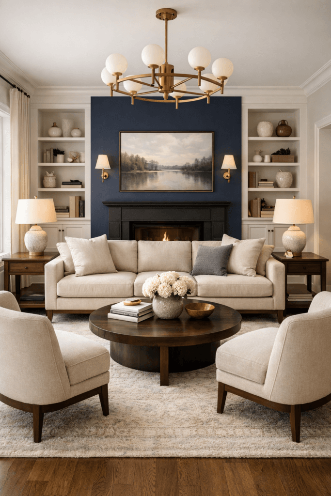
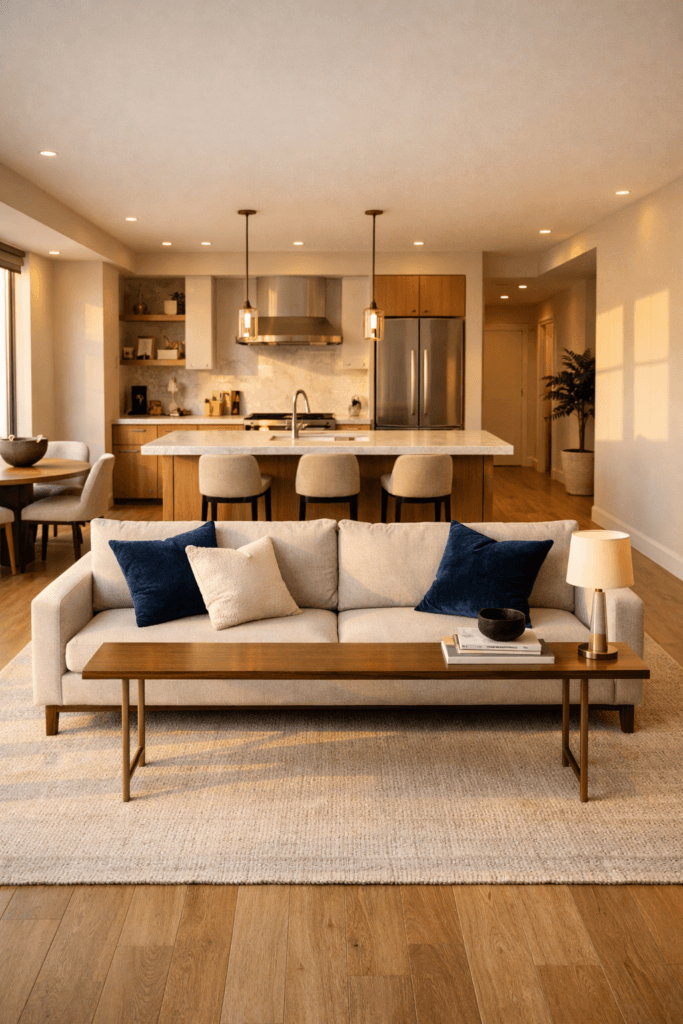
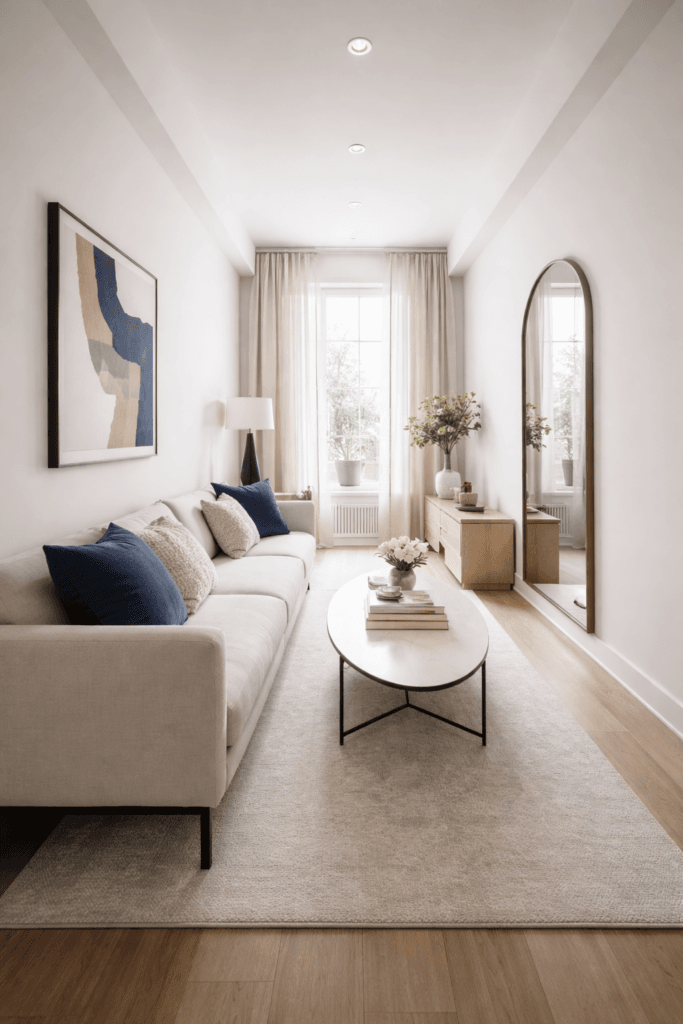
Living Room Layout Strategy
Living rooms are often the most challenging small spaces because they must accommodate comfort, conversation, and media.
Step 1: Determine the Visual Boss
Usually this is:
- The TV
- A fireplace
- A window with a view
Never design without selecting one.
Step 2: Choose the Correct Sofa Placement
Avoid:
- Blocking doorways
- Angling furniture randomly
- Oversized sectionals in tight rooms
Instead:
- Use slim-arm sofas
- Consider apartment-sized sectionals only if they follow room proportions
- Pull seating slightly off walls when possible
Step 3: Coffee Table Proportions
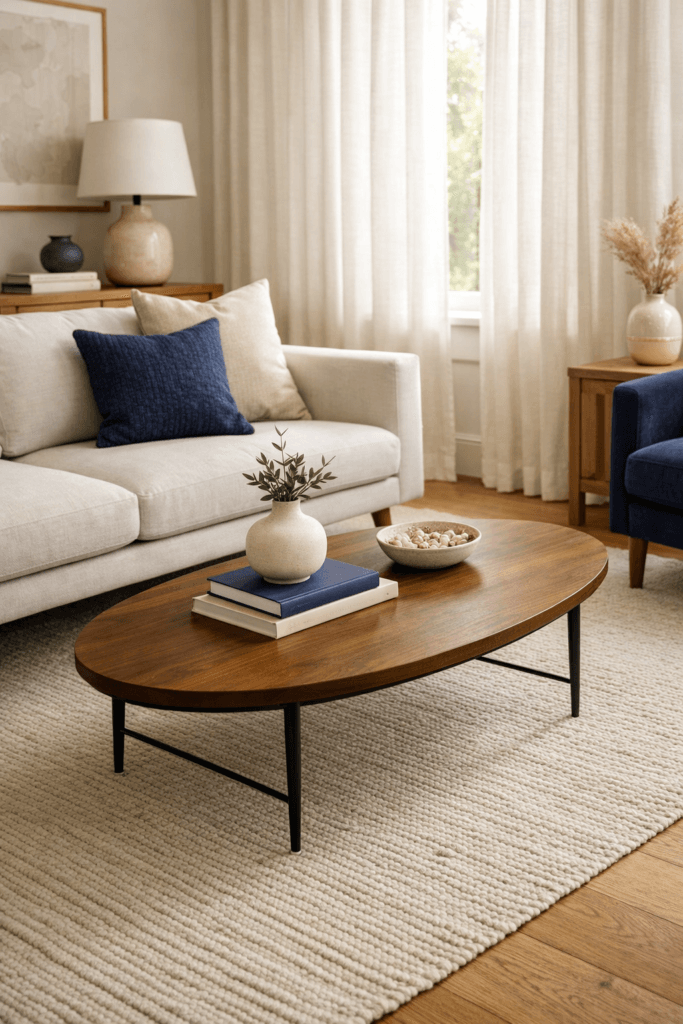
A coffee table should be:
- Two-thirds the length of the sofa
- 14–18 inches away from seating
Round tables work better in tight zones. Sharp corners reduce flow.
Step 4: Define with a Rug
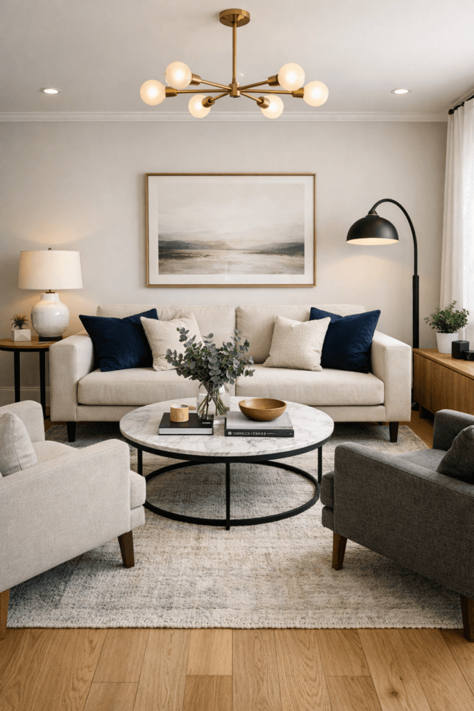
The rug must:
- Sit under at least the front legs of all seating
- Extend beyond the sofa width
- Anchor the entire grouping
Undersized rugs break cohesion and shrink the room visually.
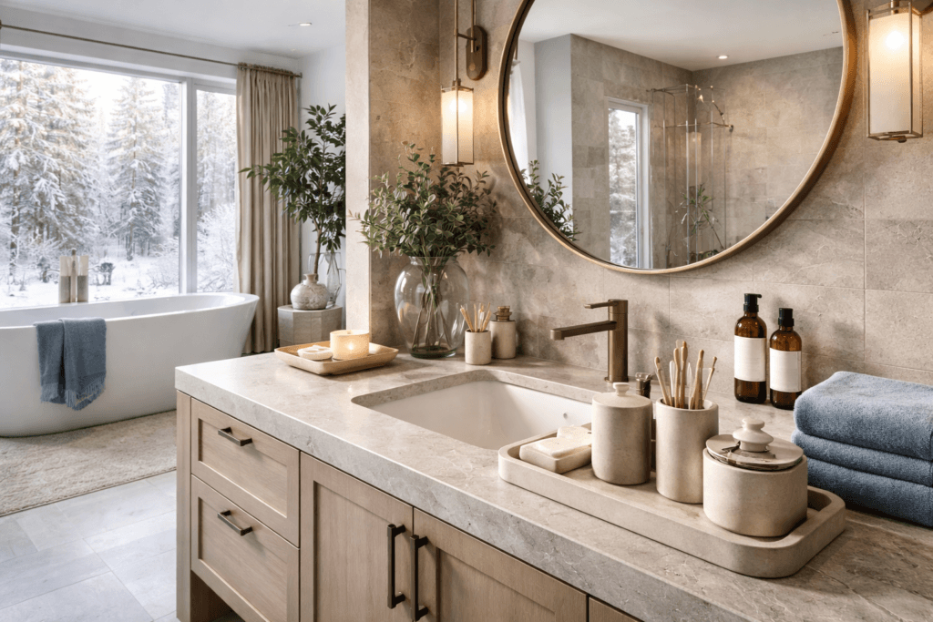
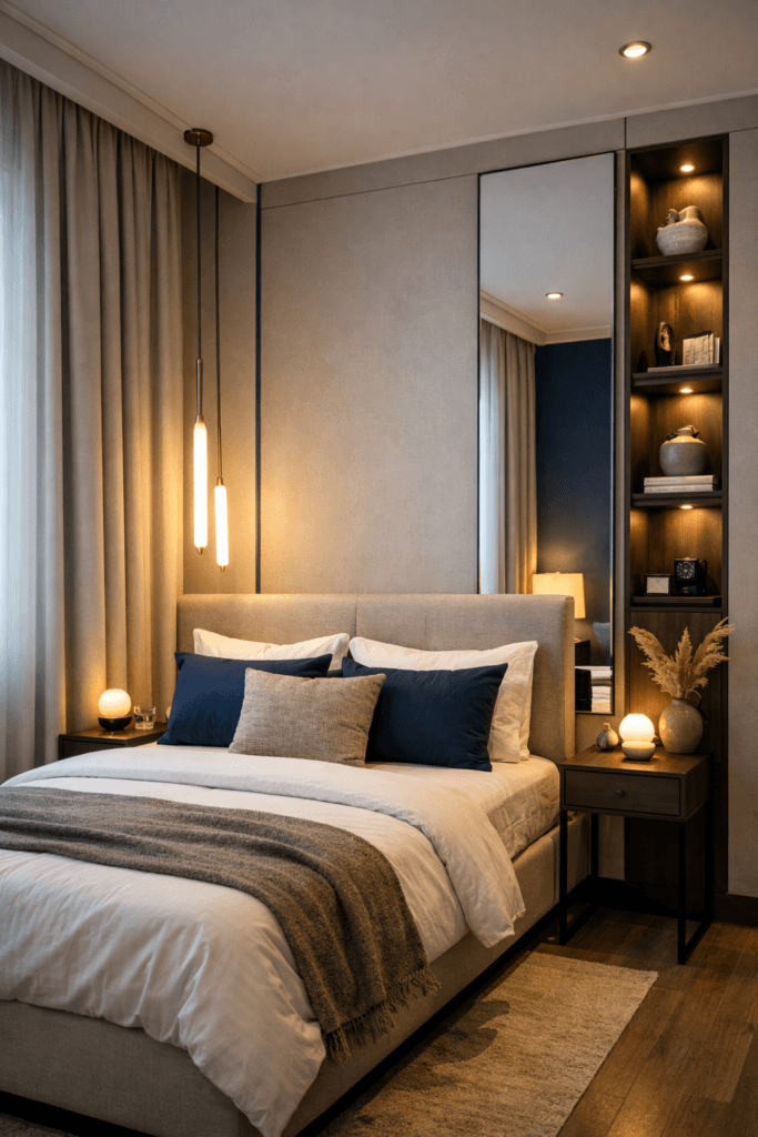
Bedroom Layout Strategy
Bedrooms require circulation clarity above all else.
Bed Placement
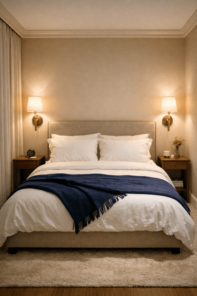
The bed should:
- Anchor to the longest uninterrupted wall
- Avoid blocking windows if possible
- Allow 24 inches of clearance on at least one side
If space is extremely tight:
- Use wall-mounted sconces instead of lamps
- Choose narrow nightstands
- Consider a storage bed to eliminate extra dressers
Dresser Placement
Keep dressers:
- Against a solid wall
- Away from primary circulation paths
Mirrors above dressers amplify perceived depth.
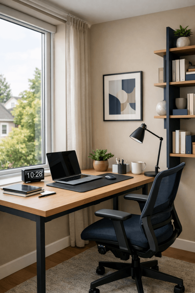
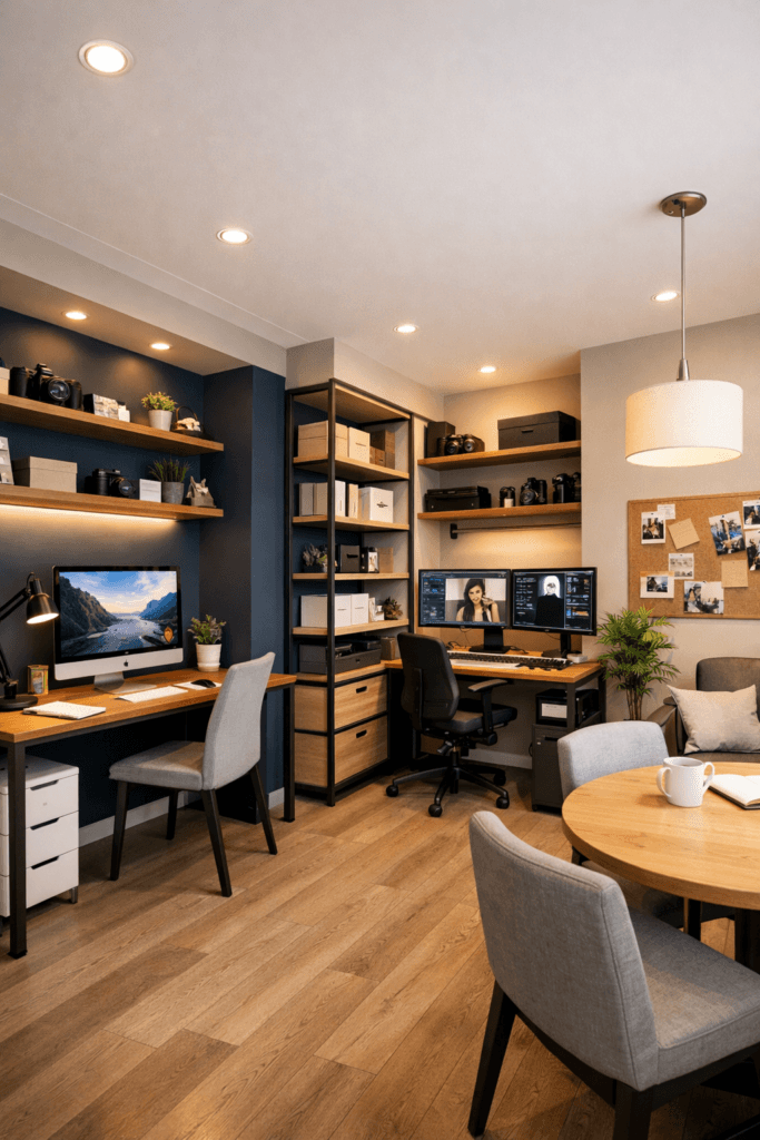
Home Office Layout Strategy
Small home offices often fail because people prioritize furniture quantity over workflow.
Desk Positioning
Ideally:
- Face natural light (but not directly blocking it)
- Avoid sitting with your back to the door if possible
- Keep wall behind desk visually calm for video calls
Storage Strategy
Use:
- Vertical shelving
- Wall-mounted cabinets
- Slim filing units
Avoid bulky storage towers in compact rooms.
If the office shares space with another room, define it with:
- A rug
- A floating desk
- A pendant light to visually mark the zone
Commercial or Studio Space Layout Strategy
In boutique offices, creative studios, or small retail spaces, layout must support both movement and branding.
Define Zones Clearly
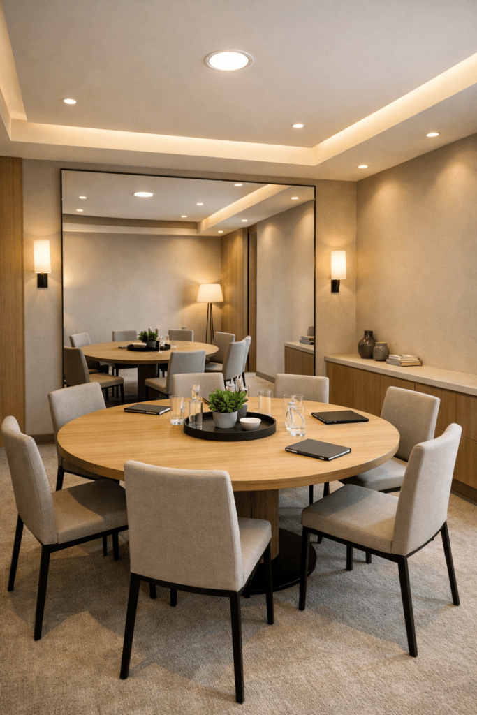
Even in 500–800 square feet, create:
- Entry zone
- Work zone
- Waiting or collaboration zone
Use subtle cues:
- Furniture orientation
- Lighting shifts
- Flooring transitions
- Rugs
Avoid Congestion at Entry Points
Nothing shrinks a commercial space faster than crowding the entrance.
Allow breathing room near doors. First impressions rely on spatial clarity.
The Most Common Small Space Layout Mistakes
Let’s address the patterns that consistently make rooms feel smaller:
- Oversized sectionals in tight rooms
- Multiple small rugs instead of one properly scaled rug
- Blocking natural light with tall furniture
- Over-layering side tables
- Angled furniture without purpose
- Ignoring vertical space
Small space layout rules reward restraint and precision.
The Layout Audit Checklist
Before finalizing any room, ask:
- Is there one dominant focal point?
- Are pathways uninterrupted?
- Does furniture feel proportional?
- Is at least one piece floating?
- Are zones clearly defined?
- Is there negative space?
If the answer is yes to most of these, the room will feel larger automatically.
Perception Psychology, Visual Weight & Expansion Strategy
Small space layout rules are not only structural. They are psychological.
Two rooms can have identical square footage and identical furniture dimensions — yet one feels open and elevated, while the other feels tight and visually heavy.
The difference lies in perception control.
Design is not just about where furniture sits. It is about how the eye moves through the room.
When you understand visual weight, balance, lighting strategy, and color placement, you can manipulate perception intentionally.
Let’s go deeper.
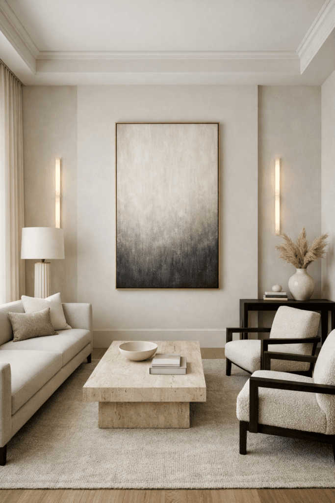
Rule 9: Control Visual Weight Distribution
Every object in a room carries visual weight.
Dark colors feel heavier than light colors.
Solid bases feel heavier than raised legs.
Large continuous shapes feel heavier than segmented ones.
In small spaces, visual weight must be distributed strategically.
Keep Heavier Pieces Grounded
Place visually heavier furniture:
- Along solid walls
- Opposite windows
- Anchored by rugs
Avoid clustering multiple heavy elements on one side of the room. That creates imbalance and makes the space feel compressed.
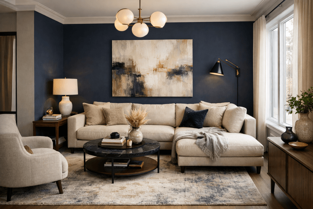
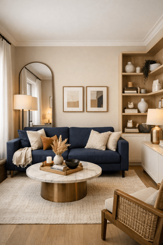
For example:
A dark navy sofa + a bulky dark wood media console + heavy blackout curtains all on one wall will visually collapse that side of the room.
Instead:
Balance dark pieces with lighter finishes, mirrors, or open shelving nearby.
Balance equals expansion.
Rule 10: Use Light to Create Depth
Lighting is one of the most powerful small space expansion tools.
A single overhead light flattens a room. Flat rooms feel smaller.
Layered lighting adds dimension.
Use Three Levels of Light
- Ambient (overhead)
- Task (table or floor lamps)
- Accent (wall lights, picture lights, shelf lighting)
When light exists at multiple heights, shadows create depth. Depth increases perceived space.
In offices and commercial spaces, this principle is even more important. Layered lighting makes compact environments feel intentional rather than utilitarian.
Avoid harsh top-down lighting without support. It compresses ceilings visually.
Rule 11: Mirror Placement as a Spatial Multiplier
Mirrors do more than reflect light. They extend sightlines.
The key is placement.
Best Mirror Positions in Small Spaces:
- Opposite a window to amplify natural light
- At the end of a narrow hallway
- Behind a console to create layered depth
- Above a fireplace to extend vertical lines
Avoid placing mirrors where they reflect clutter. A mirror doubles whatever it sees.
In offices, a well-placed mirror can expand conference rooms or waiting areas dramatically.
Mirrors are not decor. They are architectural tools.
Rule 12: Color Blocking with Intention
Color can shrink or expand a room depending on placement.
Many people assume light colors are always better for small spaces. That is not entirely true.
Dark colors can expand a space when used strategically.
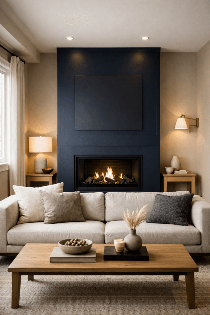
Use Dark Colors to Create Depth
When you paint:
- The farthest wall a deeper tone
- Or a single accent wall behind a focal point
The wall visually recedes.
This adds perceived depth.
In contrast, randomly placing dark tones across multiple surfaces fragments the room.
In commercial interiors, deep tones behind reception desks or conference walls create sophistication without shrinking space — when balanced correctly.
Rule 13: Keep Sightlines Clear
One of the most overlooked small space layout rules is sightline management.
When you enter a room, your eye should travel uninterrupted to a clear endpoint.
If tall furniture blocks that endpoint, the room feels shorter.
Maintain low-profile furniture near entrances.
Avoid:
- Tall bookcases immediately beside doors
- High-backed chairs blocking window views
- Cluttered entry tables
Clear sightlines equal longer visual reach. Longer reach equals larger perception.
Rule 14: Create Visual Flow Through Repetition
Flow is not accidental. It is created through repetition.
Repeat:
- A finish (brass, black metal, wood tone)
- A shape (rounded forms, linear forms)
- A color accent
- A texture
Repetition reduces visual chaos.
When too many competing materials exist, the brain works harder to process the room. That cognitive effort translates into a feeling of tightness.
Consistency feels spacious.
Rule 15: Embrace Negative Contrast
Contrast creates interest. But in small spaces, it must be controlled.
Instead of:
Multiple high-contrast elements scattered randomly
Try:
One intentional contrast moment.
Example:
- A bold navy sofa in a warm neutral room
- A sculptural pendant in an otherwise calm space
- A dramatic art piece centered intentionally
One bold move feels curated.
Five bold moves feel chaotic.
In boutique offices or creative studios, one signature element can elevate the space without overwhelming it.
Rule 16: Use Furniture Transparency Strategically
Transparent or visually open materials can expand small spaces significantly.
Consider:
- Glass coffee tables
- Acrylic chairs
- Open metal shelving
- Slim-profile furniture with visible legs
When light passes through objects, the room feels less dense.
This works beautifully in:
- Studio apartments
- Compact offices
- Small waiting rooms
However, transparency should complement structure, not replace it entirely. Anchor with solid pieces, then lighten with open ones.
The Advanced Spatial Formula
At this level, small space layout rules become layered:
- Anchor visually
- Protect pathways
- Scale proportionally
- Distribute weight evenly
- Layer lighting
- Extend sightlines
- Repeat finishes
- Introduce one bold contrast
- Maintain negative space
Each layer compounds the illusion of expansion.
Small spaces do not need minimalism.
They need strategy.
Layout Templates, Transformation Frameworks & The Professional Audit System
By now, you understand the structural, functional, and psychological layers of small space layout rules.
Now we translate theory into execution.
Because the difference between inspiration and transformation is application.
This final section gives you:
- Room-by-room layout templates
- A before-and-after redesign framework
- Commercial adaptation strategy
- A professional-grade layout audit checklist
Let’s systemize this.
Ready-to-Use Layout Templates
These templates work across residential and commercial environments. Adjust proportions, but keep the structure.
Template 1: The Compact Living Room (Under 12×14 ft)
Best System: Anchor + Orbit
Layout Order:
- Identify the focal point (TV, fireplace, window).
- Place sofa centered and facing anchor.
- Add one accent chair diagonally across (not parallel).
- Use one correctly sized rug to define zone.
- Add one slim console behind sofa if floating.
Key Rules:
- Keep 24 inches of walkway behind seating.
- Coffee table = ⅔ sofa length.
- Avoid two matching bulky chairs.
This template prevents overcrowding while maintaining conversational flow.
Template 2: The Narrow Living Room
Best System: Linear Efficiency
Layout Order:
- Anchor focal point to long wall.
- Use apartment-size sofa.
- Replace coffee table with narrow oval or nesting tables.
- Keep furniture aligned along dominant axis.
Advanced Move:
Use one tall mirror at the far end of the room to extend depth visually.
Avoid angling furniture. In narrow rooms, angles create chaos.
Template 3: The Small Bedroom
Best System: Centered Anchor
Layout Order:
- Bed centered on longest uninterrupted wall.
- Slim nightstands (12–18 inches wide).
- Wall-mounted sconces instead of bulky lamps.
- Dresser opposite bed only if walkway remains clear.
Optional Upgrade:
Float bed 2–3 inches off wall and layer curtains floor-to-ceiling to increase perceived height.
Bedrooms feel larger when vertical emphasis replaces horizontal clutter.
Template 4: The Home Office Nook
Best System: Floating Island or Linear
Layout Order:
- Position desk facing natural light (side-lit is ideal).
- Keep wall behind desk visually calm.
- Add one vertical storage unit.
- Use rug to define workspace if open-concept.
Avoid oversized executive desks in compact rooms. Scale must match square footage.
In small offices, workflow > aesthetics. A clean traffic path behind seating is essential.
Template 5: Small Commercial Suite (500–900 sq ft)
Best System: Zoning Strategy
Divide into three zones:
- Entry / Reception
- Core Work Area
- Secondary Collaboration or Storage Zone
Execution Principles:
- Keep entry area visually open.
- Use rugs or lighting changes to define zones.
- Float furniture to create depth.
- Avoid stacking heavy cabinetry along one wall.
Commercial interiors shrink quickly when storage dominates. Keep storage vertical and visually light.
The Before-and-After Redesign Framework
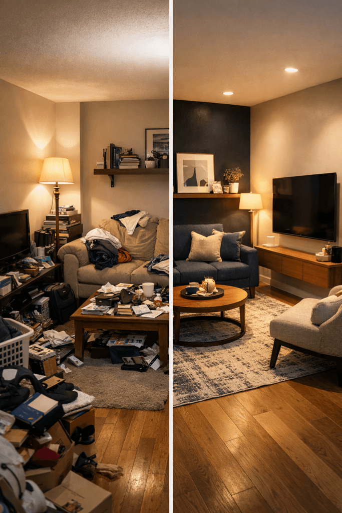
If a small space feels tight, use this transformation sequence.
Step 1: Remove Everything Non-Essential
Edit aggressively.
You cannot optimize layout until you reduce noise.
Step 2: Rebuild Around One Anchor
Choose a single focal point and align all primary furniture to it.
Step 3: Restore Walkways
Reposition furniture to create uninterrupted circulation paths.
Step 4: Adjust Scale
Replace bulky pieces with slimmer silhouettes if necessary.
Step 5: Layer Lighting
Add at least one floor or table lamp to avoid flat overhead lighting.
Step 6: Introduce One Depth Element
This may be:
- A mirror
- A darker accent wall
- A layered curtain treatment
Transformation is rarely about buying more. It is about rearranging better.
Commercial Adaptation Strategy
Small space layout rules become even more critical in commercial environments.
Why?
Because movement equals experience.
Clients judge spatial quality immediately.
Commercial Layout Priorities:
- Clear entry sightline
- Defined function zones
- Balanced visual weight
- Proper lighting layers
- Comfortable circulation
A cramped reception area reduces perceived professionalism.
An overcrowded conference room reduces comfort.
Blocked pathways reduce credibility.
In commercial design, layout influences brand perception.
The Professional Layout Audit Checklist
Use this anytime you evaluate a space.
Focal Point
- Is there one clear visual anchor?
- Is primary seating aligned with it?
Circulation
- Are pathways at least 24 inches?
- Are doorways unobstructed?
Scale
- Do furniture proportions match room size?
- Are bulky pieces minimized?
Visual Weight
- Is weight evenly distributed?
- Are heavy elements balanced?
Lighting
- Are there at least two layers of light?
- Does lighting create depth?
Vertical Emphasis
- Are ceilings visually extended?
- Is vertical storage used effectively?
Negative Space
- Is there breathing room between pieces?
- Has unnecessary furniture been removed?
If more than three categories fail, the room will feel smaller than it is.
The Final Principle: Intentional Restraint
Small spaces do not require minimalism.
They require clarity.
The most powerful small space layout rules are:
- One focal point
- Clear pathways
- Proportional scaling
- Strategic lighting
- Controlled contrast
- Negative space
When applied consistently, these principles transform compact interiors into environments that feel calm, refined, and expansive.
Square footage becomes secondary.
Experience becomes primary.