
Spring Moodboards for a Fresh Start at Home
April 2, 2026
Trending Finds Readers Are Loving
Explore affordable luxe discoveries people are clicking on right now.
See What's TrendingSpring carries a natural sense of renewal. It’s the season where light changes, routines soften, and spaces begin to feel ready for a reset. At home, this shift is often less about replacing everything and more about realigning what’s already there.
Spring moodboards help translate that feeling into design direction. They capture lightness, clarity, and balance — allowing a home to feel refreshed without becoming cluttered or overly seasonal.
Rather than focusing on trends, spring moodboards work best when they emphasize atmosphere. Color, texture, and material choices guide how a space feels, not just how it looks. When done intentionally, these moodboards become a roadmap for subtle but meaningful change.
A fresh start at home doesn’t require a complete overhaul. It begins with clarity — and moodboards provide exactly that.
Why Spring Is the Ideal Time for a Home Reset
Spring is uniquely suited for reassessing interiors because it naturally invites light and movement. Longer days highlight details that winter shadows often hide. Materials, colors, and textures reveal themselves differently under spring light.
This shift makes it easier to notice what feels heavy, outdated, or visually noisy. It also creates space to introduce elements that feel lighter, softer, and more intentional.
Design experts frequently note that seasonal resets are most successful when they focus on editing rather than adding. According to The Spruce, spring home refreshes benefit from simplified palettes and natural materials that enhance brightness and flow.
https://www.thespruce.com/spring-home-refresh-ideas-5212490
Spring moodboards help prioritize what stays, what goes, and what subtly evolves.
What Defines a Spring Moodboard
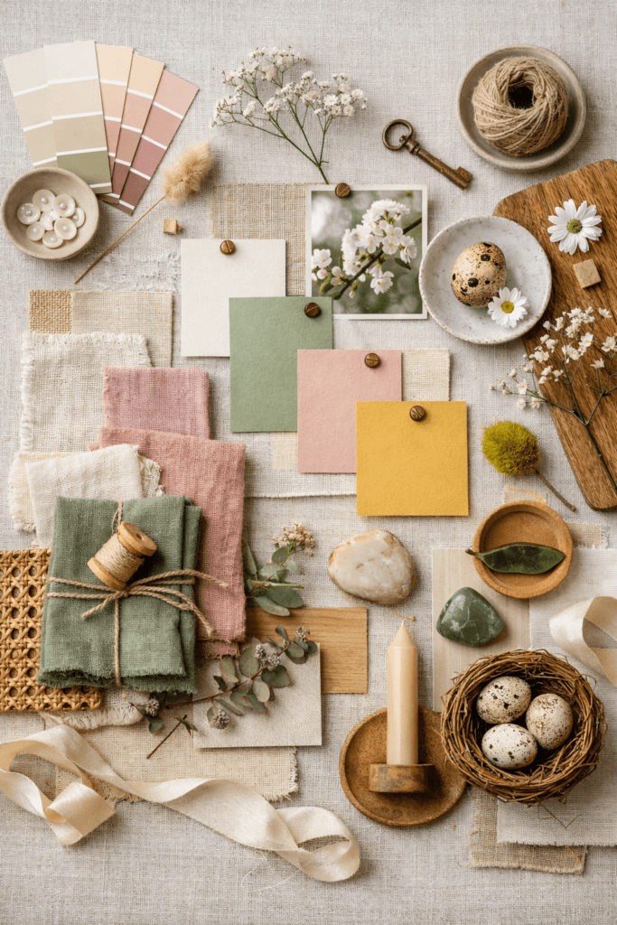
A spring moodboard isn’t about florals or pastel overload. It’s about balance, softness, and renewed energy.
Common elements found in well-designed spring moodboards include:
- Light neutrals with warm undertones
- Soft greens, muted blues, or gentle earth tones
- Natural textures like linen, wood, and stone
- Airy compositions that leave visual breathing room
These elements work together to create a sense of calm movement — not stillness, but flow.
Moodboards allow these components to be tested together before they’re introduced into a space. This prevents overcorrection, where a home feels themed instead of refreshed.
Color Palettes That Signal Spring Without Feeling Seasonal
Spring color palettes succeed when they feel timeless with a seasonal lift. Instead of relying on obvious seasonal colors, spring moodboards often soften existing palettes.
For example:
- Warm whites replace stark winter whites
- Muted greens replace heavy jewel tones
- Soft blues introduce calm without coolness
- Pale wood tones lighten the visual weight of a space
Design guidance from Architectural Digest emphasizes that successful seasonal updates rely on subtle palette shifts rather than dramatic color changes.
https://www.architecturaldigest.com/story/spring-decorating-ideas
Spring moodboards help visualize these transitions so the result feels intentional rather than reactive.
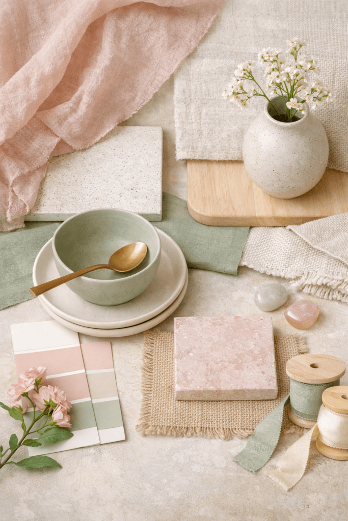
Texture as a Tool for Lightness
Texture plays a major role in how spring interiors feel. While winter spaces often rely on weight and coziness, spring textures lean toward breathability.
Spring moodboards typically highlight:
- Linen and cotton fabrics
- Lightly woven rugs
- Natural wood with visible grain
- Ceramic and stone with soft finishes
These textures reflect light gently and introduce movement without visual noise. Moodboards allow designers and homeowners to see how texture interacts with color and light — before making changes.
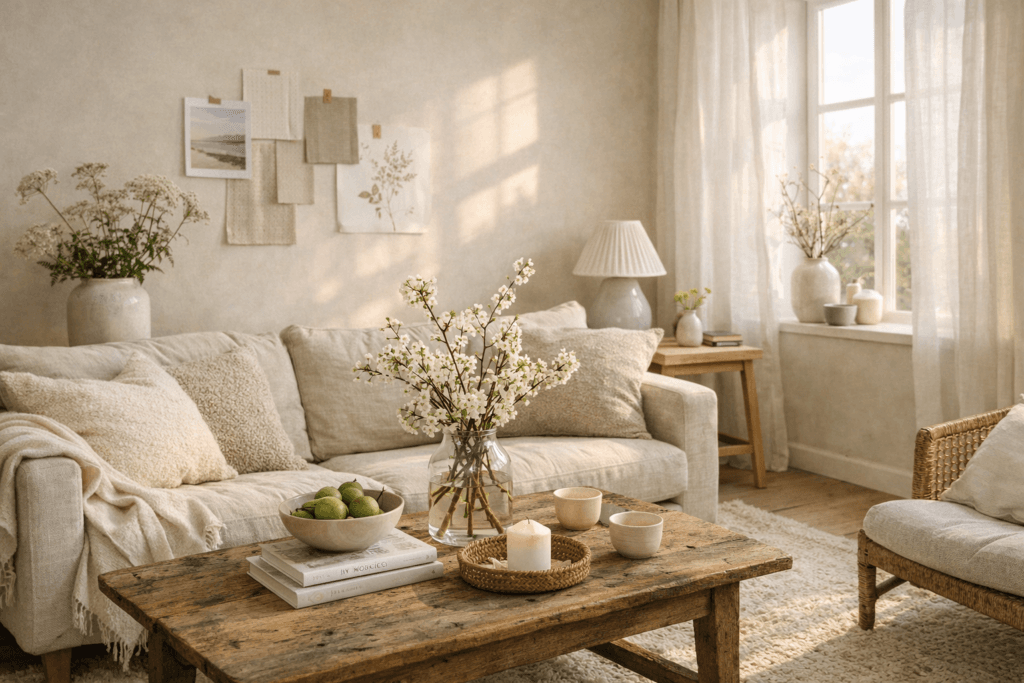
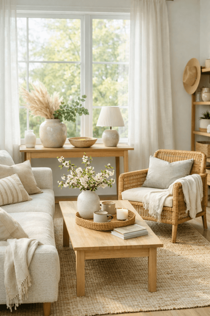
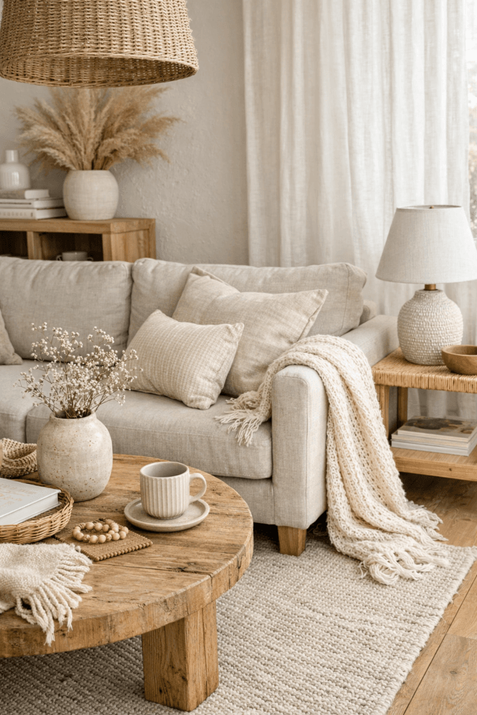
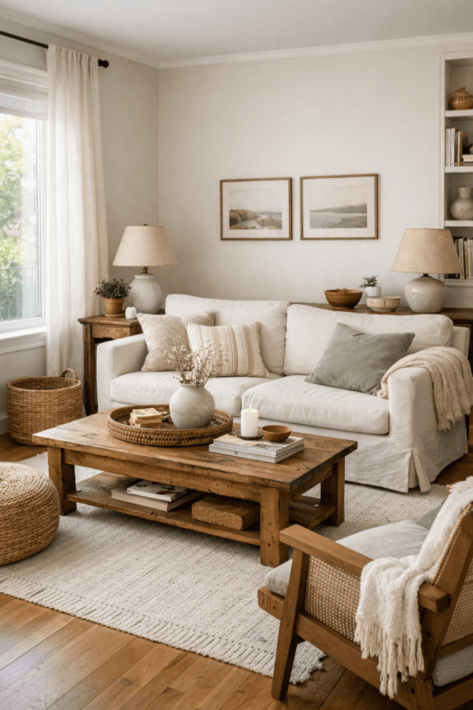
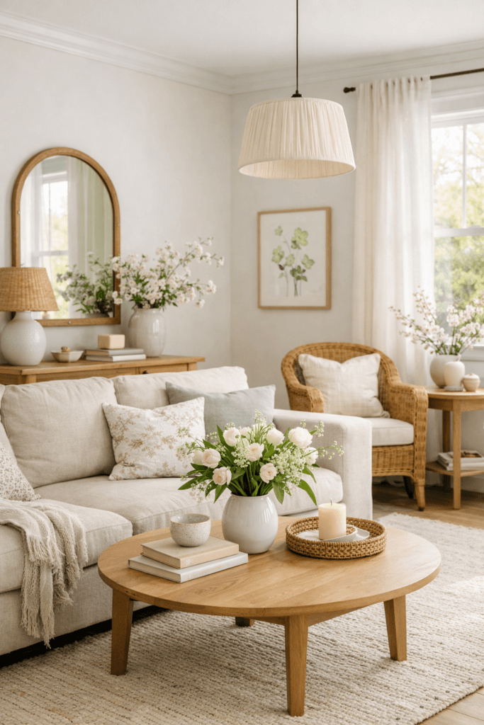
Spring Moodboards for Living Spaces
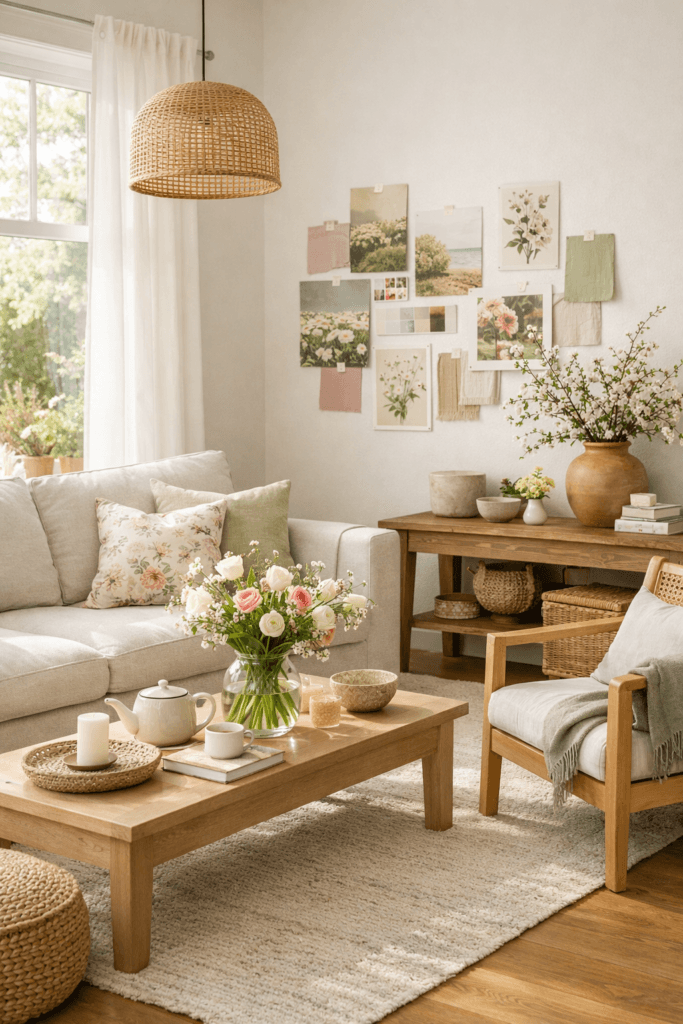
Living spaces are often the first place spring energy should be felt. These rooms benefit most from lightness, flow, and subtle warmth rather than bold transformation.
Spring moodboards for living rooms often focus on:
- Softened neutral foundations
- Lighter wood tones or woven materials
- Gentle contrast instead of heavy accent colors
- Fewer but more intentional decorative elements
Rather than introducing seasonal décor, spring moodboards encourage editing. Removing visual weight — dark throws, overly dense arrangements, or heavy textures — allows light to move more freely through the space.
Interior experts at Dwell often highlight that successful spring interiors prioritize openness and material honesty over ornamentation.
https://www.dwell.com/article/spring-interior-design-refresh-ideas
Moodboards help ensure these changes feel cohesive rather than sparse.
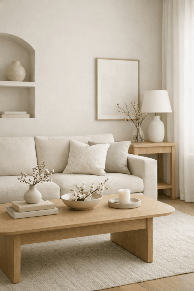
Spring Moodboards for Bedrooms

Bedrooms benefit from spring updates that focus on calm and renewal. The goal is not energy, but ease.
Spring bedroom moodboards often include:
- Crisp yet warm bedding palettes
- Soft tonal layering instead of contrast
- Natural fibers that feel breathable
- Simplified color stories
This is where spring moodboards shine. They help visualize how subtle shifts — such as changing undertones or textures — can dramatically affect how restful a room feels.
According to The Sleep Foundation, lighter visual environments support relaxation and emotional reset, especially during seasonal transitions.
https://www.sleepfoundation.org/bedroom-environment
Spring moodboards allow those principles to translate into design without overcorrection.
Spring Moodboards for Kitchens and Dining Areas
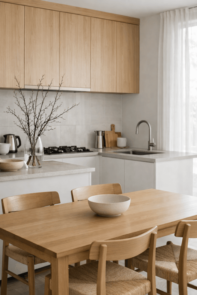
Kitchens and dining areas respond especially well to spring refreshes because they reflect daily rhythm and movement.
Spring moodboards in these spaces often emphasize:
- Clean surfaces and visual clarity
- Light-toned ceramics and glass
- Natural wood or stone elements
- Muted accent colors rather than bold contrasts
Instead of introducing seasonal décor, spring moodboards often guide material swaps — lighter linens, simpler table styling, or refreshed countertop accents.
Design guidance from Architectural Digest notes that seasonal kitchen updates work best when they enhance function rather than interrupt it.
https://www.architecturaldigest.com/story/kitchen-design-refresh
Moodboards keep these updates intentional and restrained.
Common Spring Moodboard Mistakes to Avoid
Spring styling can easily tip into excess if not guided carefully.
Common mistakes include:
- Overusing pastels without grounding tones
- Adding too many seasonal accents at once
- Removing warmth in pursuit of “lightness”
- Treating spring as a theme instead of a feeling
Moodboards prevent these issues by keeping decisions anchored to a broader visual story. They help ensure spring updates feel like an evolution of the home — not a temporary costume.
Refreshing Your Home Without Buying Everything New
One of the most powerful aspects of spring moodboards is their ability to encourage resourceful design.
Instead of replacing furniture or décor, moodboards often reveal:
- Items that can be restyled or relocated
- Palettes that can be softened rather than replaced
- Textures that already exist but need rebalancing
Design writers at The Spruce consistently emphasize that seasonal refreshes are most successful when they focus on rearrangement and restraint rather than consumption.
https://www.thespruce.com/refresh-home-without-buying-new-5212098
Spring moodboards act as a visual filter — helping you work with what you already own more intentionally.
Final Thoughts
Spring invites reflection as much as renewal. It’s an opportunity to simplify, soften, and reset without starting over.
When moodboards are used intentionally, they become a design compass — helping each choice feel purposeful and connected. They allow homes to evolve naturally with the season while maintaining long-term coherence.
A fresh start at home doesn’t come from change alone. It comes from clarity — and spring moodboards offer exactly that.