
The Power of Color: Moodboards for Every Aesthetic
March 31, 2026
Trending Finds Readers Are Loving
Explore affordable luxe discoveries people are clicking on right now.
See What's TrendingColor is one of the most powerful design tools we have — yet it’s often treated as an afterthought. In reality, color shapes how a space feels long before furniture, décor, or layout come into play. It influences mood, perception, and even how we experience comfort.
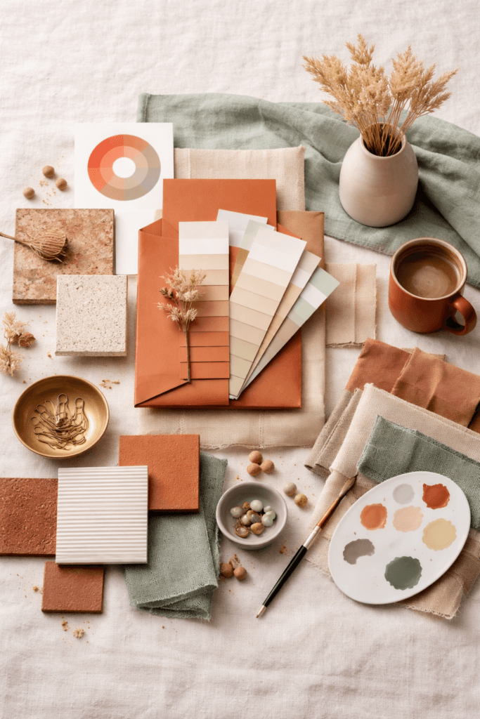
Moodboards exist to bring clarity to that process. They translate abstract ideas into visual direction, allowing color to guide decisions instead of complicating them. When used intentionally, moodboards become more than inspiration — they become strategy.
Understanding the power of color is about more than preference. It’s about how different palettes interact with light, texture, and emotion. When color is chosen with purpose, a space feels cohesive, grounded, and unmistakably intentional.
This guide explores how color-based moodboards help define different aesthetics — and why color is often the quiet force behind the most successful interiors.
Why Color Is the Foundation of Every Aesthetic
Every aesthetic, whether minimal or expressive, begins with color. Before patterns, materials, or furniture are introduced, color sets the emotional tone of a space.
According to color psychology research published by the Interaction Design Foundation, color directly affects perception, mood, and decision-making — which is why certain palettes consistently feel calming, energizing, or refined.
👉 https://www.interaction-design.org/literature/topics/color-theory
In interiors, this means color determines whether a room feels expansive or intimate, cool or warm, restful or stimulating. A neutral palette can feel serene or sterile depending on undertones. Bold colors can feel expressive or overwhelming depending on balance.
Moodboards allow designers and homeowners to test these relationships visually before committing. They show how colors behave together — and how they shift under different lighting conditions.
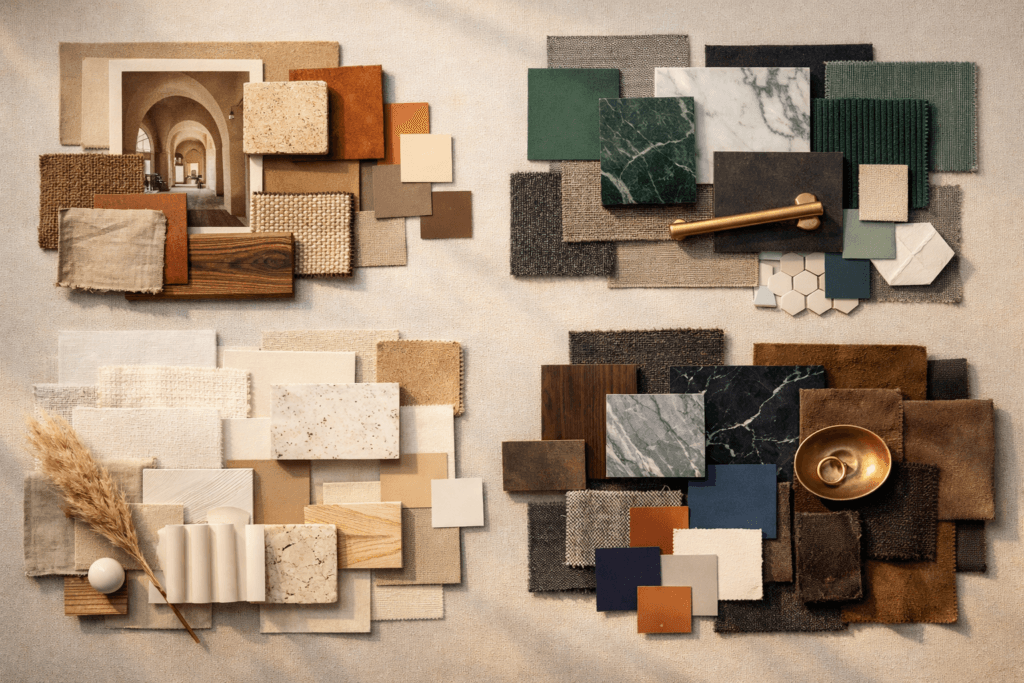
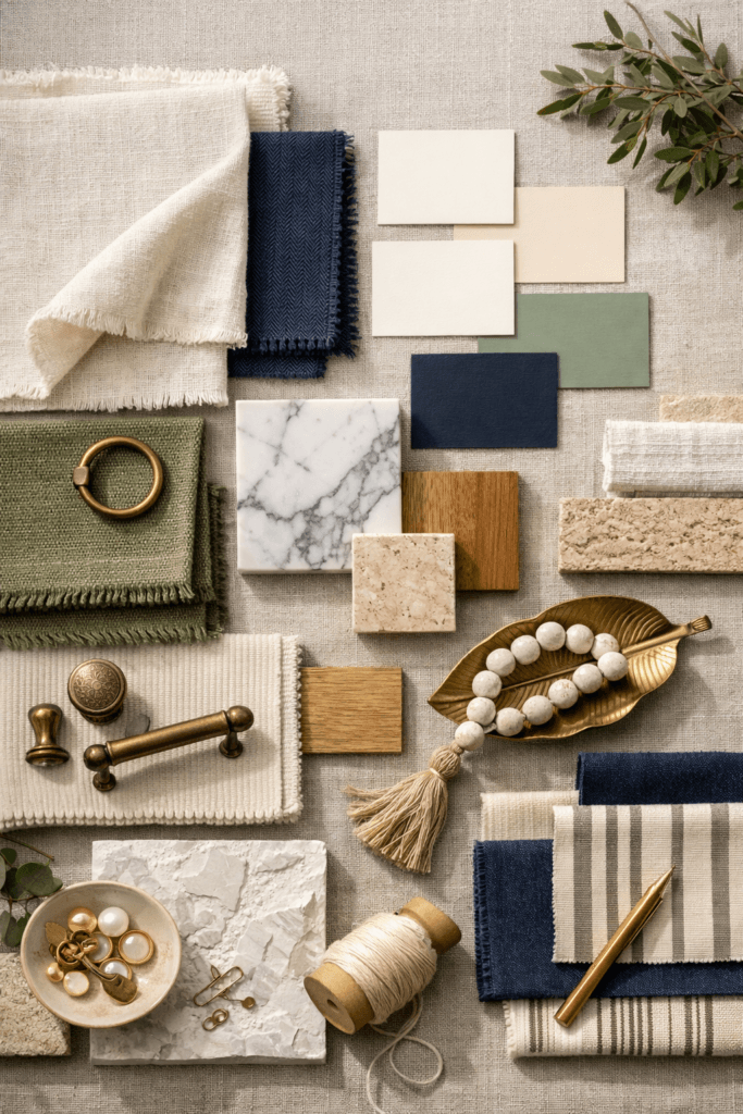
Moodboards as a Visual Decision-Making Tool
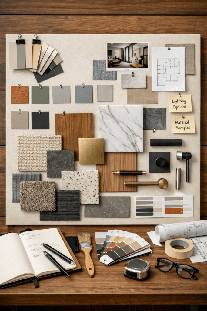
Moodboards are often misunderstood as purely inspirational. In reality, they serve a much more practical purpose: alignment.
A well-built moodboard:
- Establishes a clear color hierarchy
- Prevents impulse decisions
- Helps avoid clashing undertones
- Creates consistency across rooms
Design platforms like Architectural Digest regularly emphasize the importance of cohesive palettes when building layered interiors, noting that successful spaces rely on repetition and balance rather than isolated statements.
👉 https://www.architecturaldigest.com/story/color-theory-interior-design
Moodboards give you a reference point. When choices arise — paint, upholstery, hardware, or accessories — the moodboard acts as a filter, keeping decisions aligned with the overall aesthetic.
How Color Shapes the Feeling of a Space
Color doesn’t just decorate a room — it defines how the room is experienced.
Soft, muted tones tend to recede visually, making spaces feel calm and expansive. Deeper hues ground a room, adding intimacy and structure. High-contrast palettes feel dynamic, while tonal palettes feel composed.
Design research from The Spruce highlights how undertones play a crucial role in whether a color feels warm or cold, even within the same shade family.
👉 https://www.thespruce.com/how-to-use-color-in-interior-design-5211345
This is why two “white” rooms can feel completely different — and why moodboards are essential for understanding nuance before execution.
Building Moodboards Around Aesthetic Identity
Every aesthetic has an emotional signature. Color is what makes that signature recognizable.
For example:
- Minimal aesthetics rely on restraint and tonal harmony
- Classic aesthetics favor balanced neutrals with subtle contrast
- Modern aesthetics often use bold color intentionally and sparingly
- Organic aesthetics blend earth tones and softened hues
Moodboards help translate these identities visually. Rather than guessing, you can see how colors interact with materials, finishes, and light — long before they’re installed.
This approach aligns with guidance from Dezeen, which emphasizes that successful interiors are built on coherent visual language rather than isolated design trends.
👉 https://www.dezeen.com/interiors/
Why Color Moodboards Prevent Design Fatigue
One of the biggest challenges in designing or refreshing a space is decision fatigue. Endless options can lead to inconsistent choices or regret.
Color-based moodboards simplify the process. When color is defined early, everything else follows more naturally. Furniture selection becomes easier. Décor feels intentional. Updates feel cohesive instead of disruptive.
Moodboards also allow flexibility. When built around color principles rather than trends, a space can evolve without losing its identity.
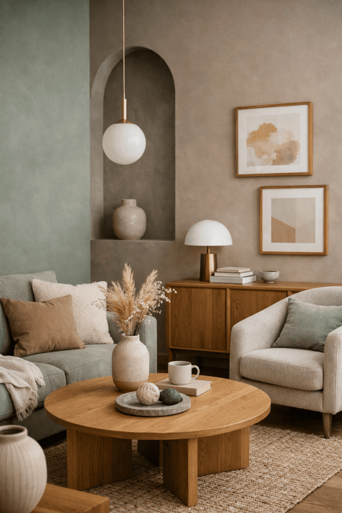
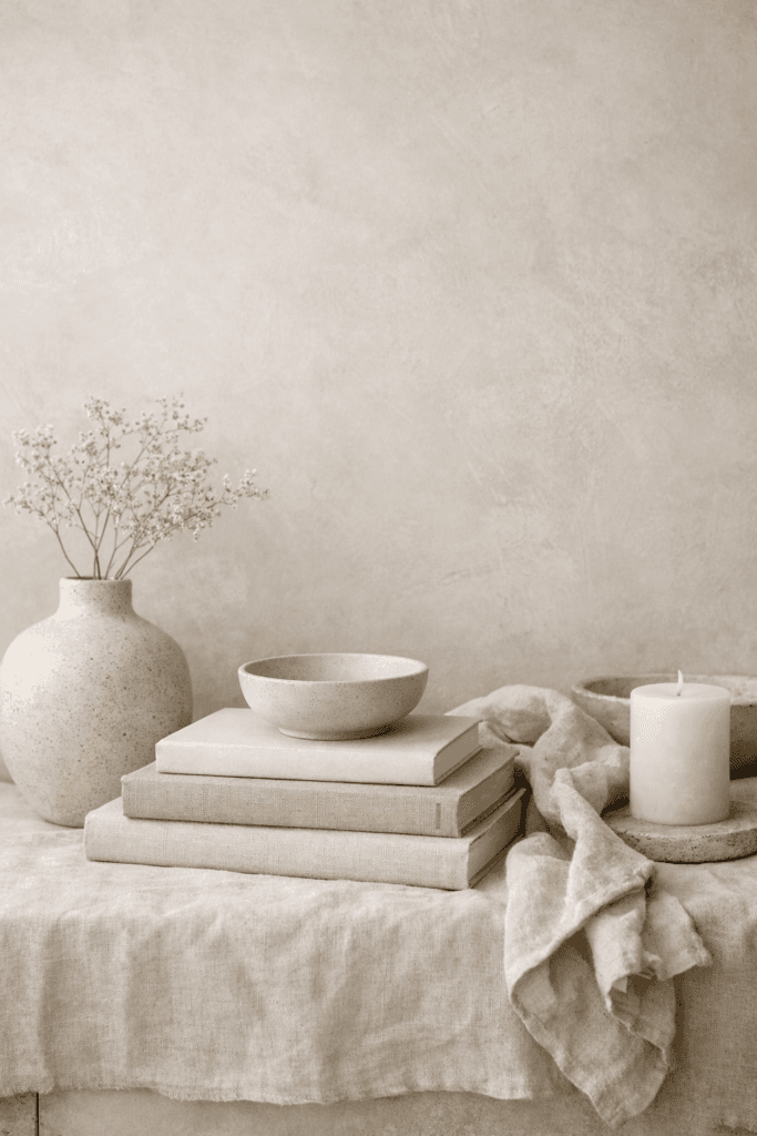
Color Moodboards for Minimal Aesthetics
Minimal aesthetics rely on restraint, but restraint doesn’t mean absence. Color plays a critical role in preventing minimal spaces from feeling flat or unfinished.
Minimal color moodboards often focus on:
- Soft whites with intentional undertones
- Warm beiges and greiges
- Muted stone, clay, or sand tones
- Gentle contrast rather than stark separation
The power of color in minimal spaces comes from tonal layering. Slight shifts in shade create depth without visual noise. This approach is frequently highlighted by Dwell, which emphasizes that minimal interiors succeed when variation is subtle rather than eliminated entirely.
https://www.dwell.com/article/minimalist-interior-design-tips-7b3a7f69
Moodboards for minimal aesthetics should include not only color swatches, but also material references — plaster walls, linen upholstery, matte ceramics — so color and texture work together rather than compete.
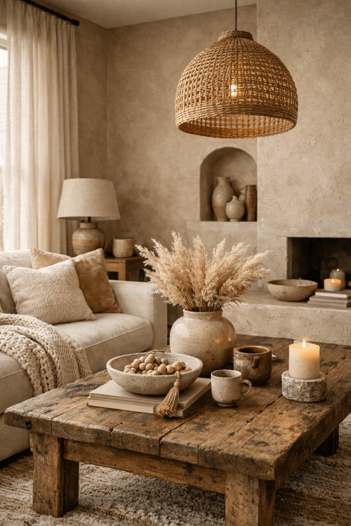
Warm Aesthetic Moodboards: Creating Comfort Through Color
Warm aesthetics are rooted in emotional response. These spaces feel inviting, grounded, and lived-in — largely because of the colors chosen.
Warm color moodboards often feature:
- Creams instead of stark whites
- Soft browns, taupes, and caramels
- Terracotta, muted rust, or clay tones
- Warm woods and natural fibers
According to The Spruce, warm palettes are especially effective in spaces meant for gathering, such as living rooms and dining areas, because they encourage relaxation and connection.
https://www.thespruce.com/warm-color-schemes-5212150
Moodboards help balance warmth without heaviness. Too many deep warm tones can feel overwhelming, while lighter neutrals keep the palette breathable. The moodboard acts as a visual checkpoint, ensuring warmth feels intentional rather than accidental.
Bold Aesthetic Moodboards Without Overwhelm

Bold aesthetics often intimidate people — not because of color itself, but because of how it’s applied.
Color moodboards for bold spaces work best when:
- One dominant color anchors the palette
- Supporting colors are restrained
- Neutrals are used as visual rest points
- Contrast is planned rather than spontaneous
Design platform Dezeen frequently showcases bold interiors that succeed because of disciplined color strategy rather than maximalism for its own sake.
https://www.dezeen.com/interiors/
Moodboards allow experimentation without commitment. You can explore saturation, contrast, and scale visually before translating bold color into paint, upholstery, or décor. This prevents the common mistake of overusing statement colors without balance.
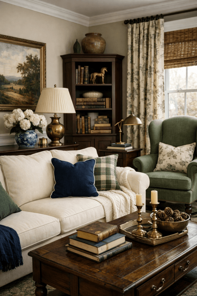
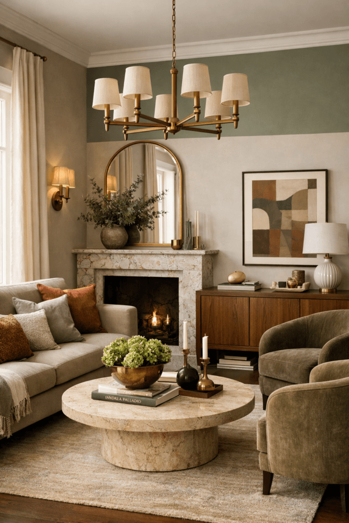
Classic Aesthetic Moodboards and Timeless Color Choices
Classic aesthetics rely on familiarity and longevity. Color here isn’t about novelty — it’s about reliability.
Classic moodboards often include:
- Navy, charcoal, and soft black
- Cream, ivory, and wClassic Aesthetic Moodboards and Timeless Color Choicesarm white
- Muted greens or blues
- Traditional wood tones
These palettes have endured because they adapt. As noted by Architectural Digest, timeless interiors rely on color foundations that can evolve through accessories and finishes rather than full redesigns.
https://www.architecturaldigest.com/story/timeless-interior-design-rules
Moodboards for classic spaces should prioritize balance and proportion. No single color should dominate without purpose. Instead, the palette should feel composed and flexible.
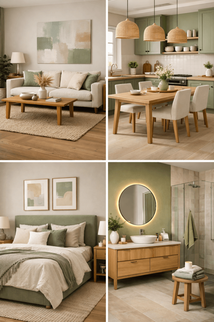
Adapting Color Moodboards Room by Room
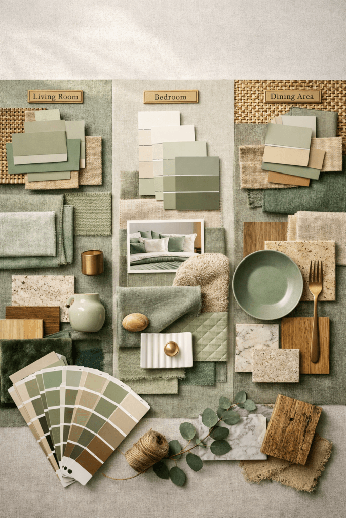
One of the most overlooked aspects of moodboarding is room context. A color palette that works beautifully in a living room may feel overwhelming in a bedroom or underwhelming in a kitchen.
Room-specific considerations include:
- Natural light exposure
- Room size and ceiling height
- Function and emotional intent
- Existing architectural elements
The Interaction Design Foundation notes that color perception changes significantly depending on environment and usage, reinforcing the importance of testing palettes visually rather than conceptually.
https://www.interaction-design.org/literature/topics/color-theory
Moodboards allow you to adjust saturation, contrast, and balance for each space while maintaining a cohesive aesthetic throughout the home.
Common Color Mistakes Moodboards Help Prevent
Color mistakes rarely come from bad taste — they come from lack of visual testing.
Moodboards help prevent:
- Clashing undertones
- Overuse of high-contrast palettes
- Trend-driven color regret
- Inconsistent room transitions
Without a moodboard, color decisions are often made in isolation. Moodboards reconnect each choice to a larger visual story.
Final Thoughts
Color is not decoration. It’s structure, emotion, and identity all at once.
When you understand the power of color and use moodboards as a strategic tool, you move beyond surface-level styling. You design spaces that feel aligned, expressive, and enduring.
The most successful interiors don’t rely on trend forecasting — they rely on thoughtful color foundations that support how people live, feel, and evolve within a space.