Trending Finds Readers Are Loving
Explore affordable luxe discoveries people are clicking on right now.
See What's TrendingBold colors doesn’t make rooms feel cold.
Unbalanced bold colors does.
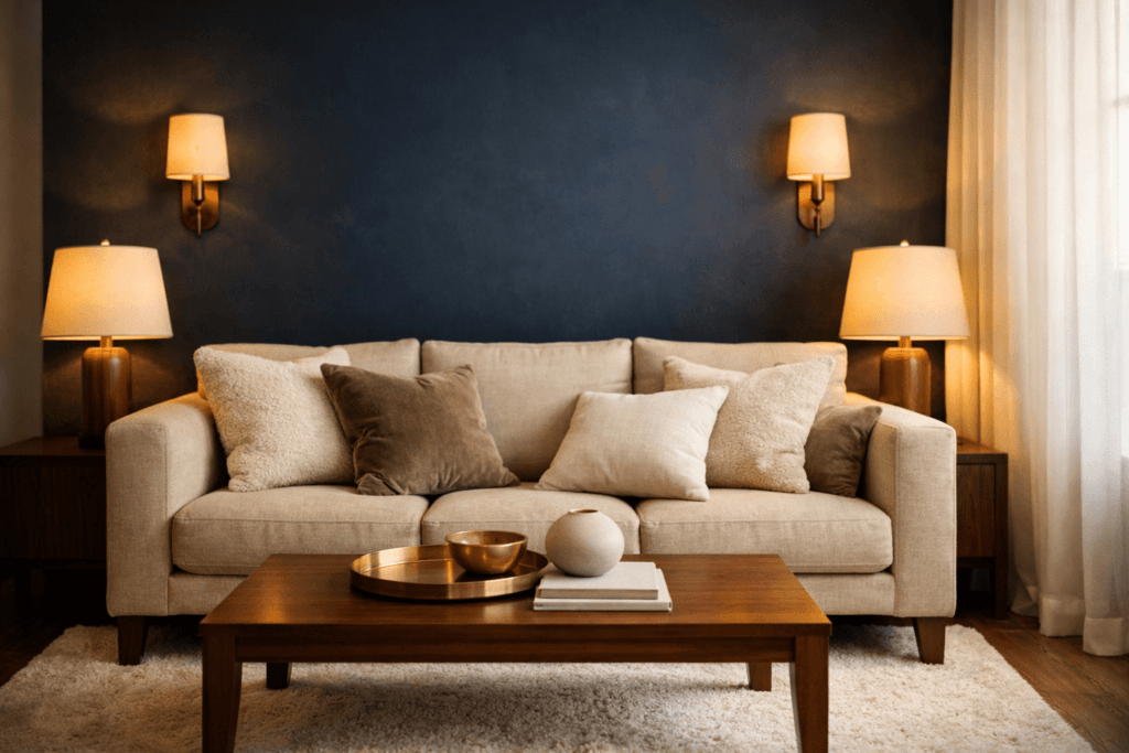
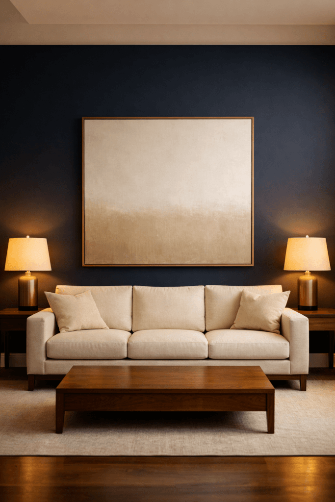
Deep navy walls. Charcoal cabinetry. Forest green paint. Plum dining rooms. Matte black offices. These tones are not inherently harsh. In fact, high-end interiors rely on them constantly. The difference between dramatic and cold comes down to one principle: warmth layering.
When bold colors are surrounded only by cool undertones — gray upholstery, chrome finishes, stark white trim, cool LED lighting — the room loses emotional softness. Instead of feeling intentional, it feels sterile.
Luxury interiors never allow bold color to stand alone.
They stabilize it.
The Psychology of Warmth vs. Coolness
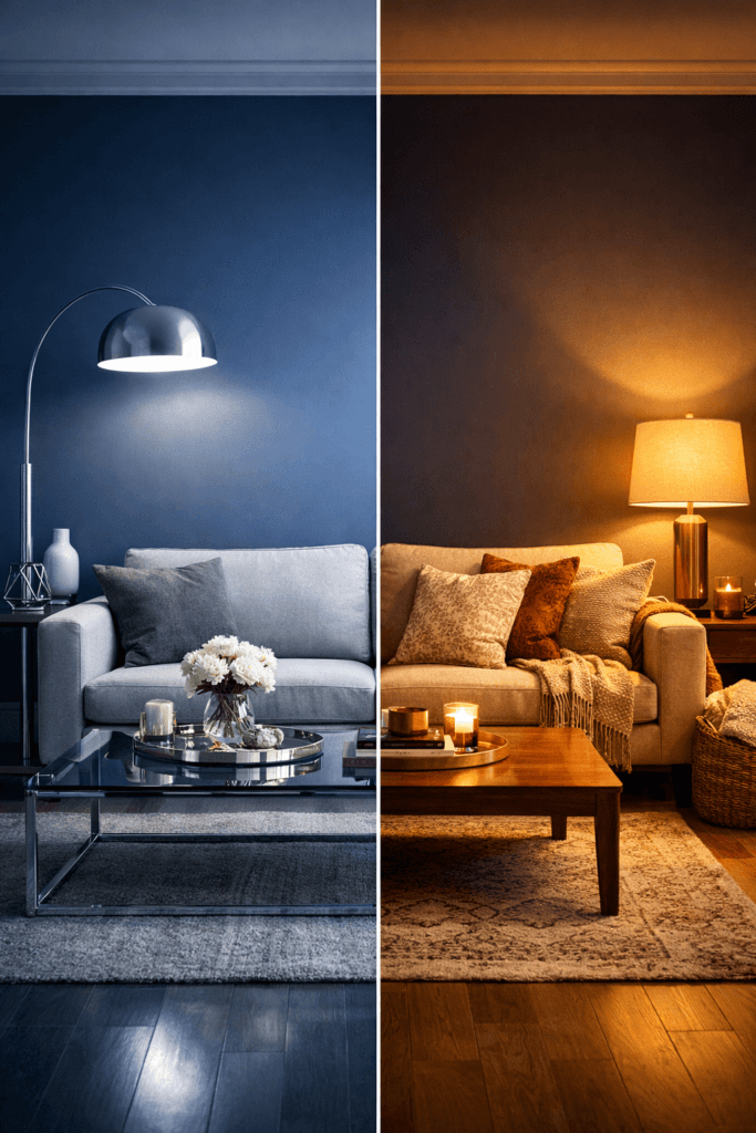
Cool tones visually sharpen a space. Warm tones soften it. When you combine deep navy with bright white and steel accents, the contrast becomes high-tension. That tension is what people interpret as “cold.”
But when navy is paired with warm beige, caramel leather, brushed brass, walnut wood, and 2700K lighting, the emotional temperature changes immediately.
Bold color needs something to absorb its intensity.
Designers understand that warmth is not just a color choice — it’s a structural decision.
According to Architectural Digest, high-end interiors consistently layer texture and warm undertones when working with darker paint colors to prevent spaces from feeling flat or stark Architectural Digest.
It’s not about dialing down boldness.
It’s about balancing it.
The Three Rules Designers Use
When introducing a bold color, professional designers instinctively manage three elements:
- Undertone pairing
- Material contrast
- Lighting temperature
Let’s break that down.
If you use navy, pair it with warm neutrals (cream, taupe, beige), not cool gray. Gray drains depth from navy. Beige enhances it.
If you use charcoal, layer natural wood. Wood introduces organic warmth that prevents charcoal from reading corporate.
If you use emerald, introduce brass or aged bronze. The metallic warmth counteracts green’s potential heaviness.
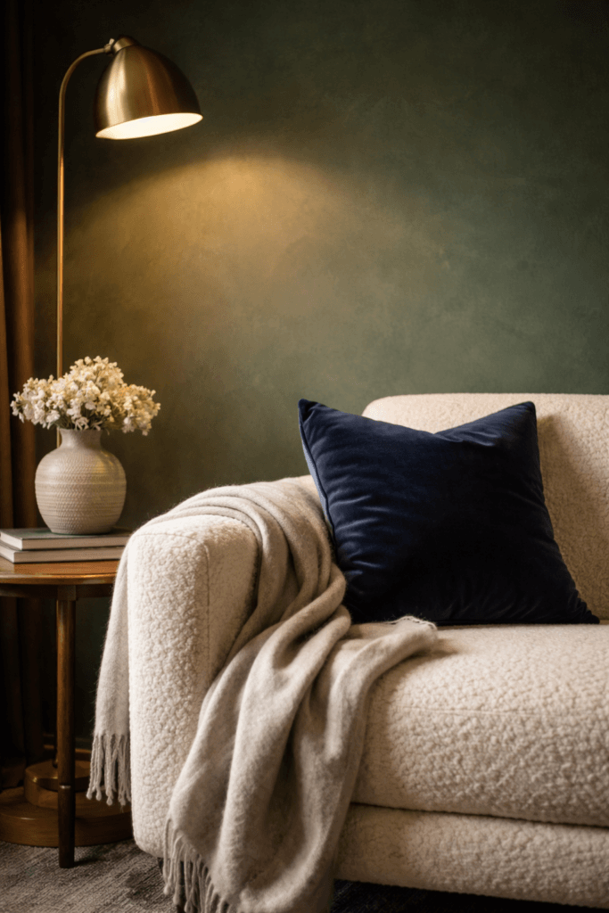
Material matters just as much as color. Linen, bouclé, wool, velvet, oak, walnut, travertine — these materials visually soften strong tones. High-gloss finishes and cold metals amplify sharpness.
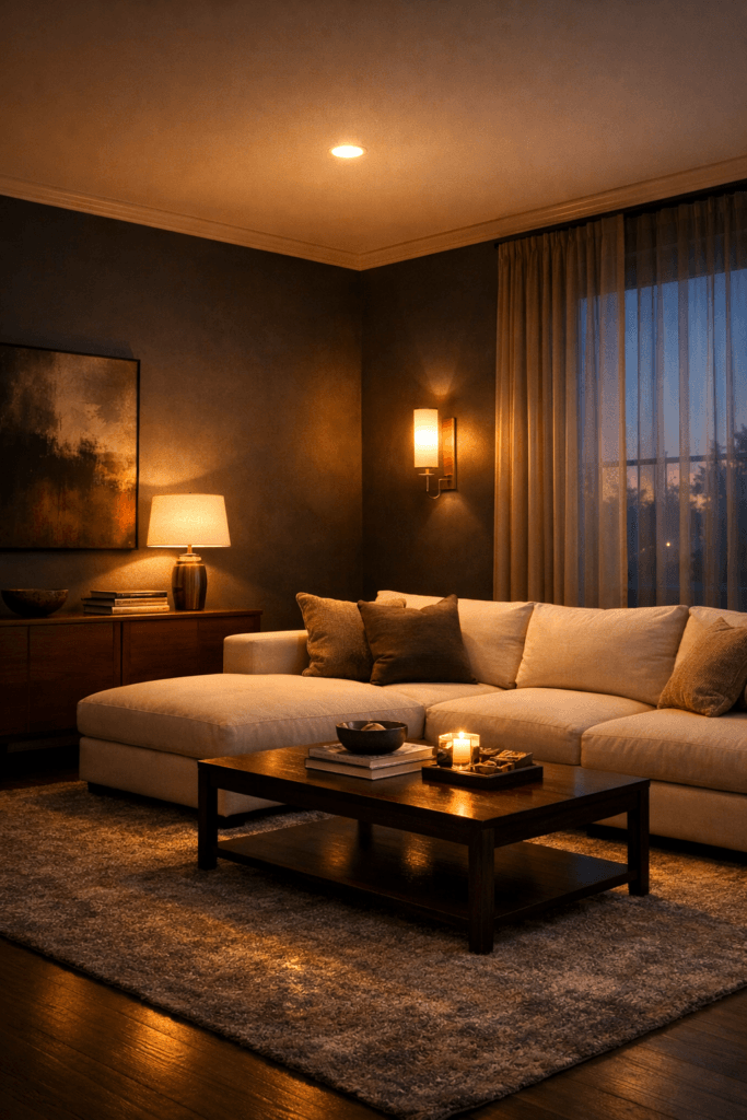
The second mistake homeowners make is relying on overhead lighting only. Cool white bulbs flatten bold paint. Warm layered lighting adds dimension.
Interior design publications like Elle Decor consistently emphasize lighting temperature as a defining factor in how color is perceived within a room. A navy wall under cool light feels flat. The same wall under warm layered lighting feels rich and enveloping.
Why Bold Can Actually Make Small Rooms Feel Bigger
There’s another misconception worth addressing.
Many people avoid bold color in small rooms because they believe it will make the space feel tighter. In reality, darker tones visually recede. That means they can create depth when properly balanced.
A deep navy accent wall paired with warm oak floors and cream upholstery can make a compact living room feel grounded and expansive. Without warmth, however, that same navy wall can feel abrupt.
The difference is context.
Bold color without warmth feels abrupt.
Bold color with warmth feels architectural.
And architecture feels expensive.
The Foundation of Bold + Cozy
Think of bold color as the structure of a room — the backbone. Warmth is the comfort layer that makes structure livable.
When the two are balanced correctly, you get tension without discomfort. Depth without darkness. Drama without sterility.
That balance is what defines bold + cozy.
It’s not about choosing safer colors.
It’s about choosing smarter combinations.
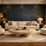
The Beige + Navy Formula That Always Works
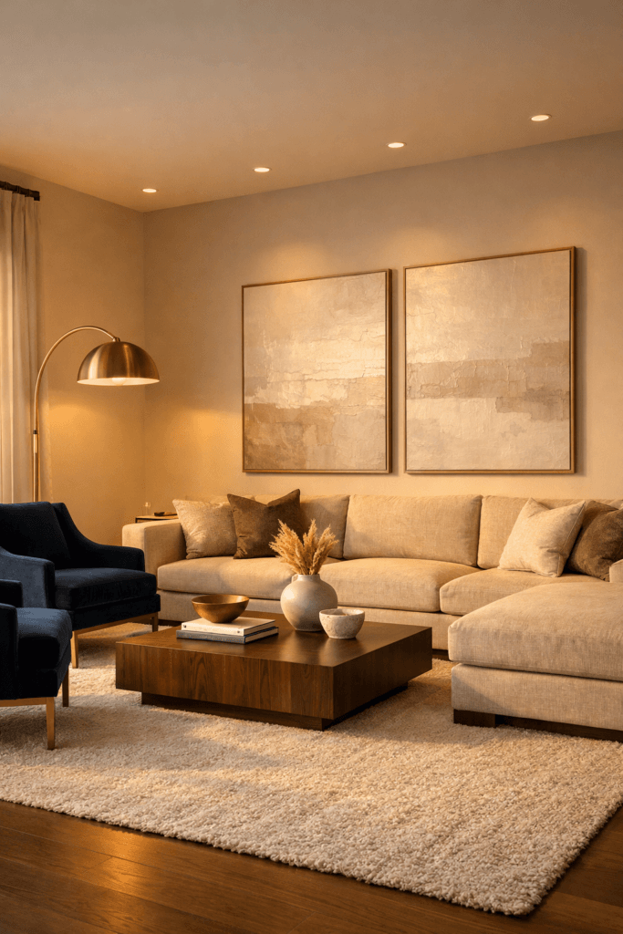
If there is one bold + cozy pairing that consistently feels elevated, timeless, and emotionally balanced, it is warm beige and deep navy.
This combination works in:
- Living rooms
- Bedrooms
- Offices
- Dining spaces
- Studio apartments
- Commercial lounges
It works because it respects visual hierarchy.
Beige expands.
Navy anchors.
Together, they create stability.
The 60–30–10 Designer Ratio
High-end interiors rarely split color evenly. Instead, designers often apply a 60–30–10 distribution model:
- 60% warm neutral (beige, cream, soft taupe)
- 30% bold anchor (navy wall, navy sofa, navy cabinetry)
- 10% accent (brass, walnut, black metal, stone)
The mistake most homeowners make is going 50/50. Equal distribution creates tension. It forces the eye to choose dominance instead of guiding it naturally.
When beige dominates the room, navy becomes intentional rather than overwhelming.
For example:
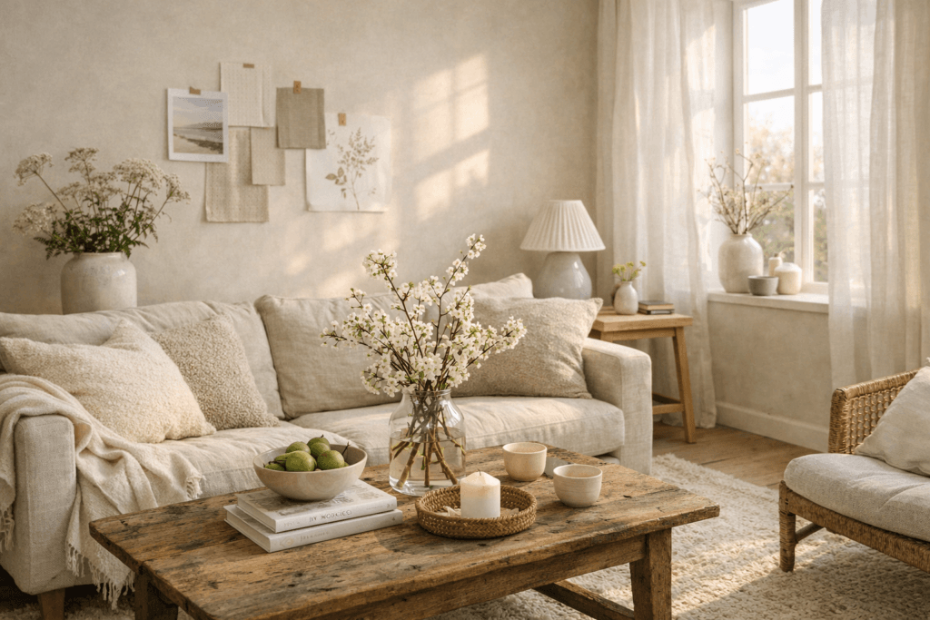
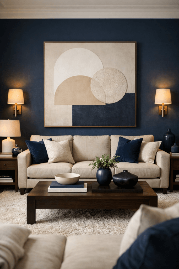
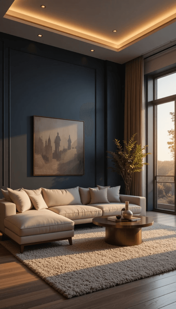
Living Room Application
A warm linen sofa, beige textured rug, oak coffee table, and cream curtains create the visual foundation. A navy accent wall or navy velvet chairs introduce depth without heaviness.
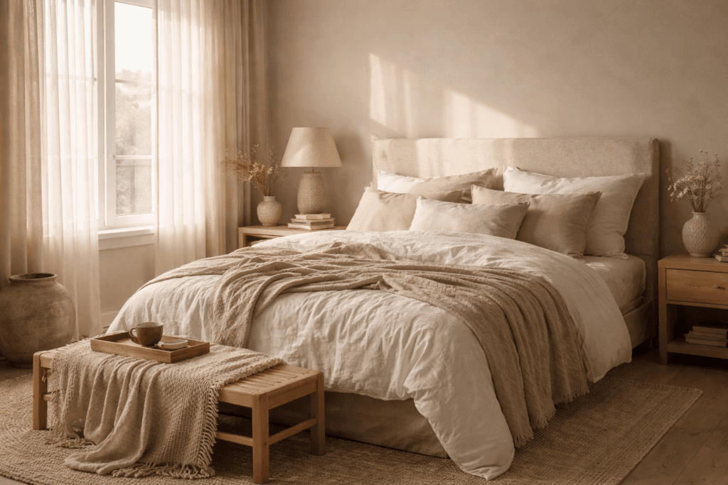
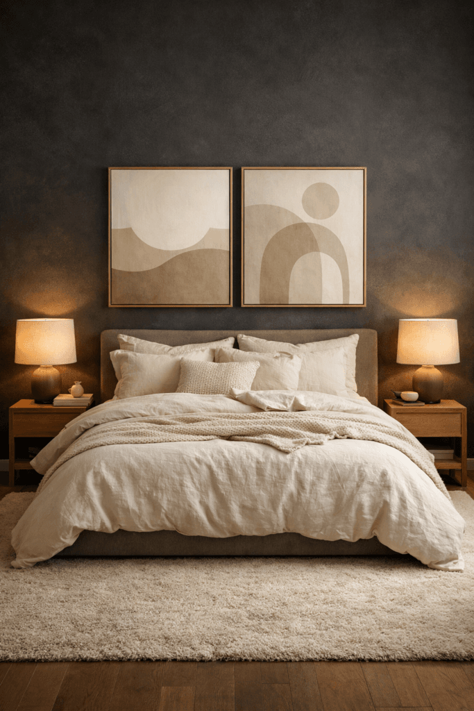
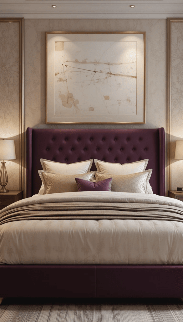
Bedroom Application
Cream bedding layered with a navy upholstered headboard and walnut nightstands feels calm but grounded. Add brass sconces and the space instantly feels curated.
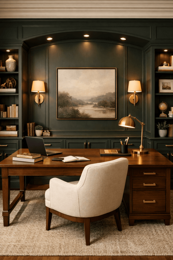
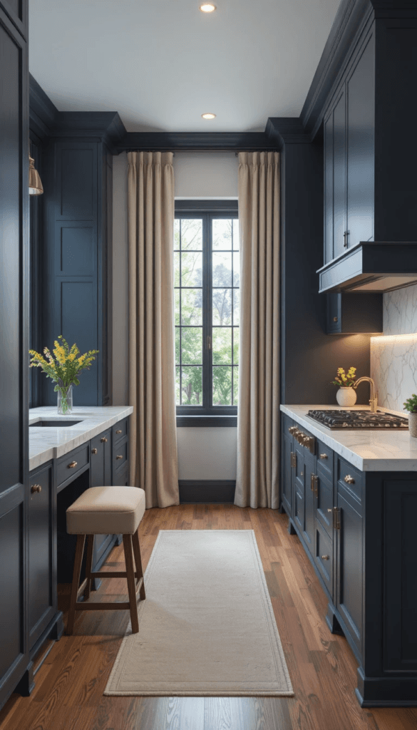
Home Office Application
Beige plaster walls paired with navy built-in shelving create authority without sterility. Cognac leather seating introduces warmth that prevents the navy from feeling corporate.
The goal is not to minimize navy.
The goal is to frame it.
Why Navy Feels Expensive
Deep navy behaves like a neutral when used properly. It offers the richness of black without the severity. It provides contrast without flattening the space.
Design publications such as Architectural Digest frequently showcase navy as a foundation color in luxury interiors because of its ability to add depth while remaining timeless.
Unlike trend-driven shades, navy is architectural. It feels permanent.
However, permanence must be softened.
The Role of Warm Undertones
Beige is not boring when it is warm. In fact, warm beige is the stabilizer that allows navy to shine.
Look for:
- Cream with slight golden undertones
- Soft taupe instead of gray
- Linen and sand tones
- Warm oak instead of ashy wood
Cool gray paired with navy often results in a flat, lifeless aesthetic. Warm beige paired with navy produces depth and dimension.
Material layering amplifies this effect. Matte navy paint feels richer than glossy finishes. Linen upholstery absorbs light. Bouclé adds softness. Wool rugs ground the space.
Texture prevents navy from appearing two-dimensional.
Lighting Is Non-Negotiable
Even the perfect beige + navy pairing can fail under the wrong lighting.
Cool white bulbs (4000K and above) strip warmth from beige and flatten navy. The result is clinical instead of cozy.
Luxury interiors rely on warm lighting between 2700K–3000K.
Layer lighting at multiple heights:
- Overhead ambient light
- Floor lamps
- Table lamps
- Wall sconces
Layered lighting adds shadow depth. Shadow depth creates richness. Richness reads as expensive.
Design experts at Elle Decor consistently emphasize the impact of lighting temperature in enhancing darker hues. Without warmth in the light, navy cannot reach its full visual potential.
Repetition Creates Sophistication
One navy element feels accidental. Repeated navy elements feel curated.
Repeat navy in:
- Throw pillows
- Art frames
- Accent chairs
- Cabinetry
- Rug patterns
Repetition builds rhythm. Rhythm builds cohesion.
When beige dominates, navy anchors, warmth layers, and lighting softens, the room feels balanced.
Balanced spaces feel intentional.
Intentional spaces feel expensive.
Unexpected Bold Pairings That Still Feel Warm
Once you understand how to stabilize navy with warmth, you can confidently expand into richer territory.
Bold color does not have to mean dark and dramatic. It means confident. And confidence, when balanced correctly, feels refined rather than risky.
The secret is undertone management.
Every bold shade has an emotional temperature. Your job is not to mute it — it’s to support it.
Here are designer-approved bold + cozy combinations that consistently feel elevated.
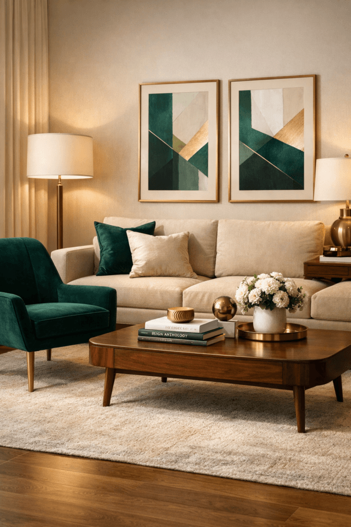
Emerald + Walnut: Organic Depth Without Drama
Emerald green is saturated, lush, and visually commanding. Used incorrectly, it can feel theatrical. Used properly, it feels tailored and grounded.
The stabilizer is walnut wood.
Walnut carries warmth and natural variation. That warmth softens emerald’s intensity and introduces an organic layer that keeps the room from feeling overly stylized.
For example:
- Emerald cabinetry paired with walnut shelving
- Emerald velvet chairs beside a walnut dining table
- Emerald accent wall with walnut console and brass lighting
The key is matte finishes and warm metals. Avoid chrome. Choose brass or aged bronze instead.
Luxury designers frequently rely on natural material layering to balance strong color, a technique often highlighted by Architectural Digest when showcasing high-end interiors.
Emerald alone can feel bold. Emerald grounded in walnut feels intentional.
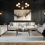
Charcoal + Cream: Depth Without Sterility
Charcoal is often misunderstood as cold. In reality, charcoal behaves like a softened black. It creates dramatic contrast while remaining more forgiving than pure black.
The mistake people make is pairing charcoal with stark white and cool gray.
Instead, pair charcoal with cream.
Cream introduces softness without reducing contrast. It absorbs intensity and allows charcoal to feel architectural rather than industrial.
Examples:
- Charcoal walls with cream linen sofa
- Charcoal kitchen cabinetry with warm marble backsplash
- Charcoal bedroom paired with layered ivory bedding
Lighting is crucial here. Warm light creates shadow gradients on charcoal surfaces, adding depth instead of flatness.
When cream dominates and charcoal anchors, the result feels calm and composed.
Terracotta + Soft Taupe: Warm Saturation Done Right
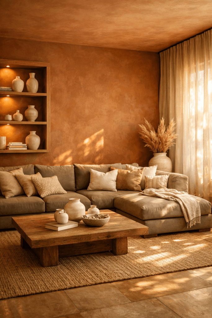
Terracotta is inherently warm. It carries undertones of rust, clay, and sunbaked earth. The challenge with terracotta is preventing it from overwhelming a space.
Soft taupe stabilizes it.
Taupe has warmth but remains neutral enough to keep terracotta grounded.
Consider:
- Terracotta accent wall with taupe upholstery
- Terracotta tile with taupe cabinetry
- Terracotta art layered over neutral walls
Texture enhances this pairing. Linen curtains, wool rugs, and matte plaster finishes elevate the combination beyond trend territory.
Terracotta works especially well in small spaces because it introduces warmth without needing additional bold contrast.
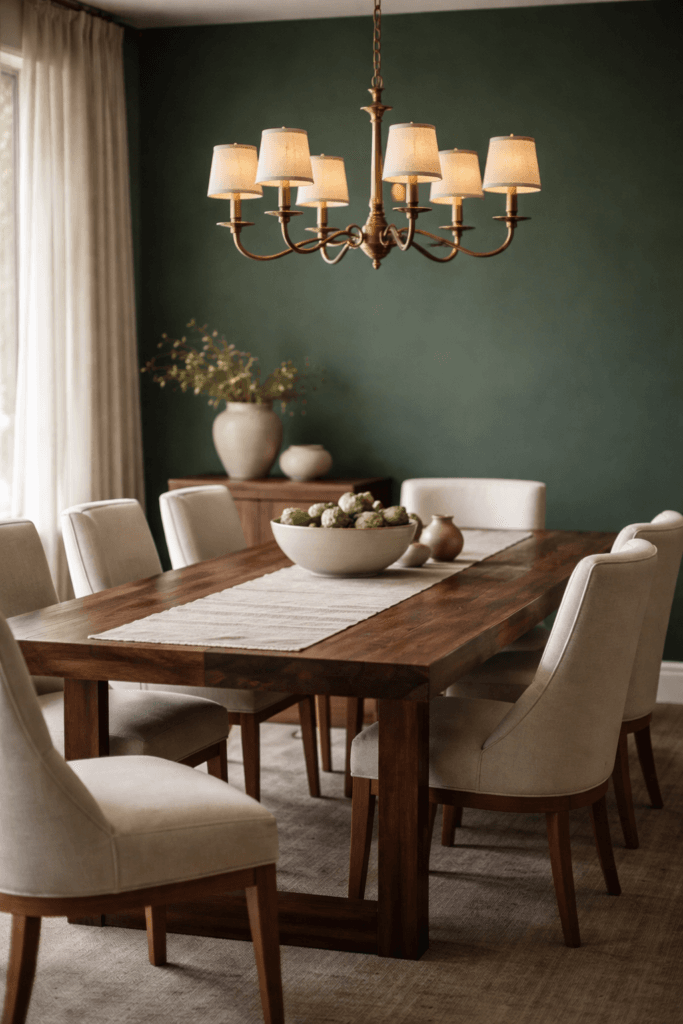
Forest Green + Brass: Moody but Inviting
Forest green carries depth similar to navy but with an organic undertone. On its own, it can feel heavy.
Brass introduces warmth and reflection.
The metallic glow from brass fixtures, hardware, or lighting creates movement within the green, preventing it from appearing flat.
Applications:
- Forest green cabinetry with brushed brass hardware
- Green accent wall with brass sconces
- Green velvet sofa paired with warm metallic decor
Interior publications like Elle Decor frequently emphasize the power of warm metallic accents in balancing darker tones. Brass adds visual warmth and breaks up saturation.
The result feels moody, but never cold.
Deep Plum + Beige: Understated Drama
Plum is rarely used because people fear it will feel overpowering. In reality, plum layered with beige creates softness and sophistication.
Plum carries warmth. Beige neutralizes excess intensity.
Use plum strategically:
- Accent chairs
- Statement walls
- Upholstery
- Artwork
Pair with cream textiles, warm wood tones, and layered lighting.
The key with plum is restraint. Let it anchor, not dominate.
The Common Thread
Every successful bold pairing shares three traits:
- Warm undertone support
- Material softness
- Lighting warmth
Avoid combining bold tones exclusively with cool gray and bright white unless you intentionally want a modern editorial aesthetic.
In smaller rooms especially, limit bold to one primary anchor. Let neutrals dominate the surrounding field.
Confidence comes from control.
When bold color is balanced by warmth, texture, and light, it doesn’t feel loud.
It feels curated.
How to Make Bold Color Feel Calm Instead of Loud
Bold color doesn’t overwhelm a space.
Uncontrolled contrast does.
There’s a major difference between a room that feels intentionally dramatic and one that feels visually chaotic. The line between the two comes down to restraint, repetition, and rhythm.
Luxury interiors rarely feel loud — even when they use saturated color — because they are strategically composed.
Here’s how designers make bold color feel calm.
Control the Visual Field
The eye needs somewhere to rest.
When every surface competes for attention — bold wall, bold sofa, patterned rug, colorful art, metallic accents — the room feels overstimulating. Bold color should anchor the room, not fight for dominance.
Instead of spreading color evenly across all elements, create a hierarchy:
- One dominant bold surface (wall, sofa, cabinetry)
- Supporting neutrals that absorb attention
- Minimal accent repetition
For example:
If you choose forest green cabinetry, keep walls neutral. If you install a navy sectional, avoid patterned navy rugs and busy art in the same tone.
Control creates calm.
Designers often speak about “negative space” in interiors — allowing parts of the room to breathe visually. Publications like Architectural Digest regularly highlight how restraint elevates strong color rather than muting it.
Bold does not require clutter.
Use Texture to Soften Saturation
Flat bold paint can feel abrupt.
Textured bold surfaces feel dimensional.
Instead of high-gloss finishes, consider:
- Matte paint
- Limewash
- Velvet upholstery
- Bouclé
- Wool
- Natural wood
Texture absorbs and diffuses light. Diffused light reduces harsh contrast.
For example, a matte navy wall with warm sconces feels enveloping. A glossy navy wall under cool overhead lighting feels sharp.
Texture introduces depth without increasing visual noise.
Layer Lighting at Multiple Heights
Lighting determines how color is experienced emotionally.
Overhead lighting alone flattens bold paint. The result is intensity without nuance.
Layered lighting adds softness.
Incorporate:
- Table lamps
- Floor lamps
- Wall sconces
- Under-cabinet lighting
- Accent lighting
Choose warm bulbs (2700K–3000K). Warm lighting enriches bold hues and enhances beige, cream, and wood tones surrounding them.
Design resources such as Elle Decor frequently emphasize lighting as one of the most critical components in achieving warmth in darker interiors.
Lighting is not decoration.
It is emotional control.
Repeat the Color Intentionally
Repetition creates cohesion. Random placement creates chaos.
If you introduce deep plum in a chair, repeat it subtly:
- In artwork
- In a throw pillow
- In a vase
- In trim detail
Two to three subtle repetitions are enough.
When bold color is used only once, the space can feel unfinished or accidental. Overusing it throughout the room often creates visual aggression and tension. However, repeating the color in subtle, intentional echoes transforms it into something curated and cohesive.
Curation reads as expensive.
Balance Hard Surfaces With Soft Ones
Bold colors often sit on hard surfaces: cabinetry, walls, tile. Hard surfaces reflect light sharply.
Balance them with softness:
- Upholstered seating
- Fabric curtains
- Plush rugs
- Cushions
- Layered bedding
Soft materials temper strong color.
A navy kitchen with stone counters and brass hardware feels elevated. Add a textured runner and upholstered stools, and it suddenly feels welcoming.
Warmth is rarely just about hue.
It’s about touch.
Limit Competing Patterns
Bold color is already a statement. Pattern introduces movement. Too much of both creates instability.
If you want patterned rugs or wallpaper, allow bold color to be quieter. If you want saturated paint, simplify patterns.
Calm spaces feel intentional because they are edited.
Editing is the difference between styling and decorating.
Bold + Cozy Is Emotional
Ultimately, bold + cozy works because it balances contrast with comfort.
- Depth without darkness
- Saturation without sharpness
- Drama without discomfort
When warmth is layered through materials, lighting, undertones, and restraint, bold color becomes immersive rather than intimidating.
And immersive spaces feel memorable.
Memorable spaces feel expensive.
Not because they shout.
Because they are controlled.