Introduction
Trending Finds Readers Are Loving
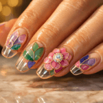
Explore affordable luxe discoveries people are clicking on right now.
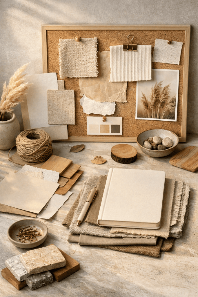
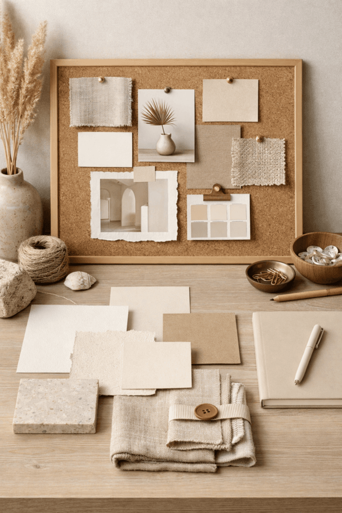
See What's TrendingWarm neutrals moodboards are the foundation of elevated minimalism. Rather than relying on bold color, sharp contrast, or trend-driven palettes, these moodboards create calm, cohesion, and a quiet confidence that feels timeless instead of temporary. They are visually grounding without being boring and refined without feeling cold or restrictive.
For elevated minimalists, warm neutrals are not chosen out of caution or indecision. They are selected with intention. Beige, cream, camel, taupe, warm white, and soft brown tones work together to reduce visual noise while allowing texture, shape, proportion, and material to take center stage. When used correctly, these moodboards communicate restraint, clarity, and confidence.
At Bellencia, these type of moodboards are used across fashion, beauty, and interiors as a strategic design language. They support consistency, longevity, and emotional ease, which are core principles of elevated minimalism.
Why Warm Neutrals Moodboards Feel More Elevated Than Trend Colors
Warm neutrals moodboards feel elevated because they do not compete for attention. Instead of dominating a space or outfit, warm neutrals support balance. Trend colors often demand focus, forcing every other element to work around them. Warm neutrals, however, allow the eye to move naturally and comfortably.
As a result, these moodboards reduce visual fatigue. They create environments and visuals that feel calm even when layered. This restraint is a defining characteristic of quiet luxury. The absence of visual noise allows craftsmanship, texture, and form to become the focal points.
Additionally, these moodboards photograph beautifully in natural light. Soft beige and cream tones reflect light gently, creating depth without harsh contrast. This quality explains why warm neutrals appear consistently in editorial spreads, luxury interiors, and high-end lifestyle branding. Their adaptability also allows them to transition seamlessly across seasons without feeling outdated.
Defining Warm Neutrals Within Moodboards
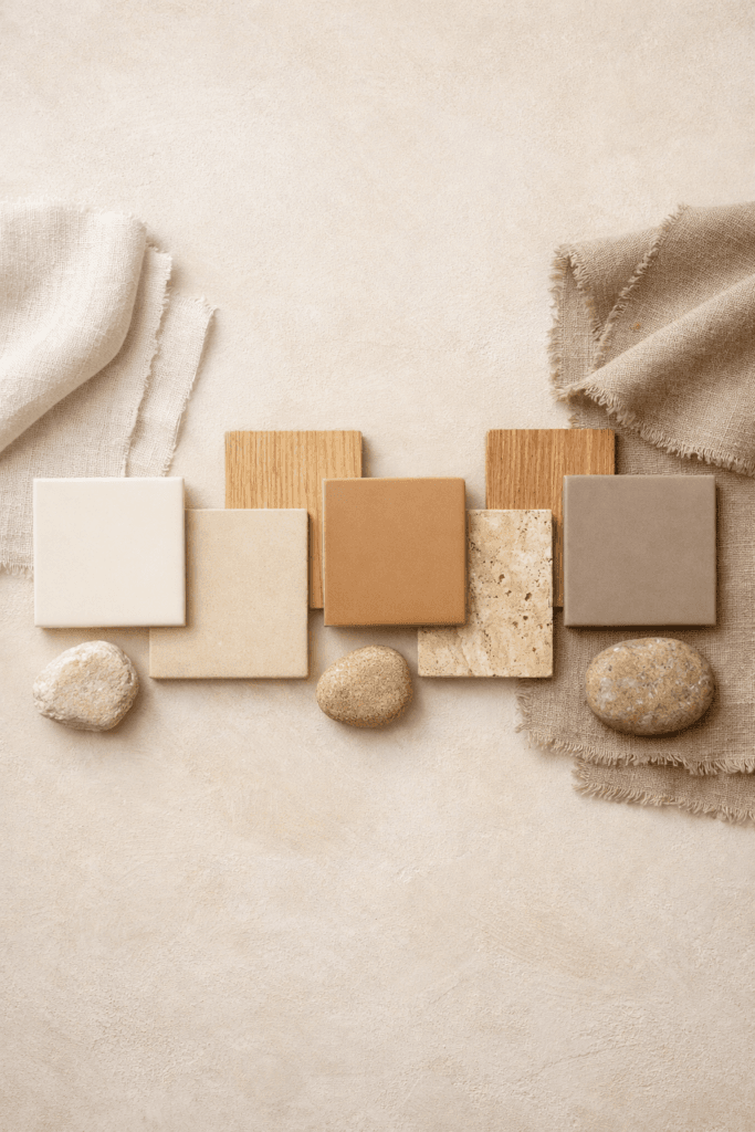
Warm neutrals moodboards rely on tones with earthy or golden undertones rather than cool or stark bases. These undertones add warmth, depth, and approachability while still maintaining structure and polish.
Common warm neutral shades include cream, warm ivory, beige, sand, camel, caramel, taupe, greige, and soft mocha. Each of these tones plays a specific role. Cream and ivory soften a palette. Camel and caramel add richness. Taupe and greige provide grounding. Soft browns introduce warmth without heaviness.
When layered intentionally, these shades create dimension without overwhelming the composition. Instead of relying on contrast, these moodboards rely on harmony. This harmony is what gives elevated minimalism its calm, grounded presence.
The Importance of Undertones in Warm Neutrals Moodboards
One of the most overlooked aspects of these moodboards is undertone consistency. Not all neutrals work together, even when they appear similar at first glance. Undertones determine whether a palette feels cohesive or fragmented.
For example, pairing cool gray with camel can disrupt visual flow. The cool undertone pulls away from the warmth of the palette, creating tension. In contrast, combining taupe, cream, and warm beige creates a seamless transition that feels intentional.
Elevated minimalists understand the importance of editing for undertones. If a shade introduces coolness or visual friction, it is removed, even if it is technically neutral. This disciplined editing process is essential to maintaining cohesion.
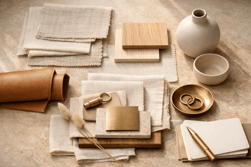
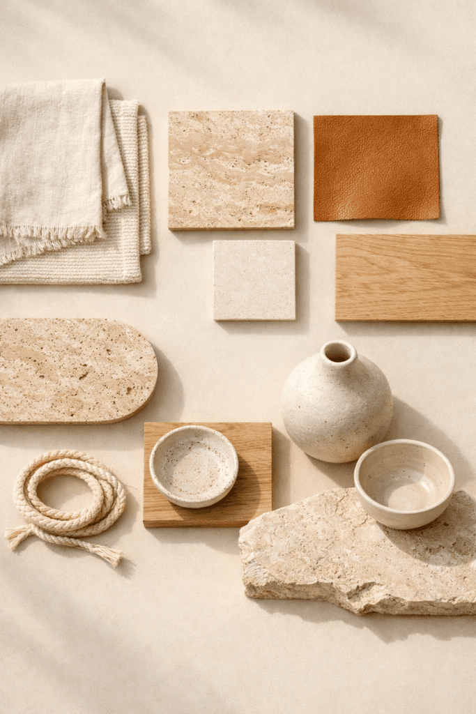
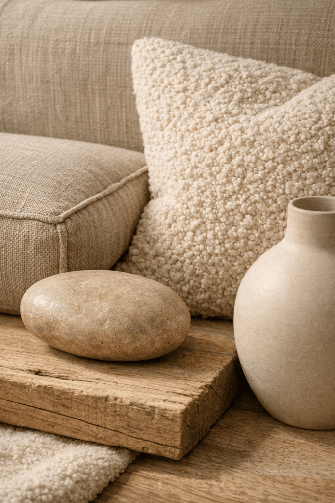
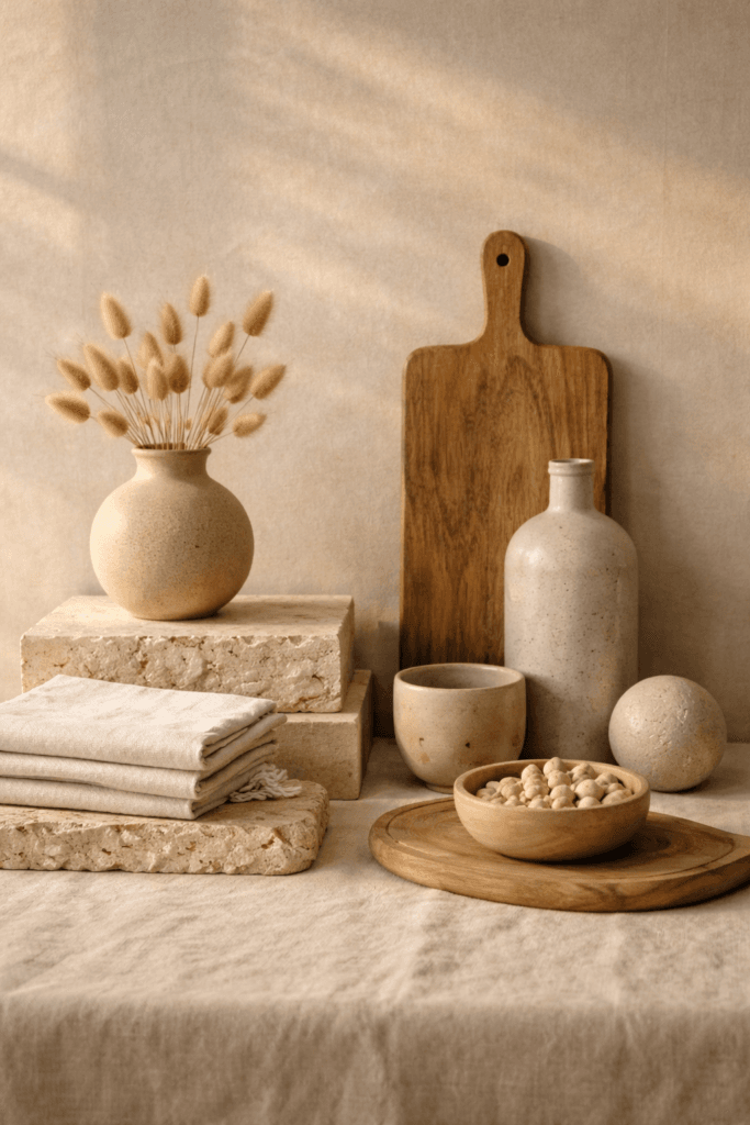
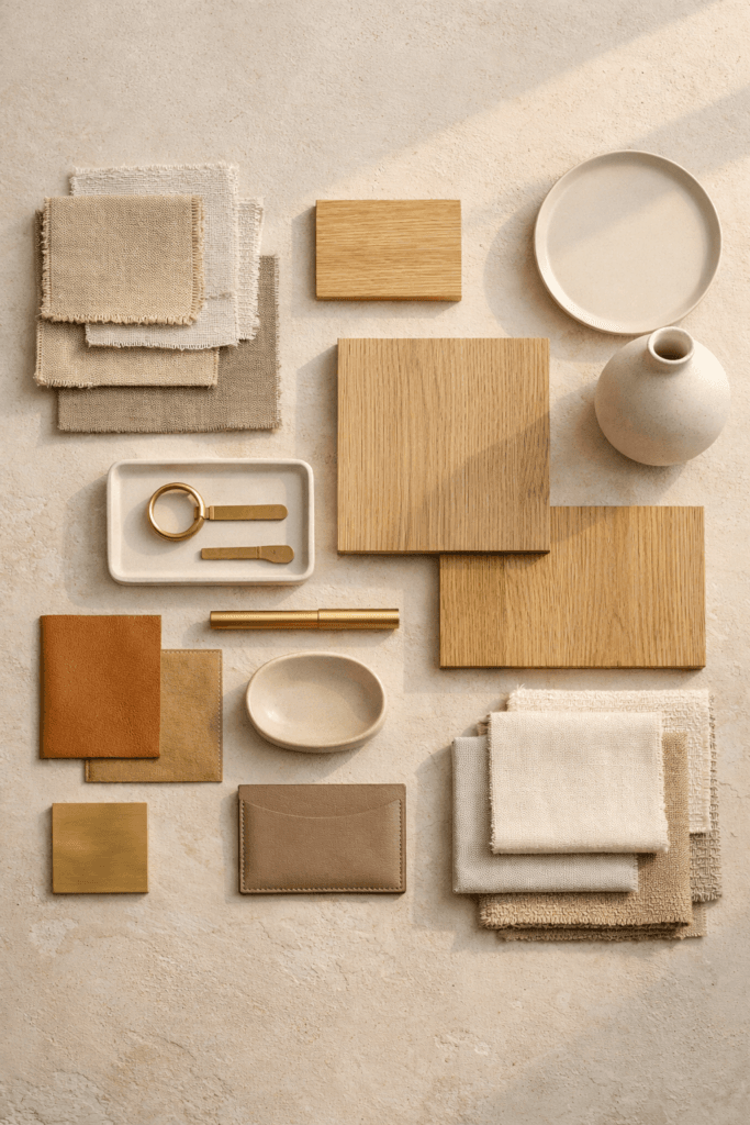
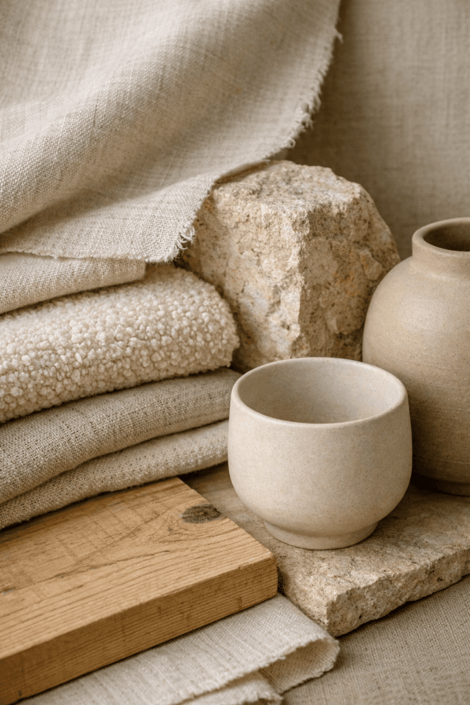
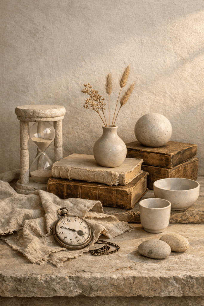
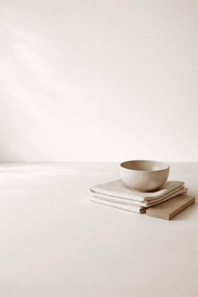
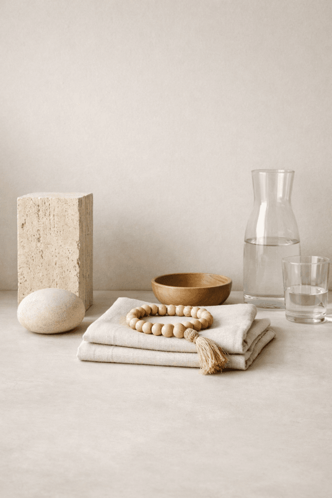
Texture as the Foundation of Warm Neutrals Moodboards
Because warm neutrals moodboards use a restrained color range, texture becomes the primary source of visual interest. Texture replaces color as the main design language. Without texture, neutral palettes can feel flat or unfinished.
Effective these type of moodboards incorporate a variety of materials, such as linen, wool, cotton, soft knits, woven textiles, stone, matte ceramics, wood grain, and brushed or muted metals. These materials create contrast through finish and feel rather than hue.
Texture also adds depth. A smooth stone surface next to a woven textile introduces variation without disrupting calm. A soft knit layered against structured wood creates balance. This layering is subtle, but it is essential. Without texture, even the most refined palette loses impact.
How Warm Neutrals Moodboards Create Emotional Calm
Warm neutrals moodboards influence more than aesthetics. They shape emotional response. Warm tones are naturally associated with comfort, stability, and ease. This emotional quality makes them especially powerful in environments designed for rest, focus, or clarity.
This explains why warm neutrals are frequently used in luxury hotels, wellness spaces, and minimalist homes. Visual simplicity reduces cognitive load. When the eye is not overstimulated, the mind feels calmer.
For elevated minimalists, emotional calm is not a secondary benefit. It is a core objective. These moodboards support a lifestyle built around intention rather than excess.
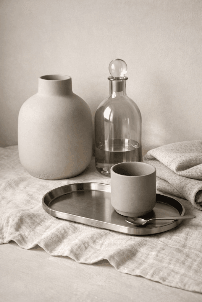
Structuring Warm Neutrals Moodboards With Balance
Balance is essential in warm neutrals moodboards. Without structure, even restrained palettes can feel cluttered or disorganized. A refined approach relies on clear hierarchy.
Typically, a balanced warm neutrals moodboard includes one dominant base tone, one or two supporting tones, and one grounding element such as wood, metal, or shadow. This structure creates repetition without monotony and cohesion without rigidity.
When balance is missing, moodboards lose their sense of purpose. Too many similar tones blur together. Too many accents introduce distraction. Elevated minimalism depends on restraint supported by structure.
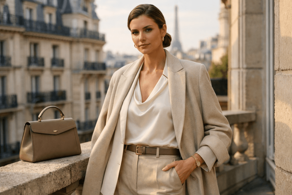
Warm Neutrals Moodboards in Fashion Styling
In fashion, these moodboards support timeless wardrobes built around versatility and quality. Camel coats, cream sweaters, taupe trousers, warm white layering pieces, and soft brown accessories form the backbone of elevated minimalist style.
These pieces layer effortlessly. They transition across seasons without requiring constant replacement. As a result, these moodboards support capsule wardrobes and reduce decision fatigue.
Warm neutrals also allow tailoring and silhouette to stand out. When color recedes, craftsmanship becomes visible. A well-cut coat or structured trouser reads as more refined when it is not competing with bold hues.
Warm Neutrals Moodboards in Beauty and Grooming
Warm neutrals moodboards translate seamlessly into beauty and grooming routines. Milky nude nails, soft beige blushes, warm brown eyeshadows, and sheer finishes enhance natural features rather than overpower them.
This approach aligns with quiet luxury. Instead of dramatic transformation, the goal is subtle enhancement. Skin texture, balance, and healthy glow become the focal points.
For elevated minimalists, beauty routines rooted in warm neutrals feel sustainable and repeatable. They age well and remain appropriate across different phases of life.
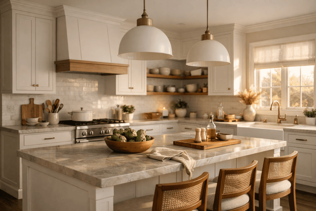
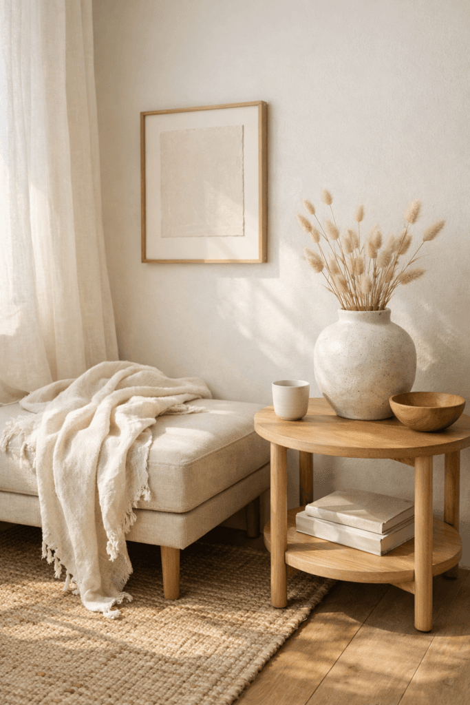
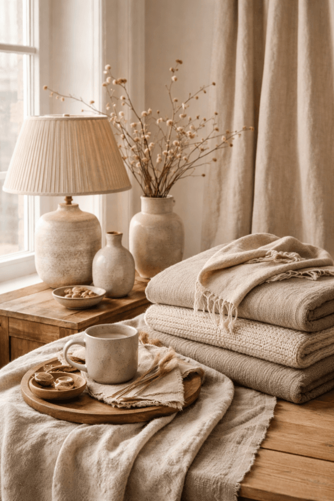
Warm Neutrals Moodboards in Interior Design
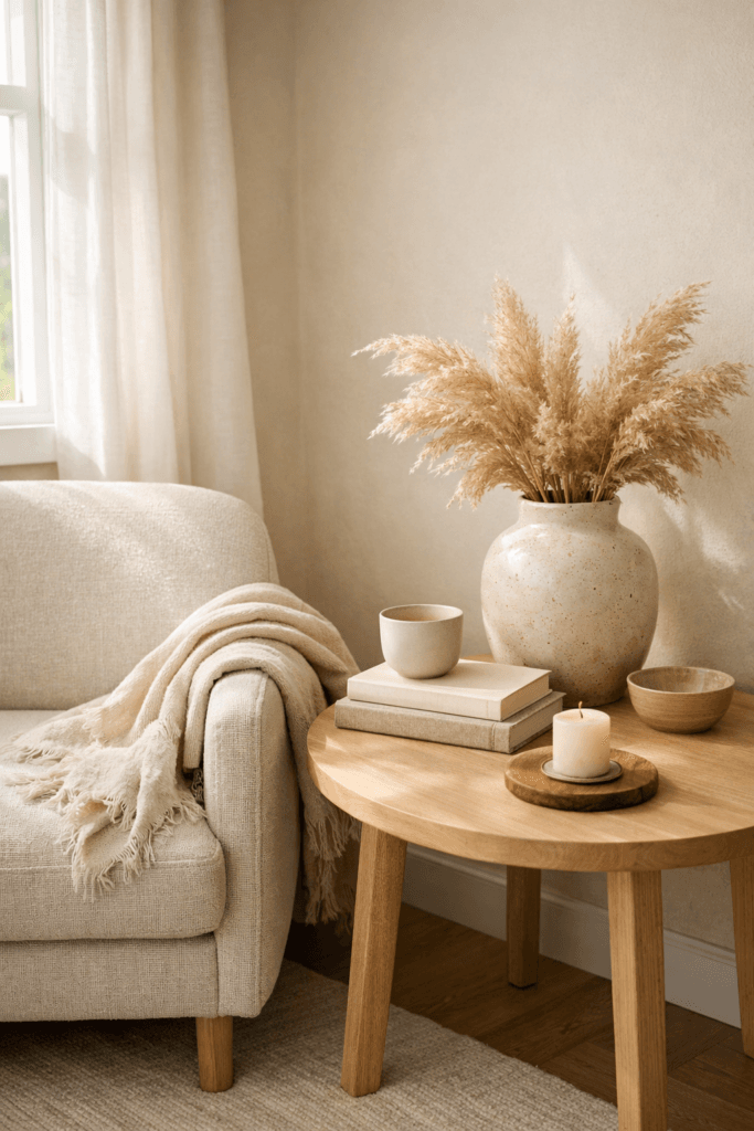
Warm neutrals moodboards are particularly effective in interior spaces. Linen upholstery, wood furniture, stone surfaces, and neutral ceramics create environments that feel welcoming and grounded.
Unlike stark minimalism, warm neutrals add softness. Spaces feel lived-in rather than rigid. Architectural details, lighting choices, and material quality become focal points instead of color.
This approach supports longevity. Interiors built on these type of moodboards evolve gracefully rather than requiring constant updates.
Why Elevated Minimalists Choose Warm Neutrals Moodboards
Elevated minimalists choose warm neutrals moodboards because they support longevity and consistency. Rather than rebuilding an aesthetic every season, warm neutrals allow gradual evolution.
This philosophy aligns with choosing better instead of more. Quality materials, thoughtful design, and intentional repetition replace excess. These moodboards encourage refinement through restraint.
They also support cohesion across lifestyle categories. Fashion, beauty, and home aesthetics feel aligned rather than fragmented.
Common Mistakes That Undermine Warm Neutrals Moodboards
Even refined palettes can lose impact when misused. Common mistakes include mixing warm and cool undertones, relying on a single beige tone without variation, ignoring texture, overusing stark white, or adding contrast purely for visual interest.
These missteps dilute the calm and cohesion that neutrals moodboards are meant to create. Avoiding them preserves elevation.
Editing as the Final Step in Warm Neutrals Moodboards
Editing is the final and most important step in creating warm neutrals moodboards. Elevated minimalists understand that removing elements often strengthens the composition.
Each element should serve a purpose. If it does not contribute to harmony, depth, or balance, it does not belong. This discipline separates elevated minimalism from unfinished simplicity.
The Bellencia Perspective on Warm Neutrals Moodboards
At Bellencia, warm neutrals moodboards represent more than an aesthetic choice. They reflect a lifestyle rooted in intention, restraint, and confidence. Warm neutrals allow beauty to exist quietly, without explanation or excess.
This philosophy extends across Bellencia’s editorial content, visual styling, and creative direction. Consistency becomes the signature.
How Warm Neutrals Moodboards Support Long-Term Visual Identity
Warm neutrals moodboards play a critical role in establishing a long-term visual identity. For elevated minimalists, consistency is not restrictive—it is strategic. A cohesive neutral foundation allows style to feel recognizable without becoming predictable.
When these moodboards are used consistently across platforms, they reinforce trust and familiarity. Whether applied to personal style, interior spaces, or brand visuals, the palette becomes part of the identity itself. Viewers begin to associate calm, refinement, and intentionality with the repeated use of warm neutrals.
This consistency is especially valuable in digital spaces. These moodboards perform well across photography, video, and social platforms because they adapt easily to different lighting conditions and formats. They also create visual continuity when content is consumed quickly, such as on Pinterest or Instagram.
Additionally, moodboards reduce the pressure to constantly refresh visuals. Because the palette is not trend-dependent, updates can focus on texture, composition, or proportion rather than complete aesthetic overhauls. This approach saves time while preserving cohesion.
For elevated minimalists, this long-term stability is a form of luxury. It allows energy to be spent on refinement rather than reinvention. Warm neutrals moodboards become a reliable framework that supports growth, evolution, and clarity without visual disruption.
Final Thoughts
Warm neutrals moodboards are not about playing it safe. They are about choosing harmony with purpose. Through balance, texture, undertone awareness, and thoughtful editing, elevated minimalists create visuals that feel timeless, calm, and quietly powerful.
Warm neutrals do not demand attention.
They hold it.