
Wall Art Size Rules Designers Use to Instantly Elevate a Room
July 23, 2026
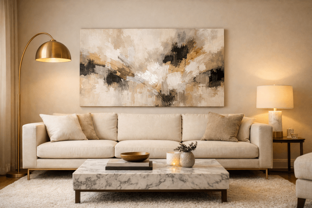
Trending Finds Readers Are Loving
Explore affordable luxe discoveries people are clicking on right now.
See What's TrendingWall art size is one of the fastest ways to make a room look elevated — or unintentionally unfinished.
Most homes do not look inexpensive because of furniture quality. They look unrefined because artwork is undersized.
Designers rarely guess when hanging art. Proportion is calculated. Placement is deliberate. Scale is intentional.
If your walls feel empty, awkward, or slightly off, the issue is often not what you chose — it’s how large it is.
The 2/3 Rule Designers Always Follow
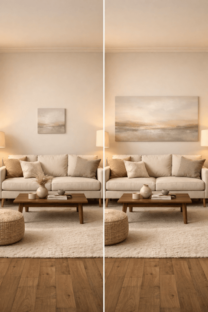
Art above a sofa should span approximately two-thirds the width of the furniture beneath it.
If your sofa measures 84 inches wide, your artwork grouping should land between 56 and 60 inches total width.
Anything significantly smaller begins to look disconnected.
When artwork floats too narrowly above a wide sofa, the eye reads imbalance. The room feels unfinished even if everything else is styled well.
For a deeper breakdown of how proportion affects overall luxury perception, review our guide on how to make your home look expensive on a budget.
Why Small Art Makes Expensive Furniture Look Cheap
Luxury interiors rely on visual weight.
Large furniture pieces require artwork that carries equal presence. When scale is mismatched, the imbalance lowers perceived value.
A $2,000 sofa paired with a 24-inch canvas will still feel underwhelming.
Design publications like Architectural Digest consistently emphasize proportion as one of the defining traits of high-end interiors.
Scale communicates confidence. Undersized art signals hesitation.
The Centerline Height Rule
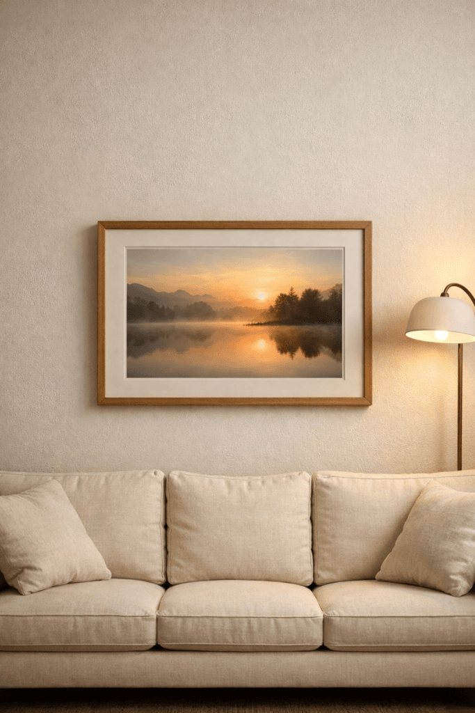
Artwork should typically be centered at 57–60 inches from the floor to the midpoint of the piece.
This measurement aligns with average eye level.
Hanging art too high is one of the most common design mistakes. It creates vertical disconnect and makes ceilings feel lower rather than taller.
Spacing between art and furniture also matters.
Leave 6–8 inches between the bottom of the frame and the top of the sofa. Larger gaps create visual drift.
Gallery Walls Without Chaos
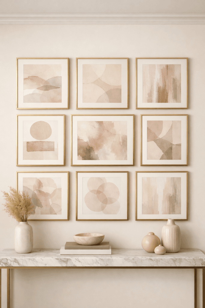
Gallery walls are often treated as decoration. Designers treat them as architecture.
Spacing between frames should remain consistent — typically 2–3 inches apart.
Outer edges should form a clear rectangular or square boundary.
When arrangement edges zigzag randomly, the wall begins to feel cluttered rather than curated.
If editing feels difficult, our breakdown of things that quietly make a home look cheap explains why simplification increases perceived luxury.
Oversized Art Is Safer Than Undersized
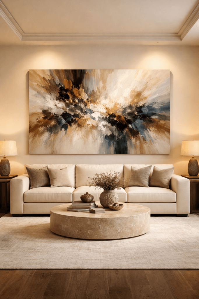
If you must choose between slightly too large and slightly too small, go larger.
Oversized art anchors a room. Small art exposes wall space.
Blank wall is not negative space when intentional. It becomes emptiness when proportion is incorrect.
Luxury is rarely timid.
It is deliberate, measured, and scaled correctly.
Single Statement Piece vs. Multi-Panel Art
Designers choose between one oversized statement piece or a balanced multi-panel layout — rarely something in between.
A single large canvas works best when the goal is calm, impact, and simplicity. Multi-panel arrangements introduce rhythm and structure.
The mistake most homeowners make is selecting medium-sized art that feels noncommittal.
Above a sofa, a single canvas should measure at least 48 inches wide in most living rooms. In larger spaces, 60 inches or more creates stronger balance.
For visual consistency across the entire room, review how scale interacts with floor coverage in our breakdown of rug scale rules designers follow.
The 8–10 Inch Expansion Rule
If artwork feels slightly small, increase width by 8–10 inches.
That subtle expansion often resolves imbalance instantly.
Designers rarely adjust by one or two inches. They scale decisively.
Rooms that look expensive typically feature art that feels generous rather than cautious.
Frame Thickness and Visual Weight
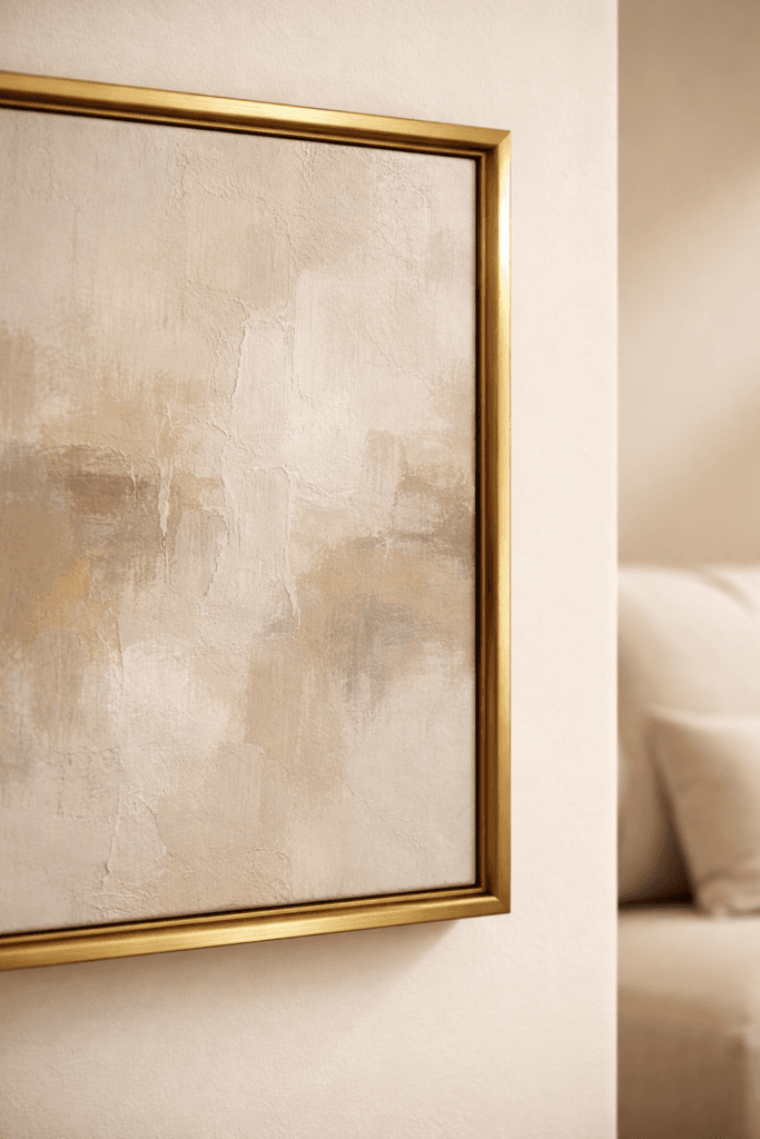
Size is not limited to canvas width.
Frame thickness contributes to perceived scale.
A thin frame on a large wall can make art appear smaller than it is. A substantial frame adds presence without increasing actual dimensions.
Warm finishes such as brushed gold or soft matte black maintain cohesion when repeated throughout the room.
Consistency of finish builds refinement. Random metal mixing lowers perceived intention.
Publications like House Beautiful consistently highlight repetition of materials as a defining luxury principle.
Spacing Rules for Multiple Pieces
Diptychs and triptychs require equal spacing.
Leave 2–3 inches between panels for smaller pieces and 3–5 inches for oversized sets.
The outer edges of grouped artwork should still follow the two-thirds width rule relative to furniture below.
When panels drift too far apart, the arrangement begins to feel scattered.
Controlled spacing creates unity.
Art in Dining Rooms and Bedrooms
Above a dining buffet, artwork should mirror approximately two-thirds the width of the furniture beneath it.
Vertical spacing should remain tight enough to feel anchored, typically 6–8 inches above the surface.
In bedrooms, art above the headboard should not exceed the width of the bed frame.
Overshooting bed width introduces imbalance.
If lighting is layered correctly, proportion becomes even more noticeable. Our guide on the designer lighting rule that instantly makes a home look expensive explains how lighting amplifies scale decisions.
When Blank Walls Are Better
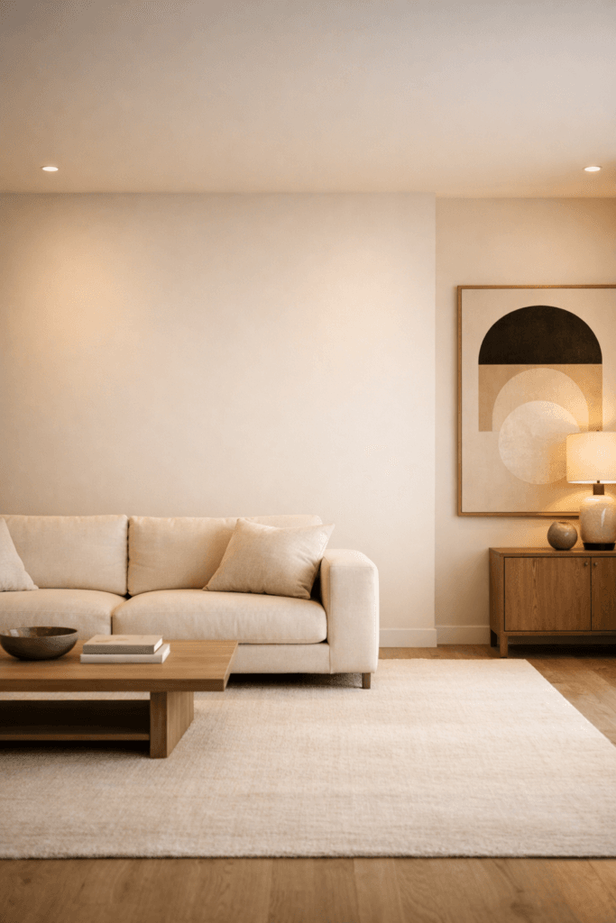
Not every wall requires decoration.
Luxury interiors often feature intentional negative space.
Placing undersized art on a large wall is worse than leaving the wall empty.
Intentional restraint communicates confidence. Random filling communicates uncertainty.
If a piece cannot meet proportion guidelines, wait until the right scale becomes available.
The Psychology of Large-Scale Art
Scale influences emotion.
When artwork is properly sized, the room feels grounded. When scale is timid, the space feels temporary.
Luxury interiors are not defined by price alone. They are defined by confidence in proportion.
Oversized art signals certainty. Undersized art suggests hesitation.
This shift is subtle but powerful. The eye reads imbalance before the brain consciously identifies it.
Design authority publications such as Elle Decor frequently highlight bold scale as a defining feature of elevated spaces.
The Ceiling Illusion Effect
Proper art placement can make ceilings appear taller.
When artwork is hung too high, vertical proportion becomes distorted. The wall feels disconnected from the furniture below it.
When art is centered correctly at eye level, the room feels balanced and architectural.
Correct placement reinforces ceiling height rather than fighting it.
If proportion throughout the room feels slightly off, revisit our complete breakdown of how to make a home look expensive on a budget to evaluate scale across furniture, rugs, and lighting together.
The Editing Principle
Adding more artwork does not solve imbalance.
Refinement begins with subtraction.
If a wall feels crowded, remove one piece. If an arrangement feels chaotic, simplify the grouping. When scale is corrected, fewer pieces often create stronger impact.
Luxury design is structured, not excessive.
The Designer Proportion Checklist
- Artwork spans roughly two-thirds the width of the furniture beneath it
- Centerline sits at 57–60 inches from the floor
- Spacing between art and furniture measures 6–8 inches
- Gallery wall edges form a clean rectangular boundary
- Oversized pieces are favored over undersized ones
- Frame finishes repeat other materials in the room
If even one of these elements is misaligned, the room may feel slightly unfinished.
Proportion compounds. When art scale, rug size, and lighting height align together, the room instantly appears more expensive.
Wall Art Is Structural, Not Decorative
Many homeowners treat artwork as an accessory.
Designers treat it as architecture.
Before replacing furniture, reassess scale.
Before purchasing more decor, correct proportion.
Once artwork size aligns with furniture width and lighting layers reinforce it, the transformation is immediate.
Luxury is not about excess.
Luxury is controlled proportion, deliberate placement, cohesive repetition, and disciplined editing.
Scale the art correctly. Center it intentionally. Repeat finishes consistently.
The room will elevate without adding anything else.
Bellencinista Notes
Undersized art quietly lowers a room’s perceived value. Let your artwork span at least two-thirds the width of the furniture beneath it, center it at eye level, and repeat frame finishes throughout the space. Proportion first. Accessories second.