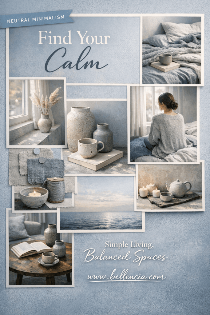
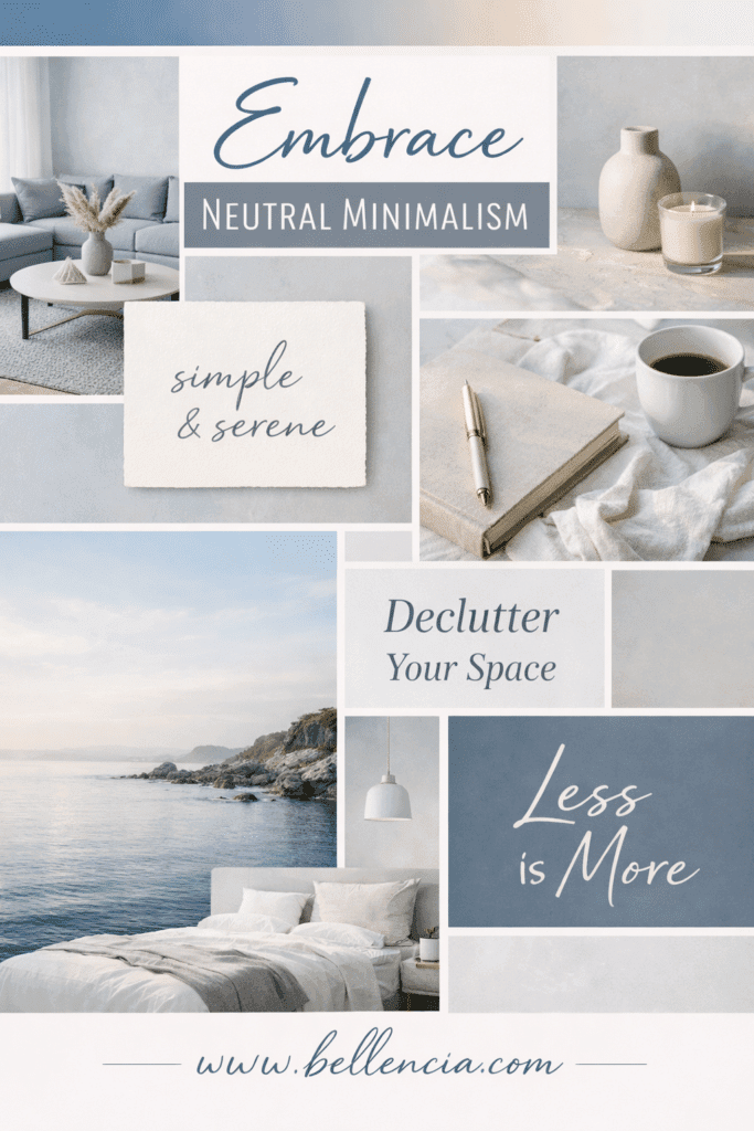
In a world saturated with visual noise, cool-toned moodboards have emerged as a powerful design solution for anyone craving calm, clarity, and emotional balance. Blues, greys, soft sages, silvers, and muted lavenders don’t just look beautiful — they actively slow the nervous system, making spaces feel grounded, expansive, and intentional. Whether you’re styling an interior, planning a Pinterest board, or refining a brand identity, cool-toned moodboards offer a visual exhale.
Unlike warm palettes that energize and stimulate, cool tones are restorative. They bring order to creative chaos and offer a sense of quiet luxury that feels elevated without trying too hard. That’s why they perform exceptionally well across Pinterest, interior design inspiration, lifestyle branding, and minimalist aesthetics. They don’t demand attention — they earn it.
This article explores why cool-toned moodboards are so effective, how they influence mood and perception, and how you can build them strategically for interiors, branding, and content creation. If your goal is to design spaces and visuals that feel calm, cohesive, and emotionally intelligent, this is your blueprint.
Why Cool Tones Instantly Calm a Space
Color psychology plays a critical role in how environments are experienced. Cool tones — particularly blues, greys, and greens — are associated with tranquility, stability, and mental clarity. These hues mimic elements found in nature: sky, water, stone, mist, and foliage. When used intentionally, they signal safety and stillness to the brain.
Cool-toned moodboards work because they visually lower contrast and reduce stimulation. This makes them ideal for bedrooms, living spaces, offices, and wellness-focused interiors. They’re also powerful in branding, where trust and professionalism matter.
Instead of overwhelming the eye, cool palettes guide it gently. That’s why these boards feel breathable, polished, and emotionally balanced.
The Emotional Intelligence of Cool-Toned Design
Design isn’t just about aesthetics — it’s about emotional impact. Cool-toned moodboards are especially effective because they align with emotional intelligence. They don’t shout. They communicate calmly and confidently.
In lifestyle branding and interior planning, this creates a sense of control and refinement. In digital spaces like Pinterest, it encourages longer engagement, saves, and trust. People return to visuals that make them feel good, not overwhelmed.
Cool tones are often associated with clarity, logic, and serenity — qualities that modern audiences crave in both physical and digital environments.
Why Cool-Toned Moodboards Perform So Well on Pinterest
Pinterest is a planning platform. Users arrive with intention — to design a room, plan a lifestyle shift, refine a brand, or create a calming environment. Cool-toned moodboards meet that intent perfectly.
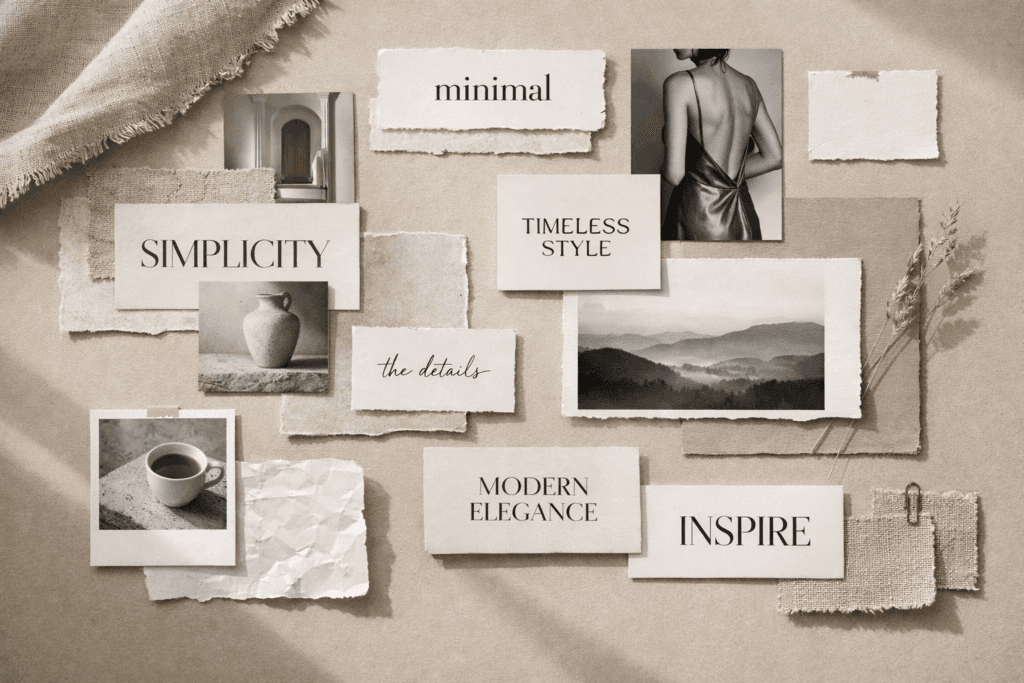
They photograph beautifully, scale well across vertical formats, and pair seamlessly with minimalist typography and editorial layouts. Because they feel timeless rather than trendy, they continue circulating long after posting.
Search terms like “calm bedroom,” “neutral living room,” “cool toned aesthetic,” and “minimal interior moodboard” consistently perform well — and cool-toned visuals dominate those results.
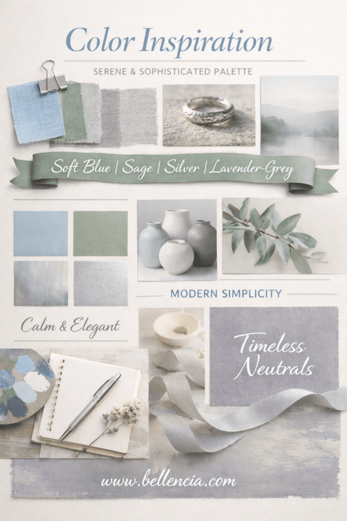
Choosing the Right Cool Palette

Not all cool tones create the same effect. Selecting the right palette depends on the emotional outcome you want.
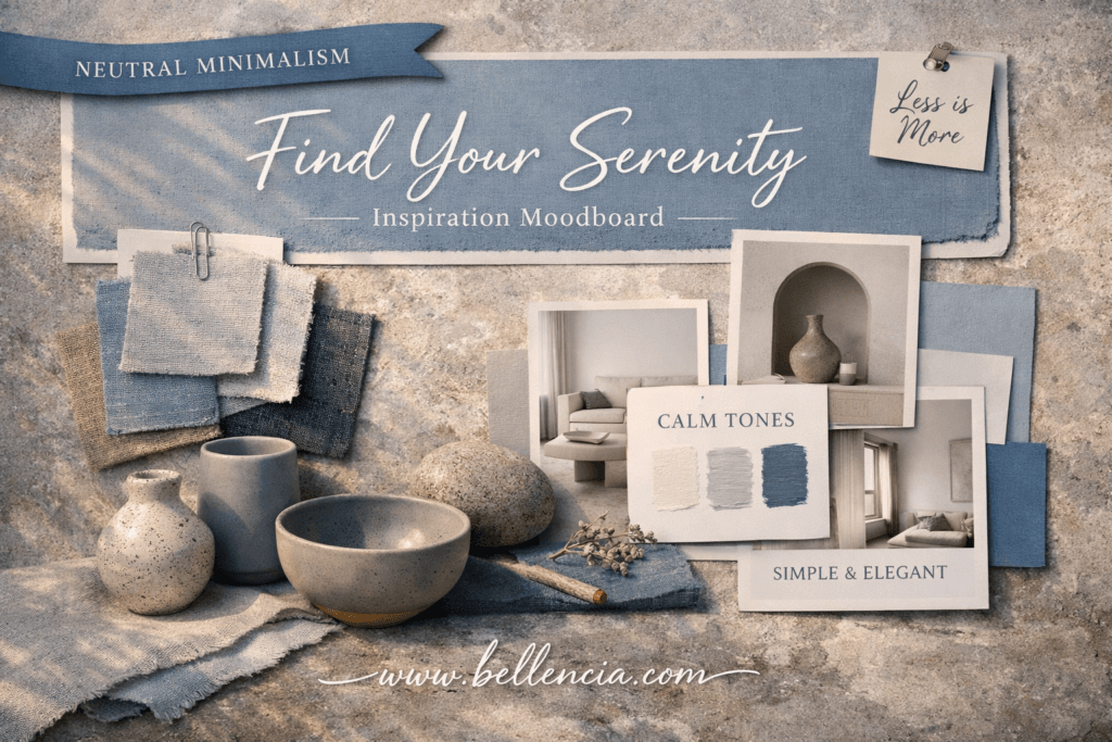
Soft blues and blue-greys evoke openness, airiness, and clarity — ideal for bedrooms and offices.
Sage and muted green-greys feel organic and restorative — perfect for wellness spaces and living rooms.
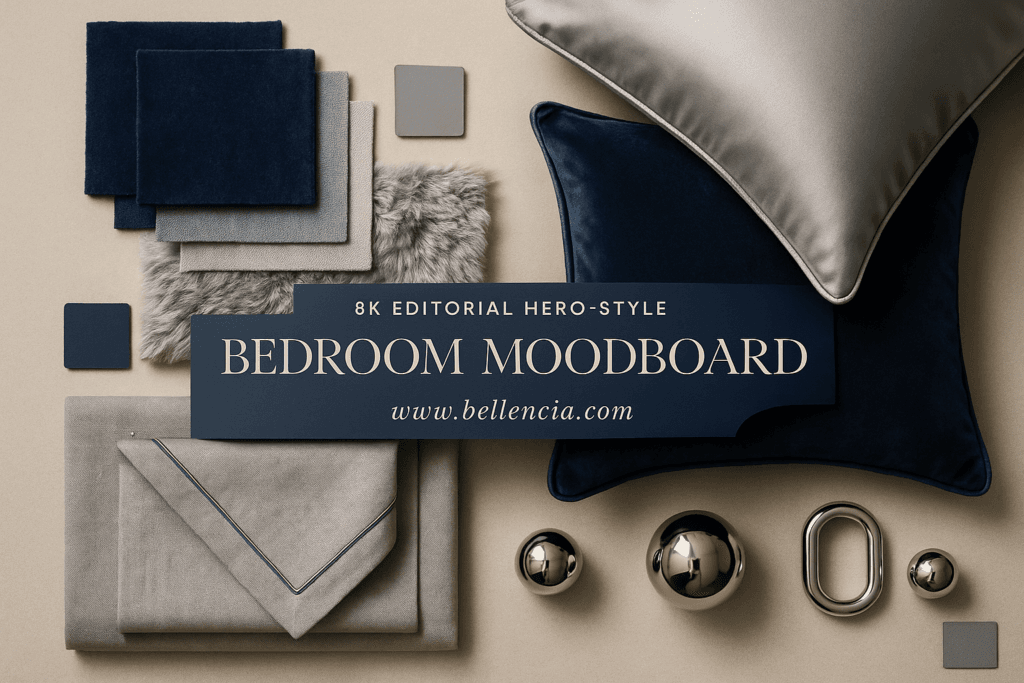
Silver and cool greys communicate structure, sophistication, and modernity — excellent for branding and minimalist interiors.
Lavender-greys add softness and subtle creativity without visual noise.
The key is restraint. Cool-toned moodboards work best when the palette is narrow and intentional.
Texture Is What Keeps Cool Tones From Feeling Cold
One misconception about cool-toned design is that it can feel sterile. Texture solves that instantly.
Layering materials like linen, boucle, wool, matte ceramics, brushed metal, stone, and glass adds warmth without introducing warm colors. Texture creates visual interest while preserving calm.
In moodboards, texture communicates comfort. It invites touch, imagination, and emotional connection — especially important in cool palettes.
Minimalism Amplifies the Calm
Cool tones and minimalism are natural partners. Clean spacing, negative space, and thoughtful composition allow the palette to breathe.
This is where cool-toned moodboards feel most luxurious. Nothing feels accidental. Every element has room to exist. The result is visual confidence — the kind that feels expensive without excess.
How to Build a Cool-Toned Moodboard

Start with a single dominant tone and build outward subtly.
- Select one primary cool color.
- Add two supporting shades only.
- Layer textures instead of colors.
- Balance light and shadow.
- Use clean typography and minimal overlays.
- Maintain consistent lighting across visuals.
Whether for Pinterest, a client presentation, or personal inspiration, consistency is what makes these boards feel calming rather than chaotic.
Where Cool-Toned Moodboards Work Best
Cool-toned boards excel in:
- Bedrooms and sleep-focused interiors
- Living rooms and shared spaces
- Home offices and studios
- Spa and wellness aesthetics
- Minimalist and modern branding
- Pinterest lifestyle content
Anywhere calm is the goal, cool tones deliver.
The Long-Term Appeal of Cool-Toned Design
Trends come and go, but calm never goes out of style. Cool-toned moodboards align with the broader cultural shift toward slower living, intentional spaces, and emotional wellness.
They are future-proof because they don’t rely on novelty. They rely on balance.
Final Thoughts

Cool-toned moodboards aren’t just visually pleasing — they’re emotionally strategic. They help rooms feel calmer, brands feel more trustworthy, and digital content feel more refined.
If your goal is to design spaces and visuals that people want to return to, cool tones are a powerful place to begin.
Fast Glam, Free Shipping
Get beauty, DIY, and home finds delivered fast. Try Amazon Prime free for 30 days.