Spotlight on Color Layering – What It Is and Why It Works
Trending Finds Readers Are Loving
Explore affordable luxe discoveries people are clicking on right now.
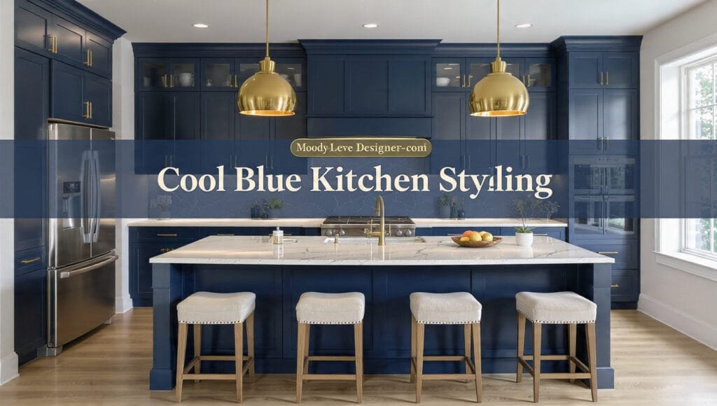
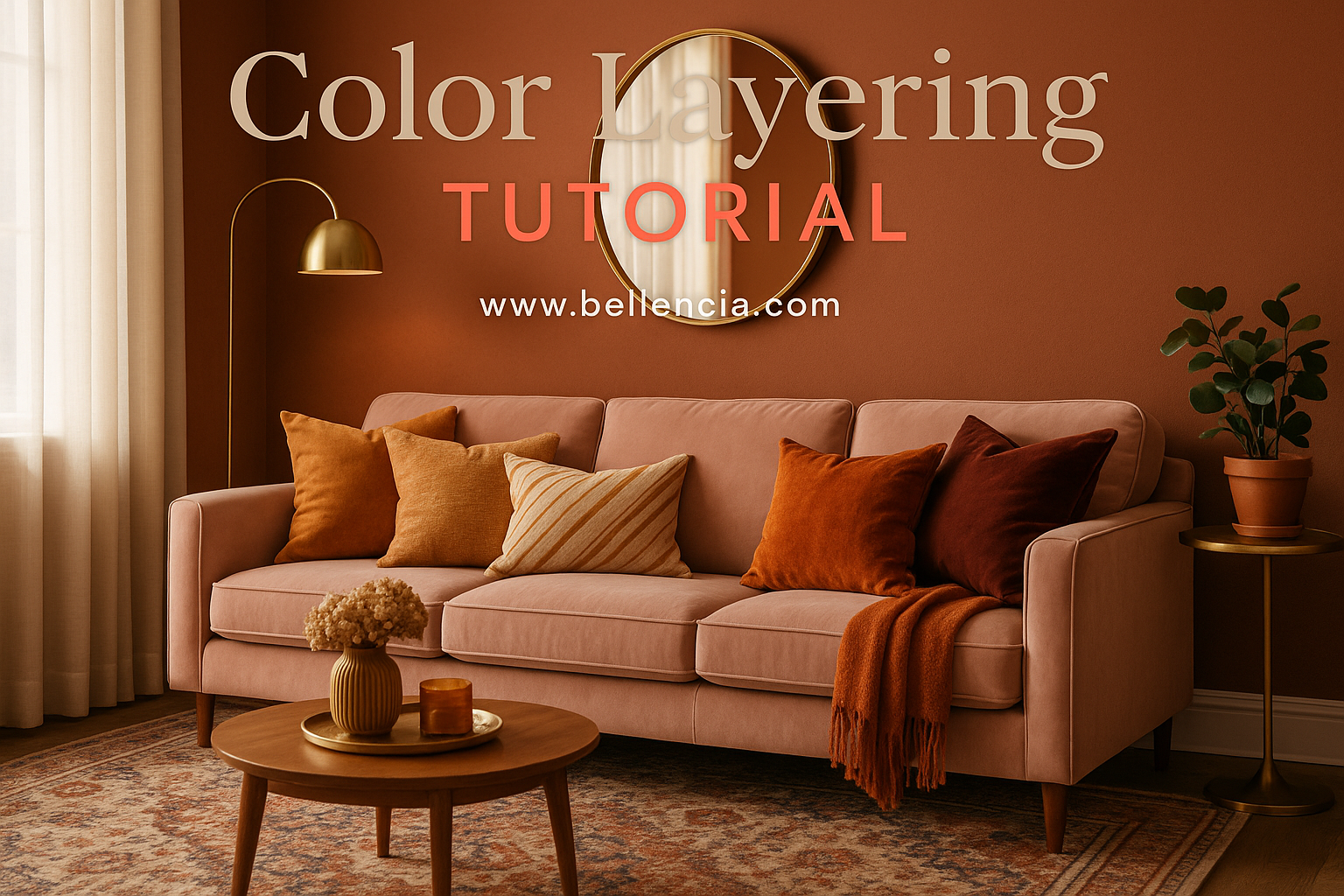
See What's TrendingColor layering is more than just putting together a pretty palette—it’s a strategy for creating mood, depth, and richness in any room. Rather than sticking to one tone, layering involves combining complementary and contrasting shades across surfaces, textiles, and accessories. This technique gives your space visual rhythm, especially when done with purpose and balance. For example, instead of painting a room one color, you might pair a blush-toned wall with coral cushions, a terracotta rug, and burgundy drapes. Together, these tones create harmony without feeling flat.
One of the easiest ways to start color layering is with textiles. Throw pillows in mixed warm hues or rugs with subtle gradients are low-commitment tools that deliver high impact. If you’re ready for bigger moves, try a layered-tonal wallpaper that brings soft transitions to your walls. This method works in all design styles, from minimalist to maximalist, and it’s a timeless way to reflect your personality through color.
When & Where to Use It – Best Rooms, Seasons & Vibes
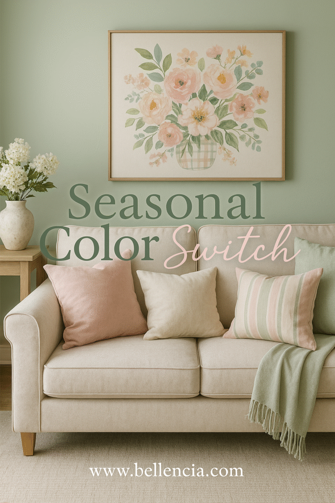
Color layering shines in spaces where you want coziness, personality, or a bit of drama. Living rooms and bedrooms are ideal for this technique because they’re built for comfort and self-expression. Try deeper layers in winter—think navy with charcoal, rust, and camel—and softer palettes in spring, like eucalyptus green with muted blush and ivory. Seasonality can also guide your palette shifts. In fall, trade out linen throws for a velvet option in a richer hue to ground the space visually.
Smaller spaces like reading nooks or breakfast corners also benefit from color layering. Because these rooms don’t rely on size to make a statement, they lean on color and texture. Use tone-on-tone techniques: a jade-painted wall next to a dark green chair, paired with sage pillows and golden accents. It’s subtle yet bold. Explore the seasonal update guide at Seasonal Home Swap Tips for ideas on how to refresh with color as the year shifts.
Perfect Pairings – Color Families, Materials & Textures
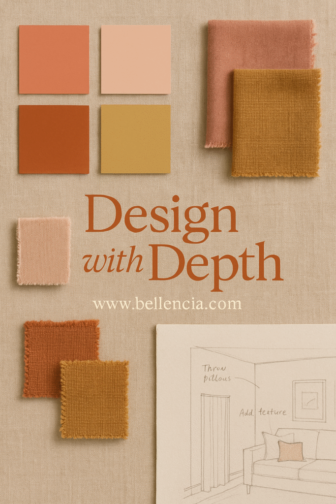
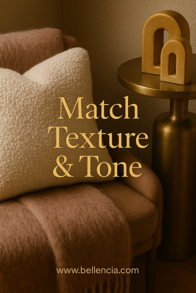
Layering color isn’t just about hues—it’s about the materials and textures that carry them. Soft fabrics absorb light, making colors appear deeper and warmer, while glossy surfaces reflect light and amplify contrast. Start by picking a primary color family (blues, terracottas, greens), then build with neutrals, metallics, and one or two unexpected accents. Pair dusty pink with olive and brushed brass. Try a palette of mustard, stone gray, and matte black for a grounded, industrial vibe.
Textures make all the difference. Combine faux mohair throws, boucle seating, and sleek metal tables—all in varying tones—to add interest and harmony. Avoid flat, one-tone furniture setups. Instead, use woven rugs, painted ceramics, and even books as tools for soft layering. These pairings visually “stack” colors while adding function and beauty to your decor.
How to Style It Like a Pro – Layering Order, Anchors & Pops
Professional stylists always begin with an anchor color—something that grounds the room and sets the emotional tone. From there, they build a gradient around that base, layering lighter and deeper shades, plus one pop color for energy. For instance, if your anchor is earthy terracotta, you might add peach, clay, and a flash of turquoise to liven the look. Start from the ground up: rug, furniture, walls, art, and finally, accessories. This order ensures your colors flow from large to small scale, just like a painting.
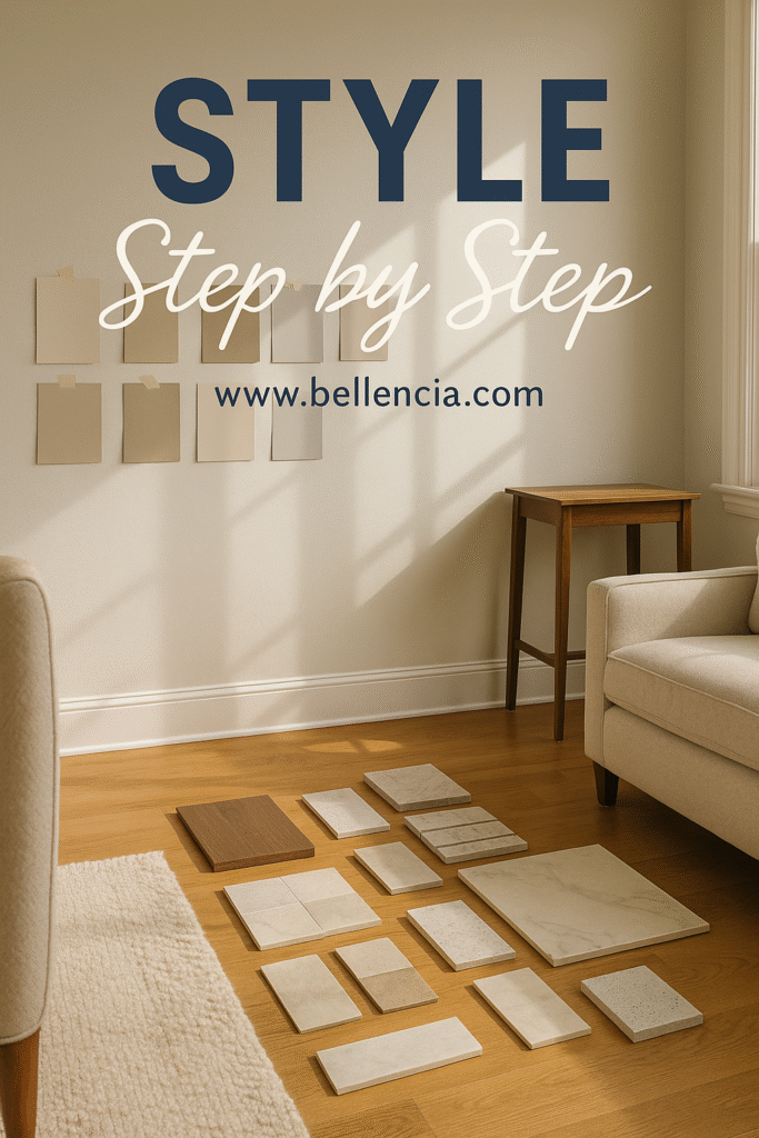
Lighting is also critical. Warm bulbs deepen warm colors, while daylight or cool-toned lighting brings out vibrancy in blues and greens. Test your palette at different times of day before finalizing it. Tools like removable swatches or peel-and-stick samples let you visualize combinations with less commitment. For expert layout tips, check out our Statement Ceiling Ideas post—it explores how ceiling colors influence vertical layering too.
Elevate the Vibe – Finish with Mood, Light & Accent Notes
Once your base palette is set, it’s time to elevate. Add mood through scented candles in tinted glass jars, diffusers in complementary packaging, and fresh flowers that echo your accent colors. Curtains and throw blankets are your final layer—choose them based on season, tone, and touch. Even books and trays can carry color, subtly reinforcing your design story. Decorative lighting like table lamps or sconces should echo your metal or highlight your contrast color.
Finally, think about how color impacts the senses. A layered palette should feel cohesive, but it should also feel personal. Does it make you feel calm? Energized? Inspired? If the answer is yes, you’ve nailed it. Layering isn’t just a design tool—it’s a language for mood, style, and intention. When done right, it creates rooms you never want to leave.