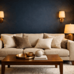
Why Most Living Rooms Feel Either Bold or Cozy — But Never Both
Trending Finds Readers Are Loving
Explore affordable luxe discoveries people are clicking on right now.
See What's TrendingA bold living room is easy to create. Paint the walls dark. Add contrast. Introduce dramatic lighting. Done.
A cozy living room is also easy to create. Layer soft textures. Use warm lighting. Keep colors neutral. Add plush seating.
The problem? Most people treat bold and cozy as opposites.
Bold becomes cold.
Cozy becomes bland.
And the room never reaches that high-end editorial balance you see in architectural homes.
The truth is, bold and cozy are not aesthetic categories. They are emotional responses. And emotional responses are controlled through layout, scale, texture, and lighting—not just color.
According to color psychology research discussed by the Interaction Design Foundation (https://www.interaction-design.org/literature/topics/color-psychology), darker hues create depth and authority, while warmer tones create comfort and intimacy. When you understand that tension, you stop decorating randomly and start designing intentionally.
This blueprint is built on one principle:
Power needs softness.
Softness needs structure.
When you combine the two correctly, the room feels expensive, intentional, and deeply inviting.
Let’s build that foundation.
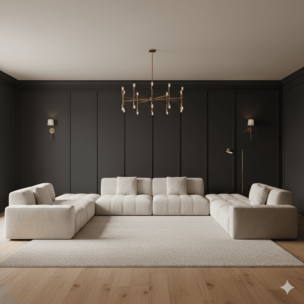
Step 1: Anchor the Room With a Confident Focal Wall
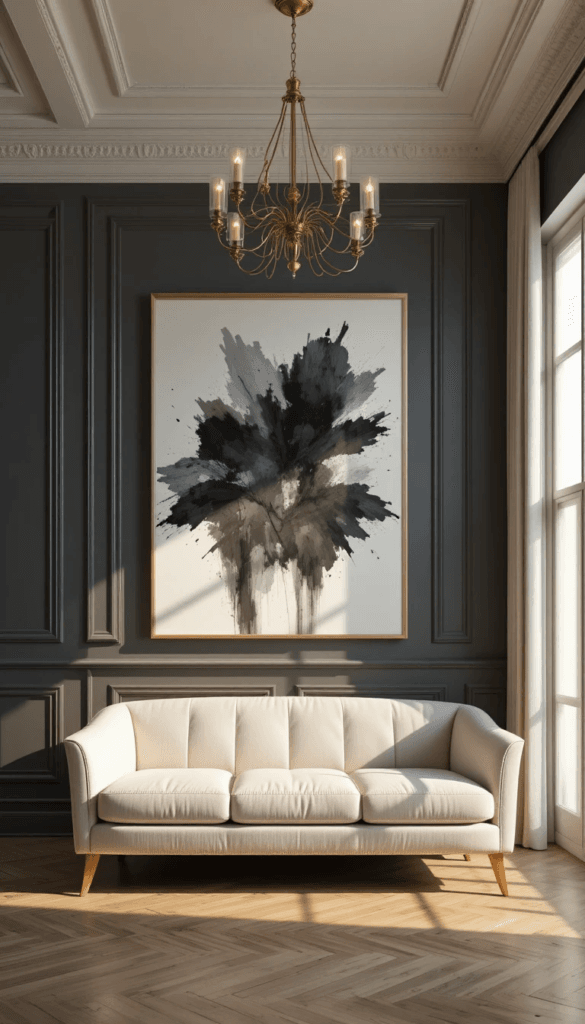
Every bold + cozy living room begins with a dominant focal surface.
That might be:
• A matte charcoal feature wall
• A deep navy paneled wall
• A plaster-textured black accent
• Or a dramatic built-in shelving unit
But here’s the critical mistake most people make:
They paint one wall dark and stop there.
Dark color without structural detail looks flat. Flat reads as unfinished. And unfinished never feels luxurious.
Instead, your focal wall needs depth:
• Applied panel molding
• Board and batten
• Vertical slat wood
• Textured plaster
• Built-in shelving with warm lighting
Architectural detailing creates shadow. Shadow creates dimension. Dimension creates perceived luxury.
For inspiration on proportion and panel spacing, Architectural Digest regularly highlights high-end interiors that rely on wall depth rather than decoration overload (https://www.architecturaldigest.com/).
When the wall carries authority, the furniture doesn’t need to scream for attention. That’s the beginning of balance.
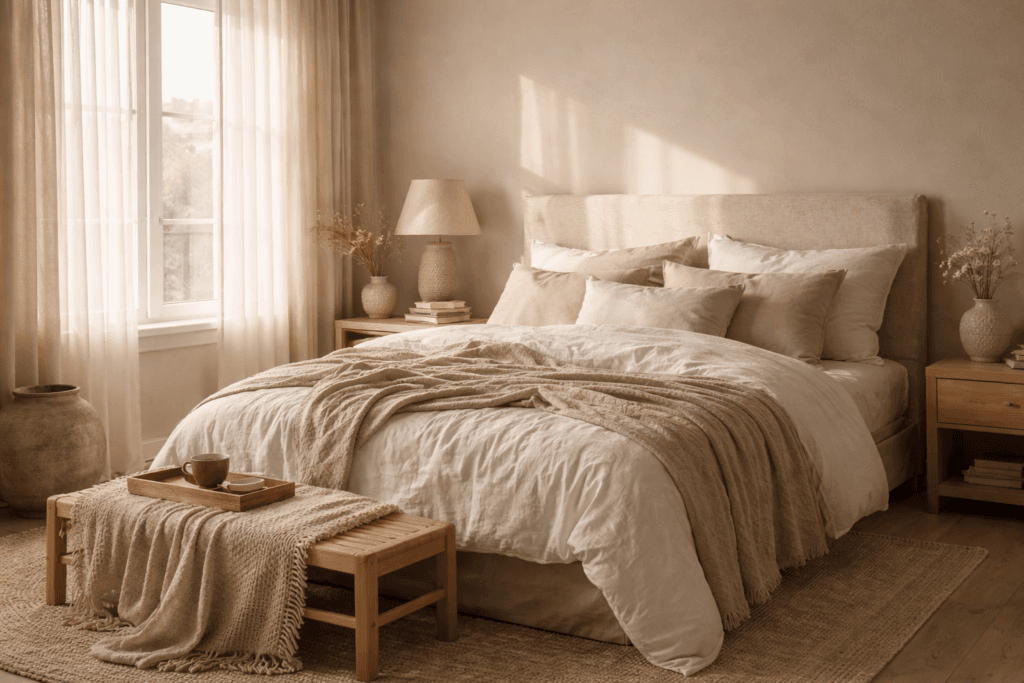
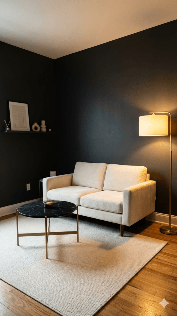
Step 2: The Sofa Must Feel Substantial — Not Delicate
Bold + cozy requires weight.
That means:
• 3-seat sofas instead of 2-seat
• Deep seating (at least 22–24 inches seat depth)
• Wider arms instead of ultra-thin arms
• Low-profile silhouettes instead of tall backs
You’re building groundedness.
Lightweight furniture paired with dark walls makes the room feel unstable. Heavy visual grounding paired with soft upholstery makes it feel secure.
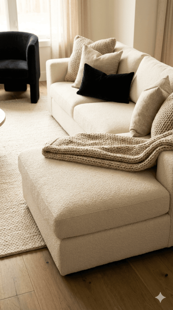
Choose materials like:
• Ivory bouclé
• Warm linen
• Performance velvet in cream
• Textured woven fabric
Texture softens bold color.
Flat upholstery against dark walls feels cold. Nubby, layered, tactile upholstery absorbs light and creates warmth.
And if you’re using a sectional, it must extend at least 24 inches beyond the visual centerline of the rug. Otherwise the room feels cramped.
Scale signals confidence.
Step 3: Rug Size Determines Whether the Room Feels Expensive
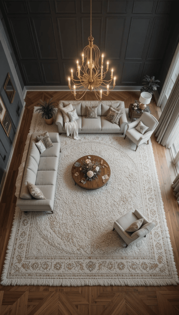
This is non-negotiable.
Your rug must:
• Extend at least 8–12 inches beyond the sofa legs
• Sit fully under the front legs of all seating
• Visually connect the sectional and any accent chairs
In bold rooms especially, undersized rugs create fragmentation.
Fragmentation feels chaotic.
Luxury feels cohesive.
Choose rugs in:
• Warm ivory wool
• Subtle geometric ribbing
• Low-contrast texture rather than high-contrast pattern
Texture > pattern.
The rug is not the star. It’s the stabilizer.
When the floor reads calm, the walls can carry drama.
Step 4: Lighting Is the Emotional Temperature Control
Dark walls do not feel cold because they are dark.
They feel cold because the lighting is wrong.
You need:
• 2700K warm bulbs
• At least three lighting sources
• A statement chandelier in brass or aged gold
• Two secondary lamps
• Optional sconces for layered warmth
Never rely on overhead lighting alone.
Overhead-only lighting creates harsh shadow under eyes and across seating. It flattens the room.
Layered lighting creates glow.
And glow equals cozy—even in a bold palette.
Interior lighting research consistently shows warm lighting increases perceived comfort and relaxation compared to cool white lighting (https://www.energy.gov/energysaver/led-lighting).
If you change nothing else in your living room, change your bulbs.
Step 5: Contrast Must Be Intentional, Not Accidental
A bold + cozy room should have:
• 60% warm neutral
• 30% bold depth
• 10% contrast metal or accent
Too much black feels aggressive.
Too much ivory feels safe but forgettable.
Balance is visual rhythm.
Repeat your bold tone at least three times:
• On the focal wall
• In one accent chair
• In a thin frame or decorative object
Repetition makes bold feel curated.
Isolation makes bold feel random.
Step 6: Texture Hierarchy — The Real Secret to “Cozy”
Most rooms fail not because of color.
They fail because everything has the same surface quality.
If your sofa is smooth…
Your pillows are smooth…
rug is flat…
Your walls are matte…
The space feels sterile.
Luxury requires texture contrast hierarchy.
Here’s the formula designers use:
• One dominant soft texture
• One medium-weight woven texture
• One smooth grounding texture
• One reflective accent
Let’s break that down.
1. Dominant Soft Texture (Comfort Driver)
This is usually:
• Bouclé sofa
• Linen sectional
• Velvet loveseat
• Plush wool rug
This texture carries the emotional warmth.
It absorbs light.
reduces harsh shadow.
It visually softens dark walls.
In bold rooms especially, your dominant texture must be light in color and soft in appearance. This is what keeps charcoal or black from feeling severe.
2. Medium-Weight Woven Texture (Visual Depth)
This layer prevents the room from looking flat.
Examples:
• Ribbed wool rug
• Chunky knit throw
• Textured pillow covers
• Woven baskets
These create micro-shadows that add dimension.
Interior styling experts frequently emphasize that texture is what separates showroom furniture from editorial interiors (https://www.architecturaldigest.com/story/how-to-layer-texture-in-a-room).
Without texture variation, bold reads as modern minimalism.
With texture variation, bold reads as curated warmth.
3. Smooth Grounding Texture (Structure Layer)
Now we anchor.
This is where your:
• Walnut coffee table
• Marble side table
• Matte black console
• Wood flooring
comes in.
Smooth surfaces create contrast against soft upholstery.
Too much softness feels casual.
Too much smoothness feels cold.
Balance creates elegance.
4. Reflective Accent (Controlled Shine)
Luxury always includes a controlled reflective surface.
Not chrome.
Not mirror overload.
But:
• Brushed brass chandelier
• Aged gold picture frame
• Subtle metallic lamp base
Reflection catches warm light and redistributes it around the room.
That glow is what makes bold feel inviting.
Without reflective warmth, black absorbs light and creates heaviness.
With reflective warmth, black feels intimate.
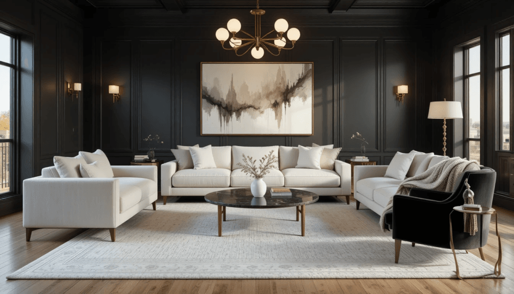
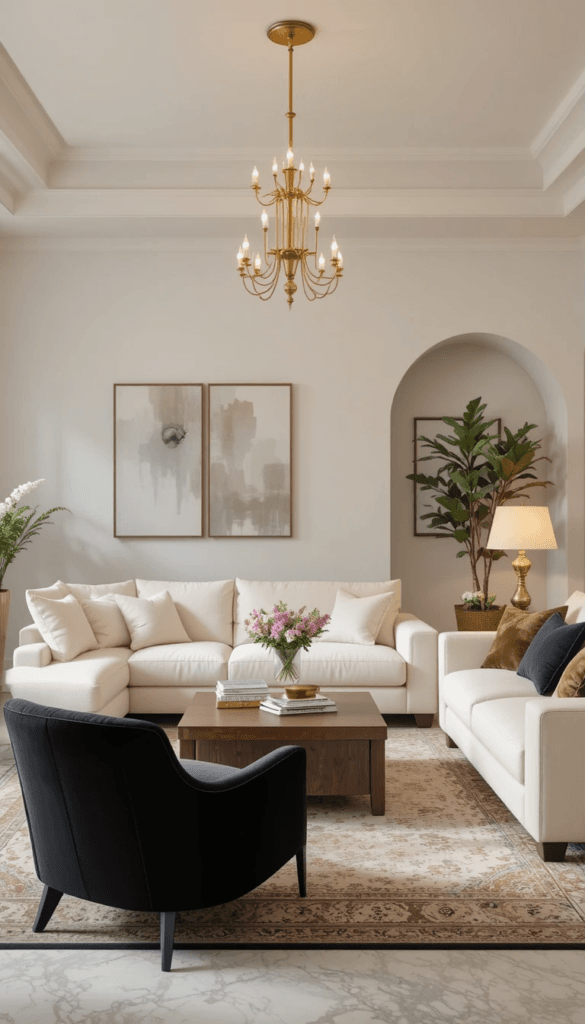
Step 7: Accent Chair Placement That Instantly Elevates Layout
Accent chairs are where most living rooms lose authority.
Here’s the mistake:
People push chairs against walls.
When seating hugs the perimeter, the room feels smaller.
Instead:
• Pull chairs inward
• Angle them slightly toward the sofa
• Let at least one chair overlap the rug fully
Floating furniture signals intention.
Even in smaller spaces, creating a subtle conversation cluster makes the layout feel custom rather than improvised.
If you have one accent chair:
Place it diagonally from the sectional corner, slightly rotated inward.
If you have two:
Position them across from the sofa, 6–12 inches apart, creating a symmetrical anchor.
Symmetry increases perceived luxury because the brain processes it as structured and expensive.
Design psychology research shows symmetry enhances feelings of stability and aesthetic satisfaction (https://www.sciencedirect.com/topics/psychology/symmetry).
In bold rooms, structure matters even more.
Step 8: Preventing Bold From Feeling Masculine or Heavy
Dark walls alone often read as masculine.
To soften:
• Introduce curved silhouettes
• Use rounded coffee tables instead of square
• Add boucle or linen upholstery
• Incorporate warm wood tones
• Use layered neutral textiles
Curves are emotional softeners.
Hard edges + dark color = corporate.
Curves + texture + warm light = luxury residential.
For example:
Instead of:
Black wall + rectangular glass table + leather sofa
Choose:
Charcoal wall + round marble table + ivory textured sectional
That small shift changes the entire emotional tone.
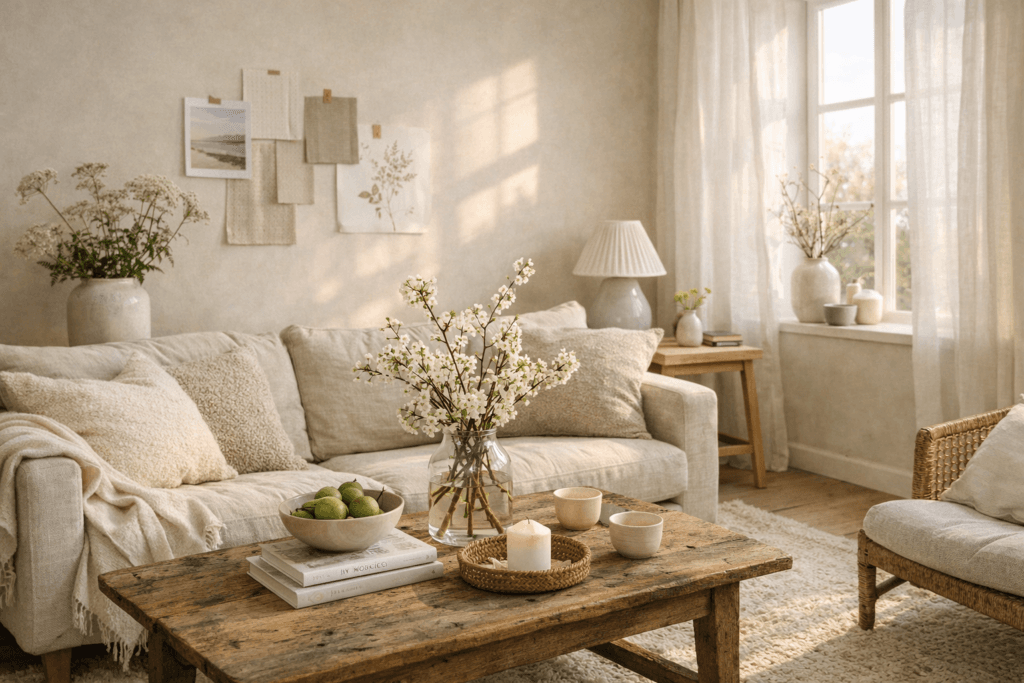
Step 9: The Coffee Table Styling Formula Designers Use
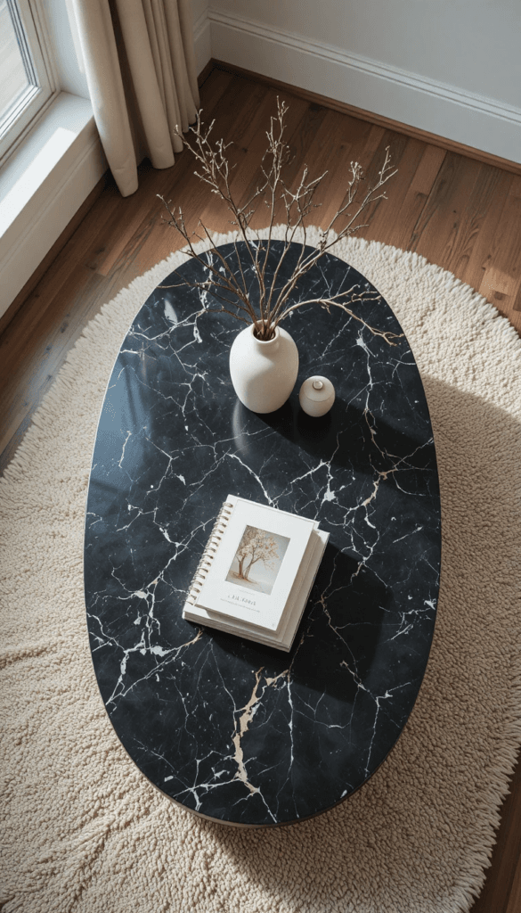
Here’s the exact ratio formula:
• 40% vertical
• 40% horizontal
• 20% organic
Vertical:
• Candle cluster
• Sculptural vase
• Decorative object
Horizontal:
• Stacked books
• Tray
• Low bowl
Organic:
• Branches
• Greenery
• Stone accent
Never style in straight lines.
Create triangular compositions.
Luxury styling always uses visual movement.
And keep negative space.
If the coffee table feels crowded, the room feels anxious.
If the coffee table feels intentional and breathable, the room feels expensive.
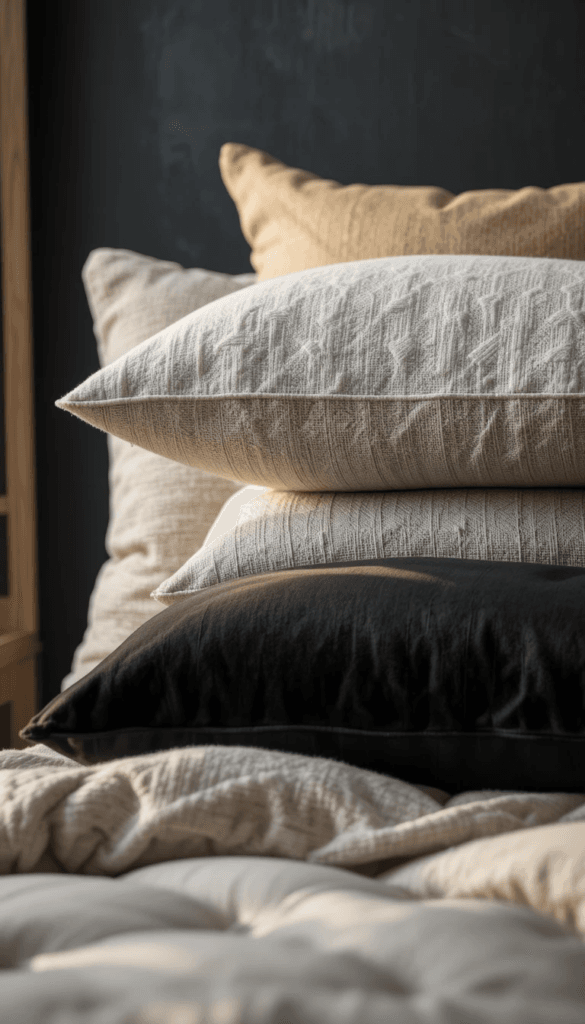
Step 10: Cushion Ratio for a Designer-Level Sofa
For a 3-seat sofa:
• 2 large 22-inch pillows
• 2 medium 20-inch pillows
• 1 lumbar
Layer from back to front.
Mix:
• One bold tone
• One neutral
• One textured
Do not use identical pillows on both sides.
Identical reads staged.
Variation reads styled.
Step 11: How to Make a Bold Room Feel Bigger (Not Smaller)
One of the biggest myths in interior design is that dark walls make rooms feel smaller.
Dark walls do not shrink rooms.
Poor contrast management shrinks rooms.
Here’s what actually determines perceived size:
• Sightline continuity
• Light distribution
• Furniture scale
• Visual breaks
If you paint a wall charcoal but interrupt the flow with:
• Tiny rugs
• Sharp furniture edges
• Cool white lighting
• Multiple competing patterns
The room will feel compressed.
But if you maintain contrast control, dark walls create depth — and depth visually pushes boundaries outward.
Design psychology research has shown that darker tones can make walls appear farther away when paired with proper lighting contrast (Interaction Design Foundation, https://www.interaction-design.org/literature/topics/color-psychology).
Here’s how you apply that in real life:
• Keep trim and ceiling lighter than walls
• Use warm light sources (2700K–3000K)
• Avoid busy wall art
• Choose oversized art instead of clusters
Oversized art reduces visual fragmentation.
Fragmentation makes spaces feel tight.
Continuity makes spaces feel expansive.
Step 12: Rug Positioning in Open-Concept Layouts
Open-concept living rooms are where bold + cozy either thrives — or collapses.
The biggest mistake?
Floating rugs disconnected from furniture.
Your rug must define the zone.
Here is the correct positioning blueprint:
For sectionals:
• Rug should extend at least 24 inches beyond the chaise edge
• Front legs of all seating must sit fully on the rug
• Coffee table must sit entirely within rug boundaries
Sofa + loveseat layouts:
• Rug should anchor both pieces, not sit between them
• At least 8–12 inches of rug visible beyond each seating edge
For small spaces:
• If budget restricts size, go larger in texture presence rather than bold pattern
• Choose low-contrast ivory or soft beige
Interior stylists consistently emphasize that rug scale influences perceived room luxury more than wall color (Architectural Digest, https://www.architecturaldigest.com/).
Luxury rooms do not have “floating postage stamp rugs.”
They have grounding foundations.
Step 13: Wall Art Scale Formula (The 2/3 Rule)
Art placement determines whether bold feels curated or chaotic.
Use the 2/3 rule:
Your art should measure approximately two-thirds the width of the sofa beneath it.
Example:
• 90-inch sofa = 60-inch artwork width
• 72-inch sofa = 48-inch artwork width
Anything smaller looks accidental.
Now layer in this rule:
If the wall is dark:
• Use art with an ivory base
• Avoid high-contrast busy patterns
• Frame in brass or thin black
The goal is to echo contrast, not fight it.
If your art introduces too many new colors, the room loses authority.
High-end homes repeat tones subtly.
Repetition builds visual rhythm.
Randomness builds visual noise.
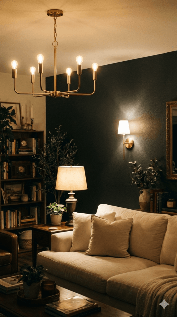
Step 14: Advanced Lighting Layer Strategy
We discussed lighting earlier — but now we go deeper.
There are four lighting layers:
- Ambient (overhead chandelier)
- Task (reading lamps)
- Accent (wall sconces or picture lights)
- Glow (hidden or indirect light)
Luxury rooms use at least three of these.
Here’s the hierarchy:
• Chandelier = structure
• Lamps = intimacy
• Accent lighting = drama
• Glow = warmth
Never rely on overhead lighting alone.
Overhead-only lighting casts downward shadow and emphasizes ceiling height rather than seating warmth.
Warm side lighting reduces harsh shadow under eyes and softens furniture contours.
The U.S. Department of Energy confirms that warm color temperatures (2700K–3000K) create more comfortable residential environments (https://www.energy.gov/energysaver/led-lighting).
In bold rooms, lighting is not decorative.
It is emotional engineering.
Step 15: The 60 / 30 / 10 Bold + Cozy Formula
This is the structural backbone of the blueprint.
60% — Warm neutral base
(sofa, rug, majority upholstery)
30% — Bold depth
(wall color, accent chair, cabinetry)
10% — Reflective or contrast accent
(brass, black frame, dark object)
When bold tones dominate beyond roughly a third of the room, the space can start to feel intense rather than inviting. On the other hand, allowing neutrals to take over almost entirely often drains the design of personality and depth. Even accent elements require restraint—once they climb past a subtle supporting role, the room quickly shifts from curated to chaotic.
Balance is psychological.
Your brain processes proportion before it processes detail.
Luxury is proportionally calm.
Step 16: Preventing Visual Clutter in Bold Rooms
Bold walls amplify clutter.
So restraint is essential.
Follow this formula:
• One large statement art piece
• Two medium decorative objects
• One organic element
• Negative space preserved
Negative space signals confidence.
Overcrowding signals insecurity.
High-end interiors leave room to breathe.
That breathing space is what makes bold feel curated instead of chaotic.
Step 17: The Full Blueprint Walkthrough (From Empty Room to Finished Space)
Let’s walk through this like a real project.
Imagine an empty living room:
• 14 x 16 feet
• One main wall
• Standard 8–9 ft ceiling
• Wood flooring
Here’s how the bold + cozy blueprint gets applied step by step.
1. Establish the Anchor Wall
Paint the primary wall matte charcoal or deep navy.
Add applied panel molding (6–10 panels depending on width) to create architectural depth. Keep trim and ceiling warm ivory to maintain vertical contrast.
Immediately, the room gains authority.
2. Lay the Rug First — Not Last
Choose an 8×10 or 9×12 ivory wool rug depending on room size.
Position it so:
• It extends at least 24 inches beyond the sectional
• The coffee table will sit fully within it
• Accent chairs overlap it
The rug becomes the foundation grid.
Everything else builds on it.
3. Position the Main Sofa
Place a 3-seat deep sectional or 90-inch sofa centered on the focal wall.
Choose ivory bouclé, linen, or soft velvet.
Keep the silhouette low-profile.
Low silhouettes emphasize wall height and make dark walls feel taller.
4. Add Structured Contrast
Introduce:
• One black or charcoal accent chair
• One walnut or marble coffee table
• One brass chandelier
These three elements prevent the room from becoming too soft.
Structure is what gives cozy rooms strength.
5. Layer Warmth
Now layer:
• Knit throw
• Textured pillows
• Soft ivory curtains
• Warm table lamps
Warmth makes bold livable.
Without warmth, bold feels staged.
Step 18: Mistakes That Instantly Kill the Bold + Cozy Effect
Even small errors can collapse the system.
Here are the most common blueprint breakers:
❌ Tiny Rugs
Makes the room feel disconnected and small.
❌ Cool White Lighting
Flattens texture and makes dark walls look gray.
❌ Matching Furniture Sets
Feels showroom, not editorial.
❌ Too Many Accent Colors
Reduces sophistication.
❌ Under-Scaled Art
Creates visual imbalance.
Luxury is restraint + proportion.
Not volume.
Step 19: Adapting the Blueprint to Small Apartments
You do not need 3,000 square feet to execute this system.
In smaller spaces:
• Use one bold wall instead of two
• Keep furniture streamlined but substantial
• Use one large art piece instead of gallery walls
• Choose light-filtering curtains instead of heavy drapes
• Use vertical lighting (tall lamps) to draw the eye upward
Small rooms benefit even more from intentional layout.
When scale is correct, even 600 square feet can feel editorial.
Step 20: Translating the Blueprint to Offices or Formal Spaces
The same system applies beyond living rooms.
In Offices:
• Bold wall behind desk
• Ivory upholstered guest chairs
• Warm brass task lighting
• Minimal decor
Structure + warmth = executive presence.
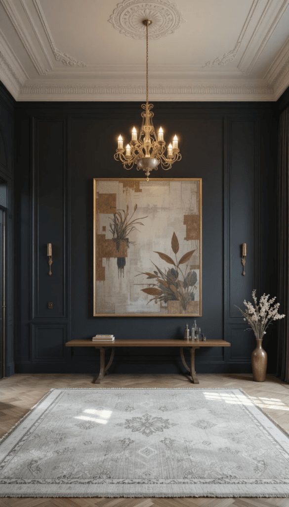
In Formal Living Rooms:
• Symmetrical seating
• Oversized rug
• Statement chandelier
• Controlled styling
In professional environments, bold signals authority.
Warmth signals approachability.
Together, they signal leadership.
Step 21: The Final Designer Checklist
Before you call the room complete, confirm:
□ Rug extends beyond seating
□ Sofa depth feels substantial
□ At least three lighting sources exist
□ Warm bulbs (2700K–3000K) installed
□ Texture hierarchy is present
□ Bold color repeated at least three times
□ Metal accents are warm, not chrome
□ Negative space preserved
If all boxes are checked, the room will feel:
• Confident
• Elevated
• Inviting
• Editorial
• Balanced
Not loud.
Not bland.
Balanced.
The Core Philosophy Behind Bold + Cozy
Bold is power.
Cozy is safety.
When both exist in one room, people relax — but they also respect the space.
That emotional duality is what makes interiors feel expensive.
It is not about copying trends.
It is about controlling contrast, proportion, and light.
And once you understand that system, you can apply it to any room in the home.