
The Console Table Width Rule Designers Always Follow
August 13, 2026
Trending Finds Readers Are Loving
Explore affordable luxe discoveries people are clicking on right now.
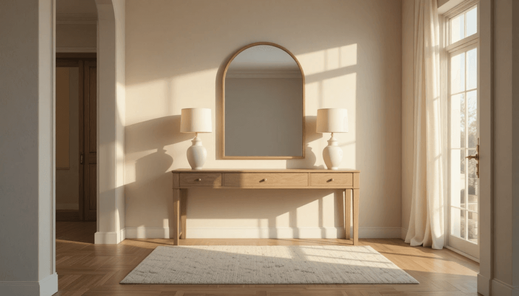
See What's TrendingA console table is rarely the star of a room. However, when proportion is incorrect, it quietly disrupts the entire layout.
Most people choose a console based on availability rather than measurement. Designers begin with width math.
The 70–80% Width Rule
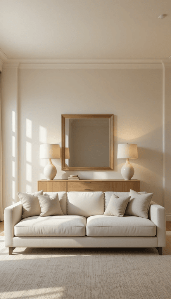
A console table should measure approximately 70 to 80 percent of the width of the surface it sits beneath or in front of.
Under a 96-inch sofa, the ideal console width falls between 67 and 77 inches.
Beneath a 72-inch mirror, the console should measure between 50 and 58 inches.
This ratio creates balance without overwhelming the visual footprint.
When a console is too narrow, it appears isolated. When it stretches too wide, it crowds adjacent walls and pathways.
Why Narrow Consoles Look Inexpensive
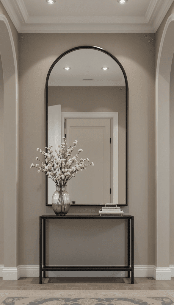
An undersized console fails to anchor the element above it.
When placed beneath a large mirror or artwork, a narrow base creates visual top-heaviness. The eye senses imbalance immediately.
This mirrors the same scale error explained in the wall art scale rule, where undersized art weakens the wall.
Proportion must be consistent vertically and horizontally.
Entryway Application
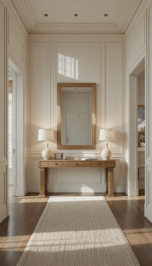
In entryways, console tables define the first impression.
A narrow table floating on a wide wall feels temporary rather than intentional.
If the wall measures 120 inches wide, the console should measure between 84 and 96 inches to create presence.
Scale signals confidence.
Behind the Sofa Placement
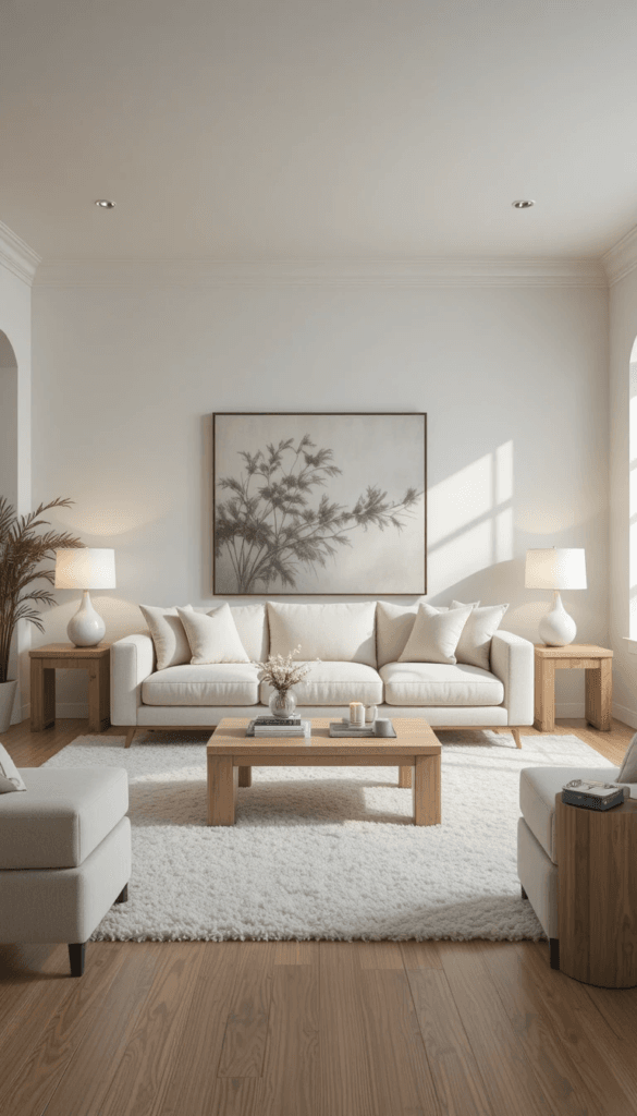
When placed behind a sofa, the console should align with the sofa width rather than the wall.
A 100-inch sofa requires a console between 70 and 80 inches wide.
Alignment reinforces the furniture footprint.
This principle connects directly to the sofa placement rule designers use, where structure determines flow.
Depth and Height Considerations
Width is not the only measurement that matters.
Console depth typically ranges between 12 and 16 inches in entryways to preserve walkway clearance.
Height should remain within 2 to 4 inches of adjacent furniture to maintain continuity.
When height differs dramatically, the room feels fragmented.
The Visual Alignment Test
Stand centered in the room.
Observe whether the console aligns proportionally with the furniture or architectural feature above it.
If negative space dominates on either side, the table is likely undersized.
If the edges feel crowded against walls, it may be too wide.
Balance rarely happens by accident. Designers calculate it.
Mirror and Console Proportion: The Vertical Anchor Rule
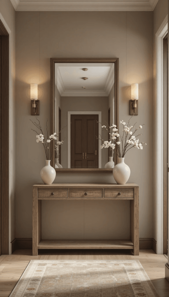
A console table rarely stands alone. It almost always supports a mirror, artwork, or television.
When the upper element is wider than the base beneath it, visual tension forms. The top feels heavy while the bottom feels insufficient.
The mirror or artwork should measure approximately two-thirds to three-quarters the width of the console below it.
If the console measures 72 inches wide, the mirror should fall between 48 and 54 inches wide.
This layering creates a stable vertical composition. The eye travels upward without sensing imbalance.
When the mirror exceeds the console width significantly, the arrangement appears improvised.
The TV + Console Anchoring Formula
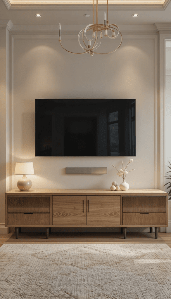
Console width becomes especially critical when anchoring a television.
A media console should always be wider than the television above it. Ideally, it extends at least 4 to 8 inches beyond the screen on each side.
If a 65-inch television measures roughly 57 inches wide, the console should measure at least 65 to 73 inches in width.
This extension visually grounds the screen and prevents it from appearing top-heavy.
The alignment logic reinforces the same structural discipline outlined in the TV height rule, where proportion corrects discomfort.
Luxury interiors never allow a screen to visually outweigh its base.
Floating Consoles and Wall Clearance
Floating consoles require precision.
When mounted on a wall, the table should remain centered to the furniture footprint rather than the drywall edges.
Leave balanced margins on each side to maintain symmetry. Uneven spacing draws attention immediately.
In open walls wider than 120 inches, the console should still follow the 70–80 percent width rule relative to the zone it anchors, not the entire wall span.
Proportion is contextual rather than arbitrary.
Entryway Styling and Symmetry
In entryways, consoles often support decorative symmetry.
Lamps, vases, or stacked books should echo the table’s width without exceeding it.
When styling overflows beyond the console edge, the arrangement feels chaotic.
Balanced repetition builds refinement, a principle consistently emphasized by publications such as Architectural Digest in discussions of high-end interior composition.
Scale governs elegance.
Hallway and Passageway Rules
Narrow corridors require restraint.
Console depth should remain between 10 and 14 inches in tight spaces to preserve walking clearance.
Even in slim hallways, width proportion still applies.
A 90-inch hallway wall should support a console between 63 and 72 inches wide to prevent the wall from feeling empty.
Leaving excessive blank space on both sides makes the table appear disconnected.
Layering Height Above the Console
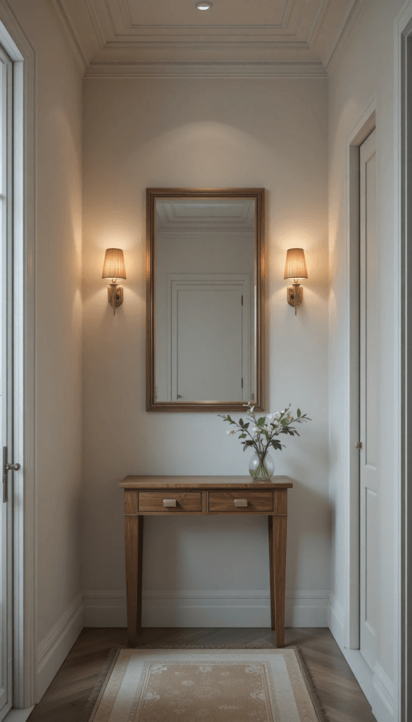
Vertical layering must feel intentional.
The center of a mirror placed above a console typically falls between 57 and 65 inches from the floor, depending on ceiling height.
This positioning aligns with average eye level and maintains comfort.
When mirrors are placed too high, the room loses intimacy. When positioned too low, the composition appears compressed.
Proportion applies in every direction.
The Structural Confidence Test
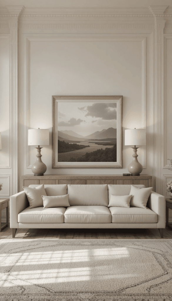
Step back and evaluate the console zone as a whole.
Does the table visually support what sits above it?
Are margins even?
Does the arrangement feel grounded rather than floating?
If something feels slightly off, measurement is usually the missing variable.
Designers rely on math before they rely on instinct.
7 Console Table Mistakes That Instantly Make a Room Look Cheap
Console tables rarely draw attention when they are correct. When proportion fails, however, the imbalance becomes impossible to ignore.
1. Choosing a Console That Is Too Narrow
A table that measures less than 60 percent of the width of the element above it will appear visually disconnected.
Under a 90-inch mirror, for example, a 48-inch console creates excessive side margins. The composition feels top-heavy and unsupported.
Width must anchor what sits above it.
2. Allowing the Mirror to Exceed the Console Width
When a mirror stretches significantly wider than the console, the arrangement looks improvised.
The base should always support the visual weight above it. Ideally, the mirror measures two-thirds to three-quarters the width of the table.
This proportional alignment reinforces the logic discussed in the wall art scale rule.
3. Centering to the Wall Instead of the Furniture Zone
In open layouts, consoles are sometimes centered on the drywall rather than aligned to the sofa or dining footprint nearby.
Even slight misalignment creates subtle visual tension.
Designers align furniture to functional zones, not architectural emptiness.
4. Choosing the Wrong Depth
Depth directly impacts circulation.
In narrow hallways, a 20-inch-deep console obstructs flow and makes the space feel cramped. Conversely, a 10-inch-deep console beneath a large mirror can appear insubstantial.
Entryway consoles typically range between 12 and 16 inches deep to preserve movement while maintaining presence.
5. Ignoring Height Alignment
A console placed dramatically lower or higher than adjacent furniture disrupts visual continuity.
Height should remain within a few inches of nearby sofas, sideboards, or tables to create horizontal consistency.
This continuity principle mirrors the alignment strategies outlined in the sofa placement rule.
6. Overstyling the Surface
Clutter diminishes proportion.
When decorative objects spill beyond the width of the console, the table appears smaller than it actually is.
Editing preserves structure.
7. Using Materials That Feel Too Light for the Scale
A long wall may require a substantial wood or stone console rather than a thin metal frame.
When materials lack visual weight, the arrangement feels temporary.
Luxury interiors use materials that match the room’s proportions.
The Evening Console Test
Lighting reveals imbalance.
In the evening, turn off overhead lighting and rely on lamps placed on or near the console.
Does the table feel grounded beneath its mirror or artwork?
Do shadows create dimension rather than harsh contrast?
If the console disappears at night, scale or styling may need refinement.
The Proportion Checklist
- Console width: 70–80 percent of the sofa, mirror, or furniture zone
- Mirror width: two-thirds to three-quarters of console width
- Depth: 12–16 inches in entryways for comfortable circulation
- Height: within 2–4 inches of adjacent furniture surfaces
- Alignment: center to furniture footprint, not drywall edges
Structural proportion determines perceived refinement long before decorative details are noticed.
A console table may seem secondary, yet its measurements quietly influence the balance of the entire room.
Measure deliberately. Align intentionally. Edit confidently.
Luxury is rarely louder. It is simply more precise.
Bellencinista Notes
Before styling a console table, measure its relationship to what surrounds it. Width anchors mirrors, artwork, and televisions just as rugs anchor seating zones. When margins feel balanced and alignment is precise, the room immediately reads refined.