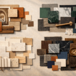
Trending Finds Readers Are Loving
Explore affordable luxe discoveries people are clicking on right now.
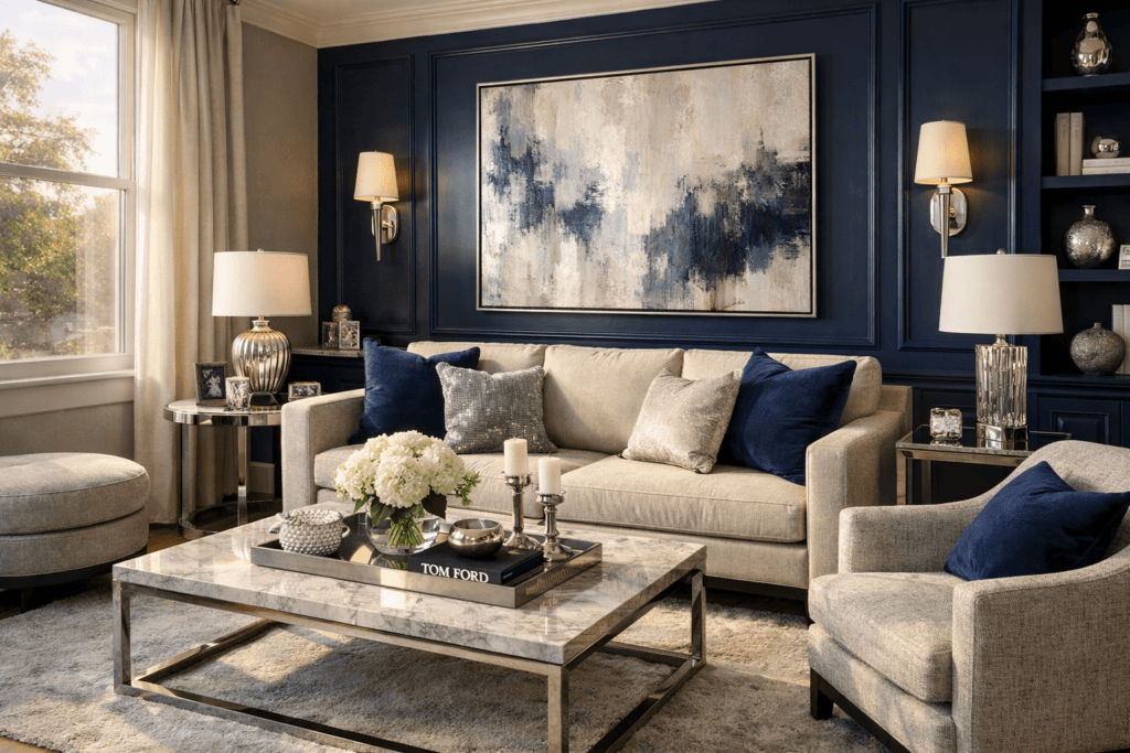
See What's TrendingNavy and silver form a color pairing that feels quietly powerful. Together, they create depth without heaviness, elegance without excess, and structure without rigidity. When styled thoughtfully, this combination delivers a polished interior that feels intentional rather than decorative.
Navy anchors a space. It brings richness, stability, and visual calm. Silver, when used with restraint, introduces light, reflection, and refinement. The result is an interior that feels balanced — neither stark nor overly dramatic.
Moodboarding this palette is about more than choosing colors. It’s about understanding how finishes interact, how light shifts across surfaces, and how texture prevents the space from feeling cold or flat.
This guide explores how to build navy and silver moodboards that translate into cohesive, livable interiors with lasting appeal.
Why Navy + Silver Feels Instantly Polished
Polish comes from contrast handled well. Navy provides a deep, grounding base, while silver introduces clarity and lift. Together, they create visual structure that feels composed and confident.
Unlike brighter metallics, silver reflects light softly rather than loudly. This makes it ideal for spaces that aim to feel elevated rather than showy. When paired with navy, silver highlights architectural details, frames focal points, and adds dimension without overpowering the room.
This pairing works across design styles — from classic to modern — because it relies on balance rather than trend.
The Difference Between Flat Navy + Silver and Elevated Navy + Silver
Not all navy and silver interiors feel refined. Without variation, the combination can quickly become cold or overly formal.
Flat interpretations often rely on:
- A single navy tone used everywhere
- Highly reflective silver finishes
- Minimal texture
- Strong contrast without softness
Elevated navy and silver spaces introduce nuance:
- Multiple navy shades layered together
- Brushed or aged silver finishes instead of mirror-like chrome
- Textural contrast through fabrics, woods, and stone
- Soft transitions rather than sharp divides
The goal is depth, not drama.
Choosing the Right Navy Shade
Navy is deceptively complex. Some shades lean cool and inky, while others carry warmth and softness. The right choice depends on light, room size, and surrounding materials.
In rooms with ample natural light, deeper navies feel grounding and sophisticated. In lower-light spaces, slightly softer or warmer navies prevent the room from feeling heavy.
Testing navy in different lighting conditions is essential. Morning light, afternoon sun, and evening artificial lighting all influence how navy reads — and how silver reflects against it.
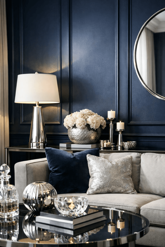
Selecting Silver Finishes That Feel Refined
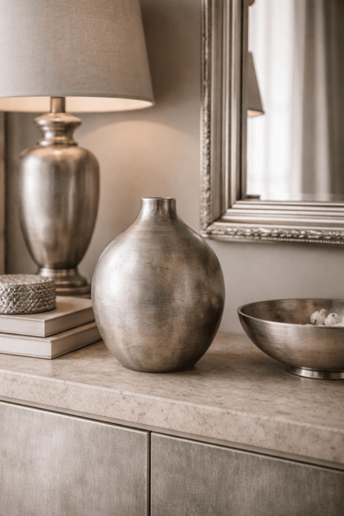
Silver works best when it’s subtle. Brushed nickel, soft chrome, pewter, and antiqued silver introduce refinement without glare.
Avoid overly shiny finishes in large doses. Instead, use silver as an accent:
- Lighting fixtures
- Hardware
- Frames
- Decorative objects
Silver should catch the light, not dominate it.
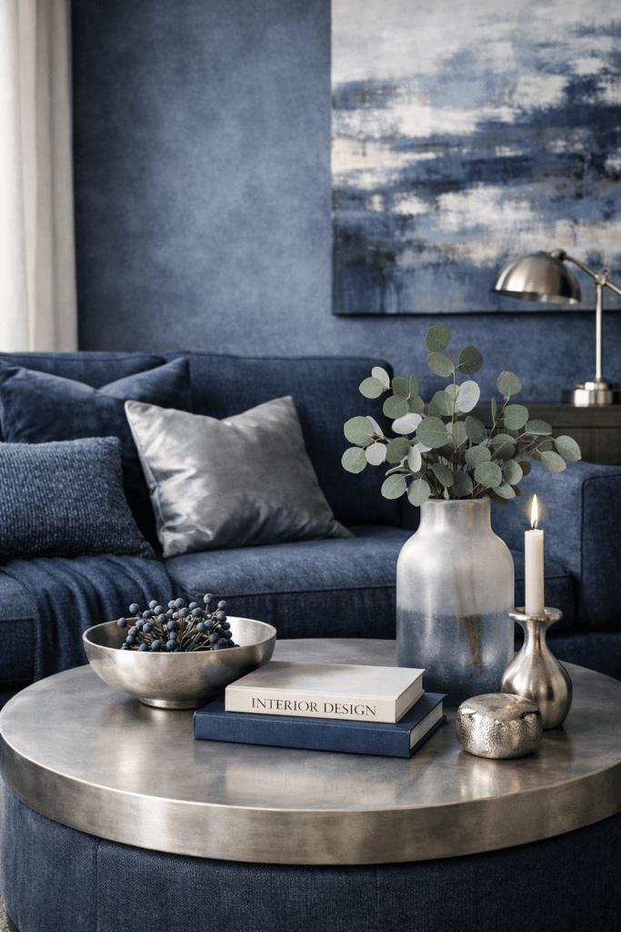
Texture: The Key to Warmth
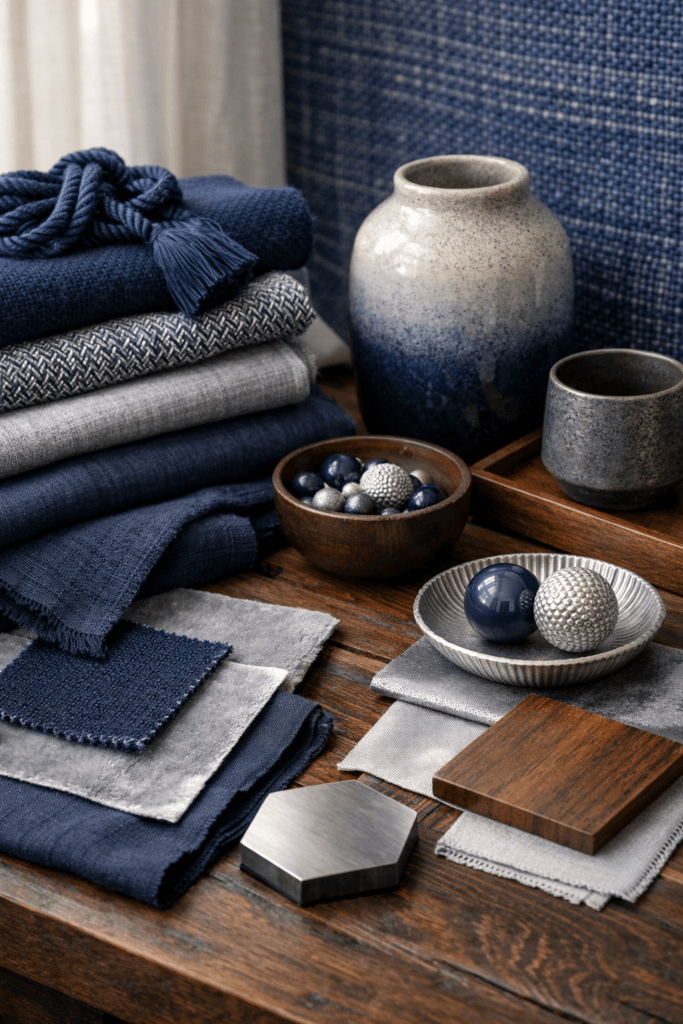
Texture is what transforms navy and silver from sleek to inviting.
Layering materials such as:
- Linen or velvet upholstery
- Wool or woven textiles
- Natural wood
- Stone or ceramic surfaces
…adds softness and balance. Texture diffuses contrast, making the palette feel livable rather than formal.
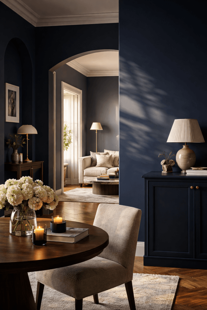
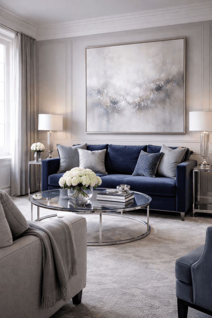
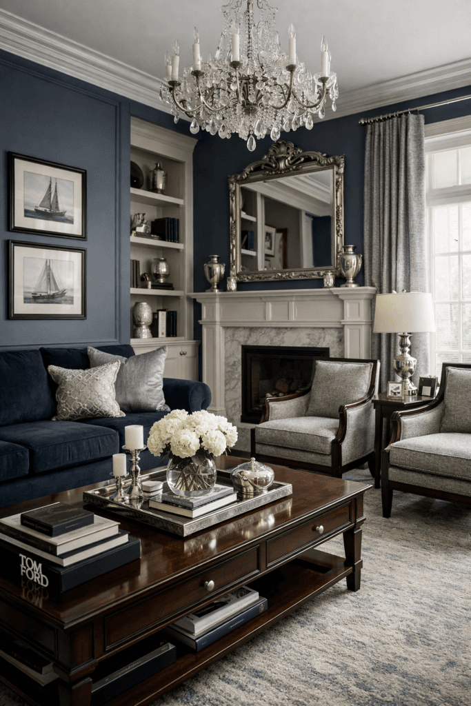
Navy + Silver Moodboards for Living Rooms
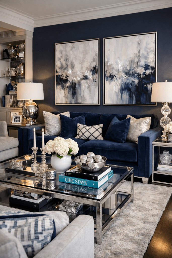
In living rooms, navy and silver work best when navy acts as the anchor and silver functions as a subtle highlight. This balance keeps the space grounded while still feeling polished.
Navy sofas, accent walls, or area rugs establish depth and structure. From there, silver can be layered through lighting fixtures, frames, trays, or sculptural décor. The key is restraint — silver should reflect light gently rather than dominate the room.
Softening elements are essential. Textiles such as wool throws, linen pillows, or velvet accents prevent the palette from feeling stiff. Introducing warm neutrals like cream, soft gray, or natural wood tones adds contrast and makes the living room feel welcoming rather than formal.
A navy and silver living room feels most successful when it looks curated, not themed.
Navy + Silver Moodboards for Bedrooms
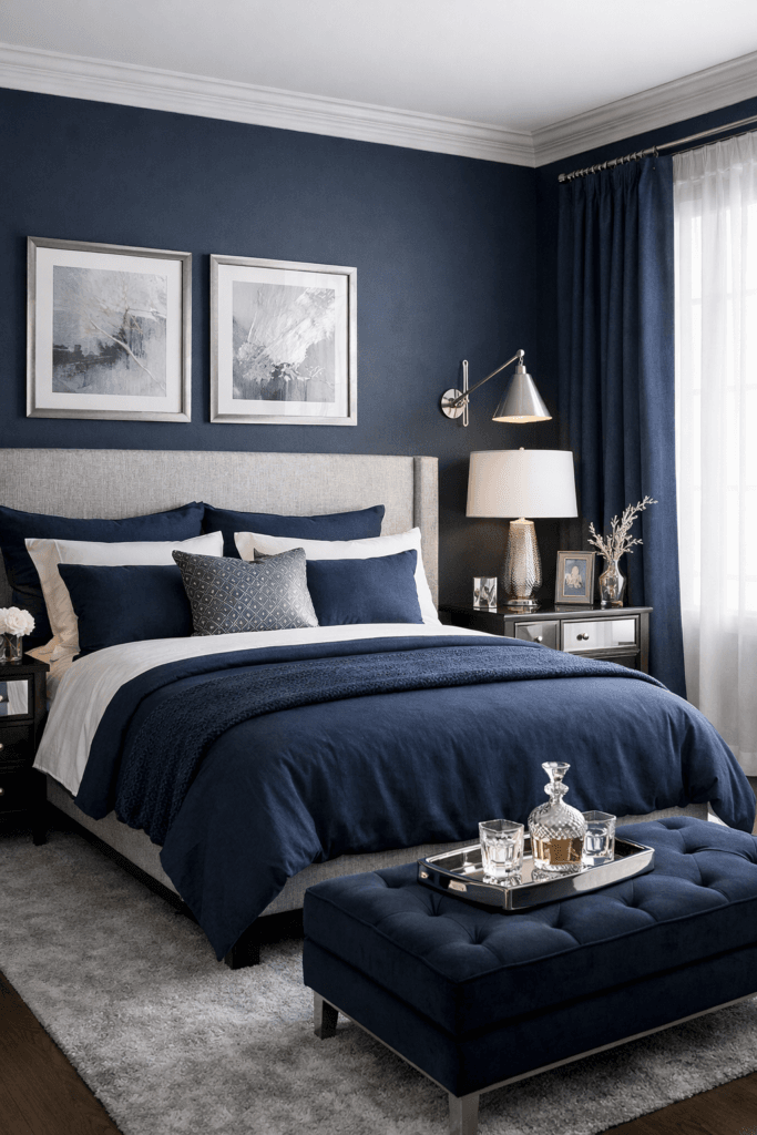
Bedrooms benefit from the calming qualities of navy when it’s used thoughtfully. In this space, navy should feel enveloping rather than heavy, and silver should feel quiet rather than reflective.
Navy works beautifully in bedding, upholstered headboards, or softly textured walls. Silver appears best through understated details — bedside lamps, mirror frames, or minimal hardware.
Layering texture is especially important in bedrooms. Crisp cotton sheets, plush duvets, woven rugs, and subtle metallic accents create a sense of comfort and refinement. Avoid overly glossy finishes here; brushed or matte silver tones maintain a relaxed atmosphere.
The goal is serenity with structure — a bedroom that feels restful but intentional.
Navy + Silver Moodboards for Dining Spaces
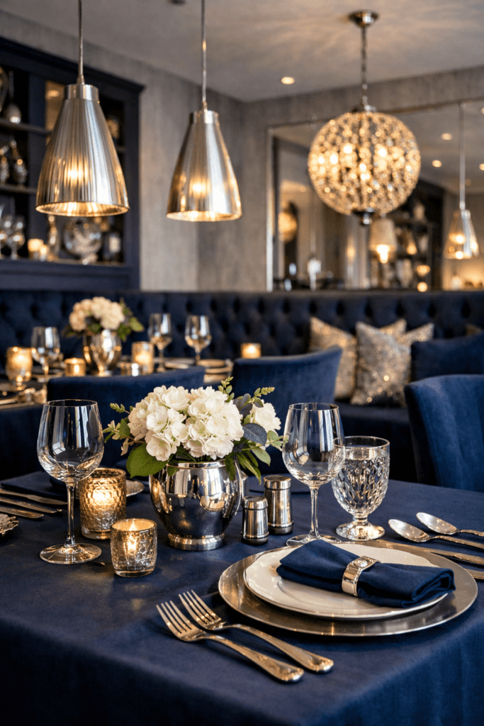
Dining spaces allow navy and silver to feel more dramatic without becoming overwhelming. Navy walls or dining chairs add presence, while silver fixtures elevate the room’s formality.
Silver chandeliers or pendant lighting often become the focal point, especially when paired with navy backdrops. To prevent the space from feeling cold, incorporate natural materials such as wood dining tables, woven seating, or textured runners.
Tabletop styling should remain simple. White or neutral dishware paired with subtle silver accents keeps the look refined and timeless rather than ornate.
In dining rooms, navy and silver communicate elegance — but only when balanced with warmth and simplicity.
Navy + Silver in Open-Concept Spaces
Open-concept layouts require careful repetition to maintain cohesion. Navy and silver should appear consistently across zones, but not identically.
For example, navy may appear on cabinetry or accent walls in one area, while silver repeats through lighting, hardware, or décor across adjacent spaces. This repetition creates flow without uniformity.
Breaking up the palette with light neutrals and natural textures ensures the space doesn’t feel segmented or overly formal. The goal is continuity, not contrast overload.
Common Navy + Silver Mistakes to Avoid
One of the most common mistakes with navy and silver is overusing contrast. When both colors are applied heavily and without texture, the space can feel cold or rigid.
Another pitfall is relying solely on shiny silver finishes. Highly reflective surfaces amplify light in harsh ways and quickly make a space feel dated. Opt for softer finishes that age gracefully.
Ignoring undertones can also undermine the moodboard. Cool navies paired with overly warm silvers — or vice versa — can clash subtly but noticeably. Always consider how finishes interact under different lighting conditions.
Finally, neglecting texture results in a flat interior. Even the most elegant palette needs softness to feel livable.
Final Thoughts
Navy and silver create a color story that feels confident, composed, and enduring. When layered thoughtfully, this pairing delivers polish without coldness and elegance without excess.
The most successful navy and silver interiors rely on nuance — varied shades, softened metallics, and tactile materials that add warmth and dimension. By focusing on balance rather than contrast, you create a space that feels refined yet comfortable.
A polished space doesn’t demand attention. It earns it quietly — and that’s exactly what navy and silver do best.