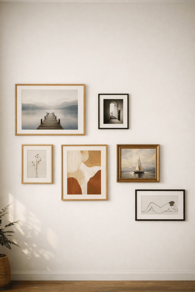
Introduction: Why Gallery Walls Often Feel “Off”
Trending Finds Readers Are Loving
Explore affordable luxe discoveries people are clicking on right now.
See What's TrendingGallery walls tend to fall into one of two extremes: overly sparse and hesitant, or visually overwhelming and chaotic. What’s interesting is that both outcomes usually come from the same root issue—designing without a framework. Most people approach gallery walls emotionally first, collecting pieces they love, then trying to make them “work” on the wall afterward.
An elevated gallery wall works in the opposite direction. It starts with structure, scale, and flow, then allows personality to fill in the gaps. This approach removes guesswork and results in a wall that feels calm, intentional, and timeless rather than trendy or cluttered.
The goal isn’t to impress visitors with quantity. It’s to create a visual rhythm that feels effortless and grounded every time you walk past it.
Price: 9.99
Shop Similar: Lunar Tranquility – a must-have featured in this post.
1. Start With the Wall’s Purpose, Not the Art
Most gallery walls fail because they begin with accumulation instead of intention. People collect pieces over time, then attempt to arrange them simply because a wall feels empty. The result often looks accidental rather than considered. An elevated gallery wall, however, always begins with a clear purpose.
Ask yourself what the wall is meant to contribute to the space. Is it meant to visually anchor furniture below it? Soften a narrow hallway? Add warmth to a room that feels stark? Or create a moment of pause in an otherwise transitional area? The answer determines everything from size and density to spacing and placement.
When the purpose is clear, editing becomes easier. You’re no longer asking, “Do I like this piece?” but rather, “Does this piece support the role this wall is meant to play?” That shift alone eliminates clutter and leads to a wall that feels intentional rather than reactive.
2. Choose a Visual Mood Before Choosing Pieces

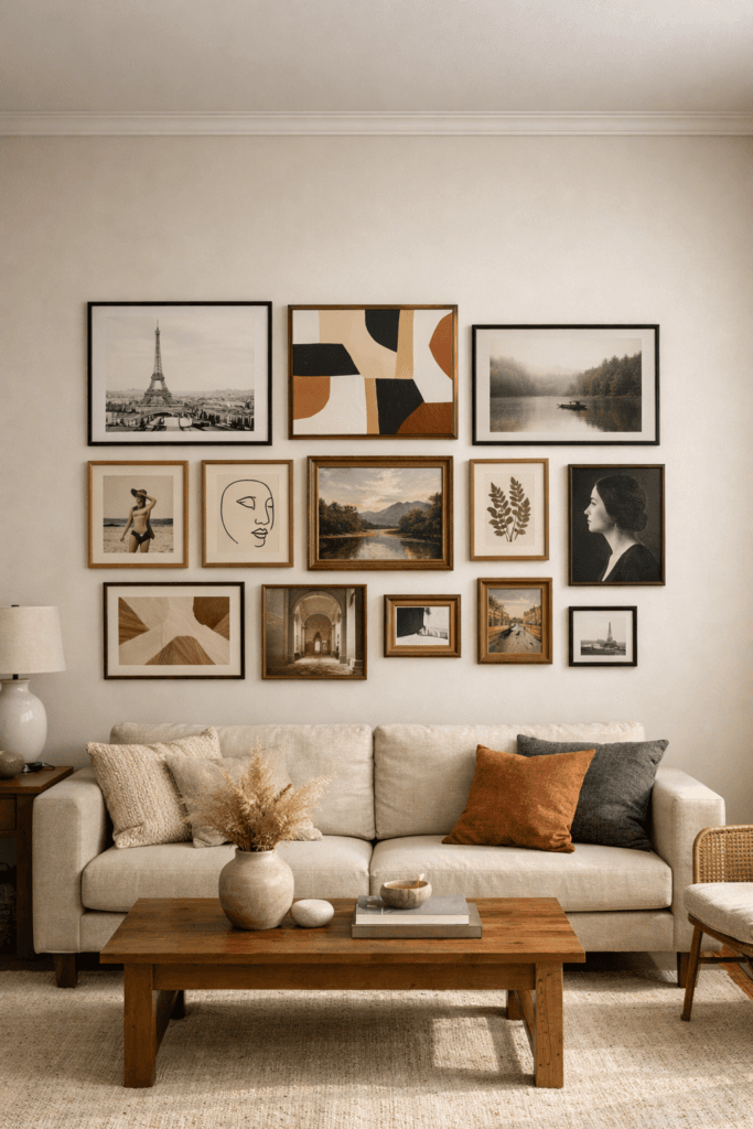
Gallery walls feel chaotic when too many emotional tones coexist. A sentimental family photo, a bold abstract print, a minimalist line drawing, and a vintage photograph may all be beautiful—but together, they can visually compete if there’s no shared mood.
Before selecting or arranging pieces, define the emotional tone of the wall. Should it feel calm and grounding? Thoughtful and introspective? Refined and editorial? Warm and nostalgic? This mood acts as a filter for every decision that follows.
An elevated gallery wall doesn’t shout different stories at once. It communicates a single feeling through many voices. Even contrast feels intentional when it supports the same emotional direction rather than pulling the eye in conflicting ways.
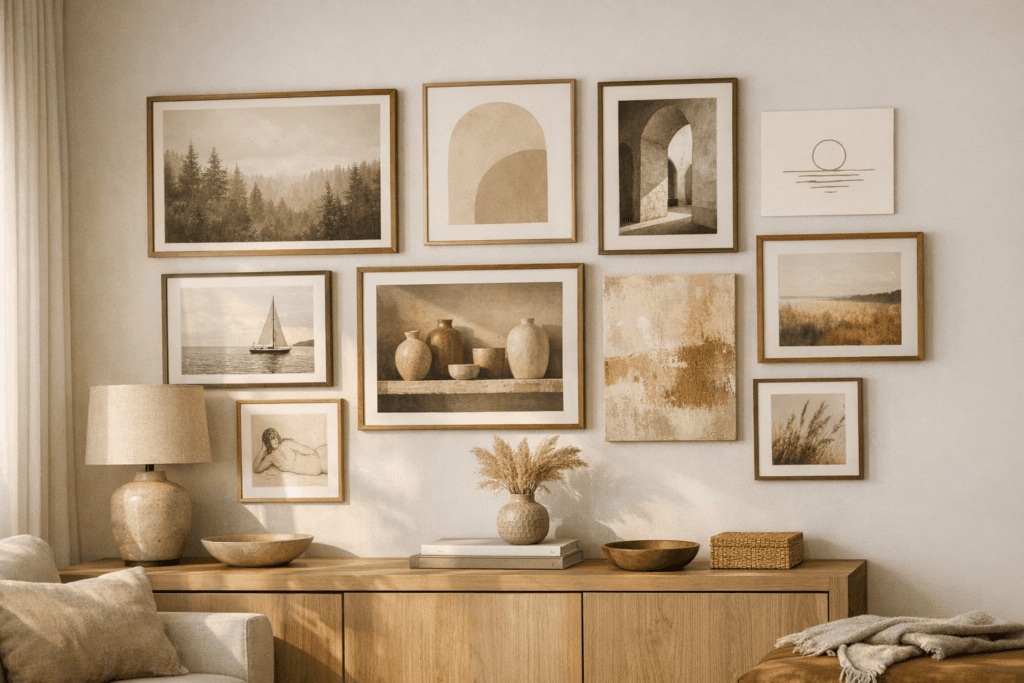
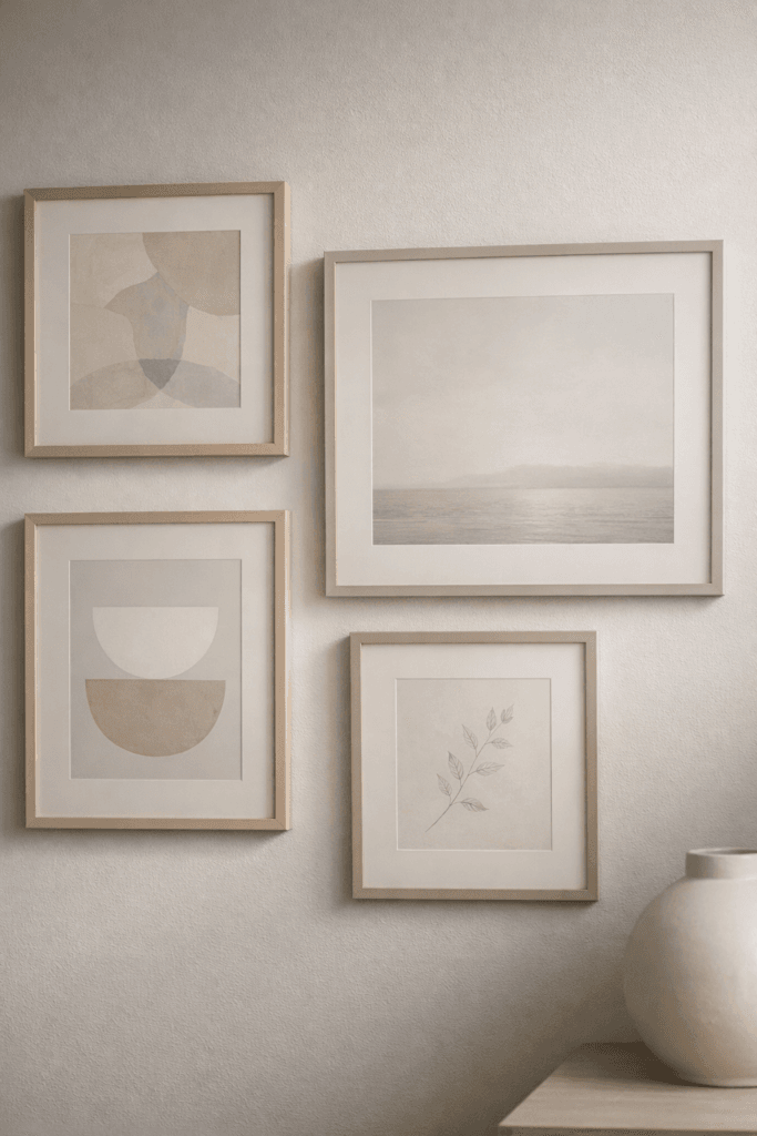
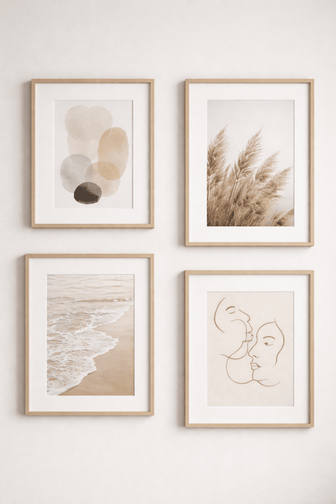
3. Limit Your Color Palette (Even If the Art Is Colorful)
Color is one of the most powerful visual tools—and one of the easiest ways to overwhelm a gallery wall. When too many colors compete for attention, the wall becomes visually loud, even if the layout is precise.
Limiting your color palette doesn’t mean eliminating color. It means choosing a restrained range that repeats across the wall. Perhaps the art includes muted blues and warm neutrals, or black-and-white imagery with subtle tonal variation. Repetition is what creates cohesion.
When the palette is controlled, the eye can move across the wall comfortably. The wall feels calm, refined, and deliberate—qualities that immediately elevate a space.
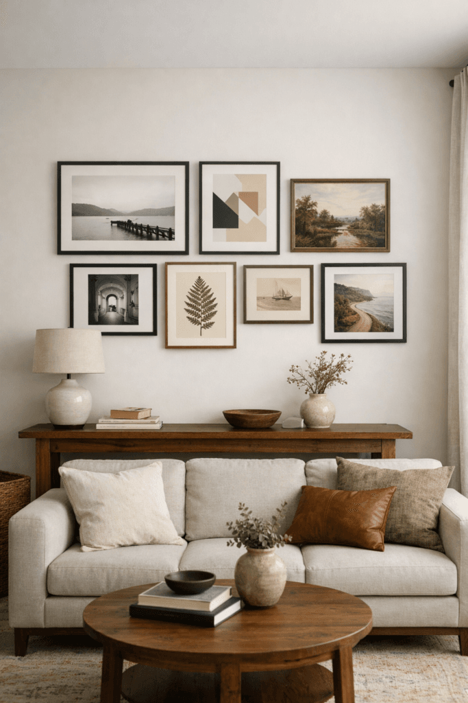
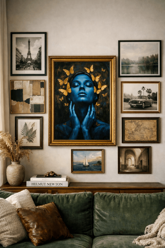
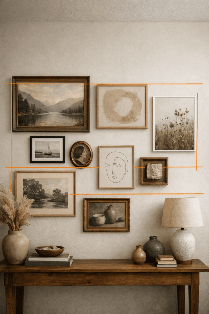
4. Let One Piece Lead the Composition
Hierarchy is essential in design. Without it, everything competes for attention, and nothing feels important. In gallery walls, this often shows up as a collection of similarly sized frames arranged without a clear focal point.
Choose one piece to act as the visual anchor. This is the piece your eye lands on first. It might be the largest frame, the most visually striking artwork, or simply the piece positioned at eye level.
Once the anchor is established, other pieces should relate to it—either by scale, spacing, or alignment. This relationship creates structure and allows the wall to feel composed rather than scattered.
5. Use Spacing as a Design Tool, Not an Afterthought
Spacing is often treated as something to “figure out later,” but in reality, it’s one of the most important design decisions you’ll make. Spacing communicates intention more clearly than almost any other element.
Consistent spacing creates rhythm. Tight spacing feels collected and intimate, while wider spacing introduces calm and clarity. What matters most is choosing a spacing approach and applying it consistently throughout the wall.
In elevated interiors, spacing often does more visual work than the art itself. It signals restraint, confidence, and attention to detail.
6. Think in Shapes, Not Individual Frames
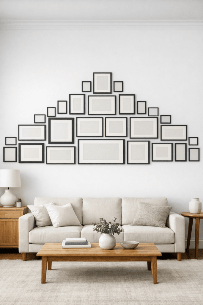
Instead of focusing on each frame in isolation, step back and consider the overall shape the gallery wall creates. Is it rectangular, vertical, horizontal, or softly organic? This outer shape is what the eye reads first from a distance.
The shape should relate to the architecture of the wall and the furniture below it. A long console benefits from a horizontal composition, while a tall stairwell may call for a vertical flow.
When the overall shape makes sense, the individual pieces inside it naturally feel cohesive—even if they vary in size or content.
7. Match the Scale to the Wall, Not the Room
A common mistake is scaling a gallery wall to the size of the room rather than the size of the wall itself. A large room doesn’t require a large gallery wall if the wall surface is narrow, and a smaller room can support a substantial gallery wall if the proportions allow.
Measure the wall and determine how much space the gallery wall should occupy, leaving intentional margins around the edges. Elevated design respects negative space and doesn’t try to fill every inch simply because it’s available.
When scale is handled correctly, the wall feels confident and balanced rather than timid or overpowering.
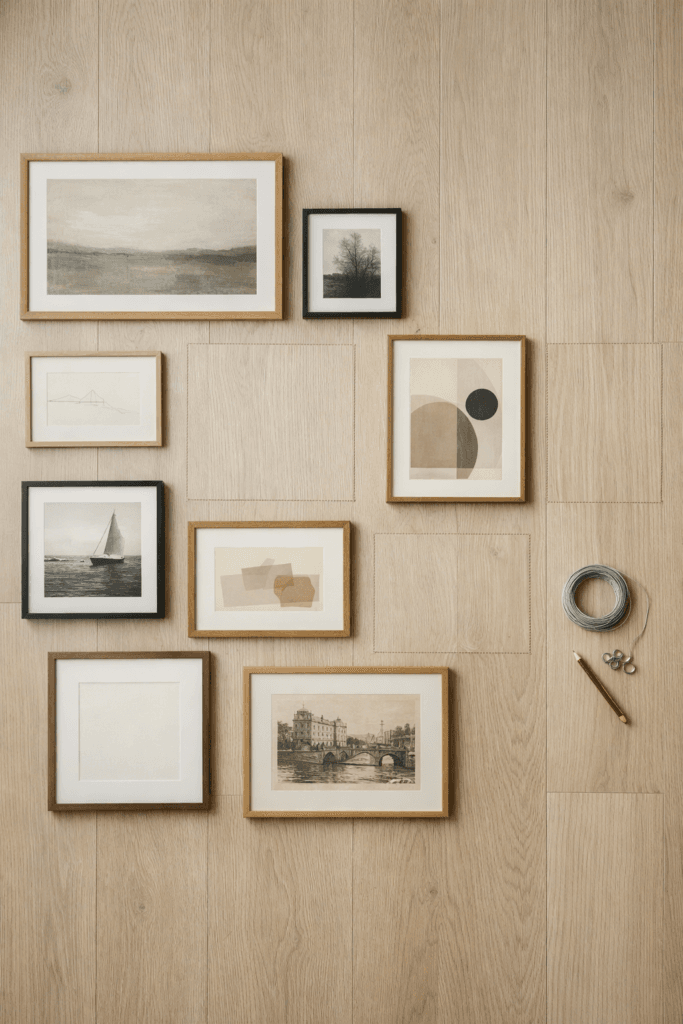
8. Mix Frame Sizes With Intention

Variation adds interest, but uncontrolled variation creates chaos. One of the easiest ways to elevate a gallery wall is to limit yourself to two or three frame sizes and repeat them throughout the composition.
This repetition creates visual rhythm. The eye begins to recognize patterns, which makes the wall easier to read and more calming to look at. Even asymmetrical layouts benefit from this kind of repetition.
Too many frame sizes disrupt that rhythm and make the wall feel improvised rather than curated.
9. Keep Frame Finishes Cohesive
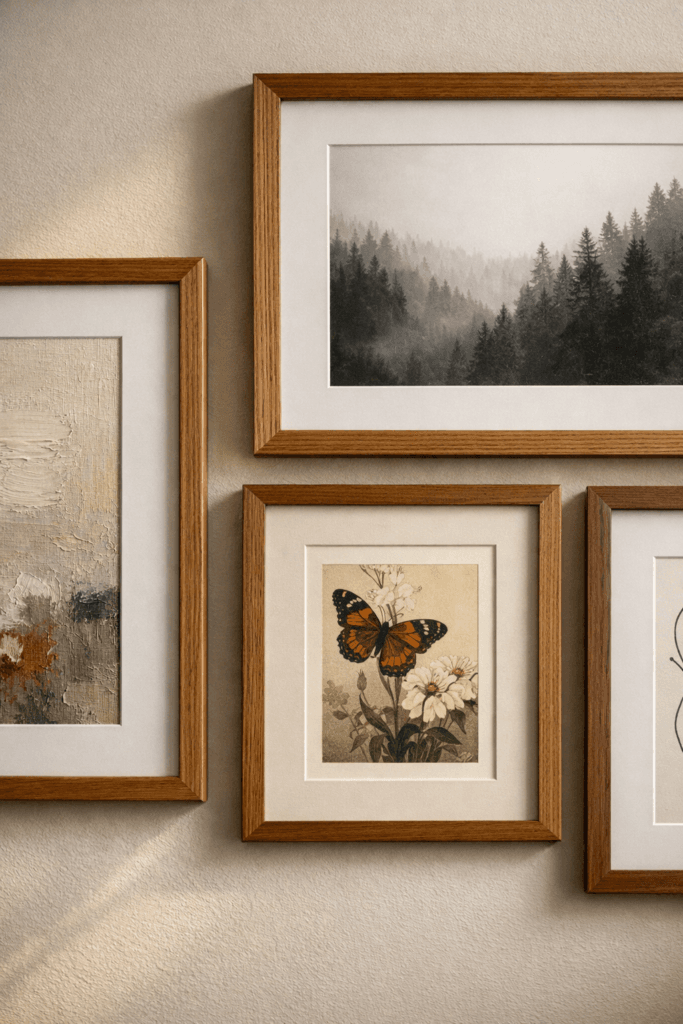
Frames are not neutral background elements—they carry visual weight, texture, and tone. Mixing finishes without intention often results in a wall that feels fragmented.
Choose finishes that share a common undertone, such as warm woods, matte black, or brushed metals. Repeating these finishes throughout the wall ties everything together, even when the artwork itself varies.
Consistency in frame finishes is one of the subtle details that separates gallery walls that feel collected from those that feel truly curated.
10. Align Edges, Even in Organic Layouts
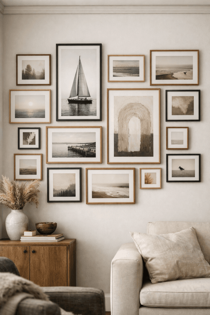
Even the most organic, free-form gallery walls rely on subtle alignment to feel intentional. Without it, the eye struggles to find order, and the wall begins to feel visually restless. Alignment doesn’t mean symmetry—it means giving the eye quiet reference points.
This can show up in shared top edges, consistent centerlines, or repeating vertical anchors across different frames. These alignments often go unnoticed consciously, but they dramatically affect how calm and professional the wall feels.
When alignment is missing entirely, the wall can feel chaotic even if the spacing and art selection are thoughtful. A few invisible lines of order are often what transform a wall from “nice” to “elevated.”
11. Edit Ruthlessly Before Hanging Anything
Editing is where gallery walls truly become refined. It’s tempting to include every piece you love, especially if each one has meaning. But elevated design values clarity over quantity.
Lay all of your pieces out on the floor and step back. Look for repetition, redundancy, or visual weight that feels unnecessary. If two pieces serve the same role, choose the stronger one. If a piece draws attention away from the composition rather than supporting it, remove it.
A smaller, well-edited gallery wall almost always feels more intentional than a crowded one. Restraint communicates confidence.
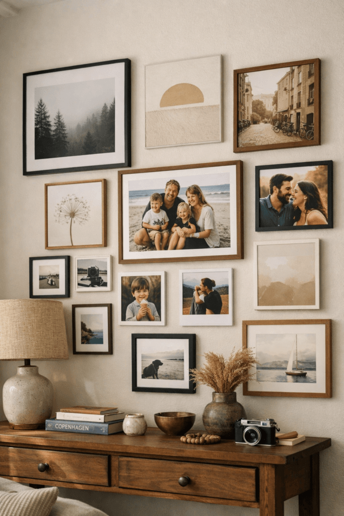
12. Avoid Over-Personalizing the Entire Wall
Personal photos bring warmth and meaning, but when every piece is deeply personal, the gallery wall can feel emotionally heavy rather than visually balanced. Elevated gallery walls often mix personal moments with neutral or artistic elements.
This balance allows the wall to feel lived-in without becoming overwhelming. It also makes the wall more adaptable over time as styles and spaces change.
Think of the gallery wall as a curated narrative rather than a full autobiography. Suggestion is often more powerful than explanation.
13. Test the Layout Temporarily Before Committing
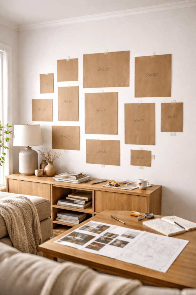
One of the most underrated steps in gallery wall design is living with the layout before making it permanent. What looks balanced on the floor or on paper can feel different once it’s on the wall.
Using paper templates, painter’s tape, or removable hooks allows you to see how the wall interacts with light, furniture, and movement throughout the day. You may notice spacing issues, alignment adjustments, or areas that feel too dense once you live with it.
Taking time here prevents regret later. Elevated spaces are rarely rushed.
14. Let Negative Space Do Some of the Work
Negative space is not empty—it’s intentional. It gives the eye a place to rest and allows each piece to stand on its own. In gallery walls, negative space is often what separates calm compositions from visually exhausting ones.
Leaving breathing room around frames and along the edges of the wall creates a sense of balance and restraint. This is especially important in minimalist and quiet-luxury interiors, where visual calm is part of the aesthetic.
A gallery wall that respects negative space feels confident rather than crowded.
15. Stop Before It Feels “Finished”
One of the most counterintuitive but effective gallery wall tips is knowing when to stop. Many walls become overworked because there’s a desire to fill every perceived gap.
Leaving the wall slightly open-ended allows it to evolve naturally over time. It also prevents the space from feeling overly styled or frozen in a single moment.
Some of the most refined gallery walls feel intentionally incomplete—not because something is missing, but because restraint has been exercised.
Final Thoughts: Why Intentional Gallery Walls Always Feel Better
An elevated gallery wall is not about filling space or showcasing everything you love at once. It’s about shaping how a room feels on a daily basis. When structure, balance, and restraint guide the process, the result feels effortless—even though it’s carefully considered.
Intentional gallery walls create calm rather than clutter. They support the room instead of competing with it. And most importantly, they age well, adapting to changes in style, space, and life over time.
When a gallery wall feels balanced, it doesn’t demand attention. It earns it—quietly.